
Looking for Information
Enroll to start learning
You’ve not yet enrolled in this course. Please enroll for free to listen to audio lessons, classroom podcasts and take practice test.
Interactive Audio Lesson
Listen to a student-teacher conversation explaining the topic in a relatable way.
Introduction to Data
🔒 Unlock Audio Lesson
Sign up and enroll to listen to this audio lesson

Today, we’ll talk about data. Data is any collected information that we use to understand particular situations. Can anyone give me some examples of data?

How many runs a batsman made in his last matches!

The number of books my friends read!
Great examples! Remember that data helps us make informed decisions. Now, let’s see how we can organize this information.
Types of Graphical Representations
🔒 Unlock Audio Lesson
Sign up and enroll to listen to this audio lesson

There are different ways to present data visually. One method is a pictograph. It uses symbols to represent quantities. For example, one symbol could represent 100 cars. Can anyone tell me what a pictograph helps us see quickly?

It helps us understand large numbers at once!
Exactly! Now, how about a bar graph? Can someone describe what it looks like?

It's made up of bars that show different quantities. Taller bars mean more quantity!
Well summed up! The height of the bars provides a quick visual comparison.
Drawing Graphs
🔒 Unlock Audio Lesson
Sign up and enroll to listen to this audio lesson
Now that we understand the types of graphs, let's practice drawing one! Let's say we have monthly sales data of watches sold. How would we begin?
List the numbers for each month first, right?
Exactly! Once we have our data organized, we can begin plotting it. Why is it important to maintain equal width in our bars?
So that the graph remains clear and easy to read!
Well done! Consistency in presentation is key.
Understanding Pie Charts
🔒 Unlock Audio Lesson
Sign up and enroll to listen to this audio lesson
Finally, let's discuss pie charts. Who can tell me what a pie chart represents?
It shows parts of a whole! Each slice is a percentage of the total.
Absolutely! And how do we calculate each slice's angle?
By determining the percentage and multiplying that by 360 degrees, right?
Correct! Now, let’s draw a pie chart based on our favorite ice cream flavors data.
Wrap Up and Review
🔒 Unlock Audio Lesson
Sign up and enroll to listen to this audio lesson
To sum up, we learned about data collection and its graphical representations. Can anyone share what type of graph they found most useful?
I think bar graphs are great for comparisons!
I liked pie charts! They are colorful and easy to understand.
Excellent points! Remember, choosing the right graph helps convey the information clearly. Keep practicing!
Introduction & Overview
Read summaries of the section's main ideas at different levels of detail.
Quick Overview
Standard
The section covers the definition of data, the various methods of organizing and interpreting data, and the types of graphical representations like pictographs, bar graphs, double bar graphs, and pie charts. Each method plays a crucial role in making data meaningful.
Detailed
Detailed Summary
In our daily lives, we continuously encounter various types of information, known as data. Data can be numbers, measurements, preferences or any collected information that helps us understand a context. For instance, a teacher may collect students' heights to understand the average height in her class. Properly organizing this data allows for effective interpretation.
Data presentation is crucial for clarity; thus, various graphical representations are employed. There are different types of graphs, including:
- Pictographs: These represent data pictorially with symbols, making it easier to comprehend large numbers at a glance. For instance, one symbol could represent 100 cars.
- Bar Graphs: A standard method to display data using bars of equal width, where the height of each bar denotes the category value. This effectively allows comparisons across different categories.
- Double Bar Graphs: Useful for showcasing two sets of data together, facilitating direct comparisons between them.
- Pie Charts: These circular representations illustrate the proportion of each category as a sector of the circle, indicating how each part relates to the whole. Each sector's angle represents the data's percentage out of a total.
The learning aims to ensure that students grasp the significance of data organization and representation, fostering analytical thinking and interpretation skills.
Youtube Videos


Audio Book
Dive deep into the subject with an immersive audiobook experience.
Defining Data
Chapter 1 of 6
🔒 Unlock Audio Chapter
Sign up and enroll to access the full audio experience
Chapter Content
In your day-to-day life, you might have come across information, such as:
(a) Runs made by a batsman in the last 10 test matches.
(b) Number of wickets taken by a bowler in the last 10 ODIs.
(c) Marks scored by the students of your class in the Mathematics unit test.
(d) Number of story books read by each of your friends etc.
The information collected in all such cases is called data.
Detailed Explanation
Data refers to raw facts or figures that have been collected, which can represent various aspects of our lives, like sports statistics, test scores, or personal habits. This data helps us understand and analyze specific situations or queries. For example, knowing how many runs a batsman made in the last few matches gives us insights into their performance.
Examples & Analogies
Imagine you are keeping track of how many hours you study each week. This information is your data, which can help you see patterns and improve your study habits.
Collection Context
Chapter 2 of 6
🔒 Unlock Audio Chapter
Sign up and enroll to access the full audio experience
Chapter Content
Data is usually collected in the context of a situation that we want to study. For example, a teacher may like to know the average height of students in her class. To find this, she will write the heights of all the students in her class, organise the data in a systematic manner and then interpret it accordingly.
Detailed Explanation
Data collection is often guided by specific questions we want to answer or insights we want to gain. For instance, if a teacher is interested in the heights of her students to see if they meet certain health standards, she will collect the height measurements, organize them (possibly in a list or table), and calculate averages or ranges to make informed conclusions about the class's growth patterns.
Examples & Analogies
Think about a gardener wanting to grow tomatoes. To understand the best conditions, they might collect data on sunlight hours, watering frequency, and soil types used in previous successful crops. This collected information helps make better gardening decisions.
Graphical Representation of Data
Chapter 3 of 6
🔒 Unlock Audio Chapter
Sign up and enroll to access the full audio experience
Chapter Content
Sometimes, data is represented graphically to give a clear idea of what it represents. Do you remember the different types of graphs which we have learnt in earlier classes?
1. A Pictograph: Pictorial representation of data using symbols.
= 100 cars ← One symbol stands for 100 cars
Example: 1 July = 250 denotes of 100
2 August = 300
September = ?
(i) How many cars were produced in the month of July?
(ii) In which month were maximum number of cars produced?
2. A bar graph: A display of information using bars of uniform width, their heights being proportional to the respective values.
Characteristics: Bar heights give the quantity for each category. Bars are of equal width with equal gaps in between.
Detailed Explanation
Visual representations like pictographs and bar graphs make complex data easier to understand at a glance. A pictograph uses symbols to represent numbers, making data both visually appealing and comprehensible. For instance, if each symbol represents 100 cars, we can quickly assess production levels in different months. A bar graph, on the other hand, uses the height of bars to differentiate values, making comparisons straightforward.
Examples & Analogies
Consider a scoreboard during a basketball game: instead of reading through a list of points scored by each player, watching a bar graph of their scores can instantly show you who performed best.
Types of Graphs
Chapter 4 of 6
🔒 Unlock Audio Chapter
Sign up and enroll to access the full audio experience
Chapter Content
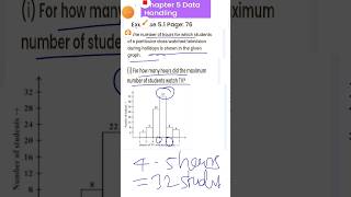
- Double Bar Graph: A bar graph showing two sets of data simultaneously. It is useful for the comparison of the data. (i) What is the information given by the double bar graph? (ii) In which subject has the performance improved the most? (iii) In which subject has the performance deteriorated? (iv) In which subject is the performance at par?
Detailed Explanation
Double bar graphs allow us to compare two sets of related data side by side, enhancing our understanding of differences or trends over time. For example, if we have data for student performance in two subjects across different years, a double bar graph can illustrate the progress in each subject, making it easier to identify strengths and weaknesses in a curriculum.
Examples & Analogies
If you’ve ever compared your grades in math and science over several years, a double bar graph would help visualize changes in your performance, helping you identify where you might need extra help.
Interactive Reflection
Chapter 5 of 6
🔒 Unlock Audio Chapter
Sign up and enroll to access the full audio experience
Chapter Content
THINK, DISCUSS AND WRITE: If we change the position of any of the bars of a bar graph, would it change the information being conveyed? Why?
Detailed Explanation
This section encourages critical thinking about how graphical data presentations work. Positioning in a bar graph is crucial because it affects the reader's interpretation. Changing the order of bars might mislead the viewer regarding the data's relevance or trends, hence maintaining a systematic approach is essential in data representation.
Examples & Analogies
Imagine rearranging trophies on a shelf: if you group them by type versus chronological order, the story they tell changes. Just like trophies represent achievements, bars on a graph communicate a narrative about data.
Graph Task
Chapter 6 of 6
🔒 Unlock Audio Chapter
Sign up and enroll to access the full audio experience
Chapter Content
TRY THESE: Draw an appropriate graph to represent the given information.
Detailed Explanation
Tasks involving data representation train students to apply their understanding of how to organize and visually present collected data, reinforcing learning. By drawing graphs based on given data, students practice the actual application of their skills to interpret and communicate information effectively.
Examples & Analogies
Think of designing a poster for a school project. You'd collect facts about your subject, then decide how best to display that information visually, which not only helps others learn but also deepens your knowledge of the topic.
Key Concepts
-
Data: Information collected from observations.
-
Graphical representation: Visual methods like charts to display data.
-
Pictograph: Uses symbols for data visualization.
-
Bar Graph: Compares different quantities using bars.
-
Pie Chart: Shows proportional data in a circular format.
Examples & Applications
A teacher collects student heights to analyze average class height.
Sales data of different months represented in a bar graph for comparison.
Memory Aids
Interactive tools to help you remember key concepts
Rhymes
Data’s what we collect each day, graphs help show it in a playful way!
Stories
Once in Data Town, everyone decided to visualize their favorite treats using delicious pie graphs, turning sweets into knowledge.
Memory Tools
Remember 'Graphs Are Fun'; each letter stands for different types: G for Graphs, A for Average, F for Frequency.
Acronyms
BRIDGE
Bar graphs Represent Information Dynamically
Generating Engagement.
Flash Cards
Glossary
- Data
Information collected for analysis.
- Pictograph
A graph that uses symbols to represent data quantities.
- Bar Graph
A visual representation using bars to show quantities of different categories.
- Double Bar Graph
A bar graph that shows two sets of data for comparison.
- Pie Chart
A circular chart divided into sectors to show proportion.
Reference links
Supplementary resources to enhance your learning experience.