
Introduction to Graphs
Enroll to start learning
You’ve not yet enrolled in this course. Please enroll for free to listen to audio lessons, classroom podcasts and take practice test.
Interactive Audio Lesson
Listen to a student-teacher conversation explaining the topic in a relatable way.
Understanding Graphs
🔒 Unlock Audio Lesson
Sign up and enroll to listen to this audio lesson

Today, we will learn about graphs, which are visual representations of data that help us understand numerical facts quickly and clearly. Can anyone tell me where you've seen graphs before?

I've seen them in newspapers!

I noticed them on TV when they showed the weather forecast.
Exactly! Graphs are prevalent in daily life. Now, let's focus on line graphs. How do you think a line graph represents information?

It connects data points with lines, showing changes over time.
Great point! Remember, a line graph is effective for showing trends. Let's look at a time-temperature graph to understand it better.
Axes in Graphs
🔒 Unlock Audio Lesson
Sign up and enroll to listen to this audio lesson

Every graph has two axes, minimalizing confusion while reading data. The horizontal axis is typically the x-axis. What do we typically find on the y-axis?

We usually find the numerical value or data, like temperature or sales!
Correct! So if I ask you what the x-axis represents in a time-temperature graph, how would you respond?
It shows the time, right?
Exactly! And the y-axis will depict the temperature recorded at those times. These axes allow us to correlate different data points.
Interpreting Line Graphs
🔒 Unlock Audio Lesson
Sign up and enroll to listen to this audio lesson
Let’s examine a line graph of a patient’s temperature taken every four hours. How would we identify the highest point in the graph?
We would look for the peak line in the graph!
Exactly! Now suppose you notice the temperature rises from 37°C to 40°C, how much did it increase?
That would be an increase of 3°C!
Yes! This kind of analysis helps in understanding health trends over time. These patterns can be crucial for decision-making. Let's summarize what we learned.
Introduction & Overview
Read summaries of the section's main ideas at different levels of detail.
Quick Overview
Standard
This section introduces the concept of graphs, explaining how they visually represent data to convey information effectively. It discusses different types of graphs, particularly line graphs, and their applications in illustrating changes over time or trends in data.
Detailed
Introduction to Graphs
Graphs are an important part of data representation that help individuals easily interpret numerical data visually. This section highlights the significance of using graphs over tables for data comprehension, particularly when trends or comparisons are present. The section covers fundamental types of graphs, with a specific focus on line graphs and their use in displaying continuous changes over time.
Key Points Covered:
- Purpose of Graphs: To present numerical facts in a format that is quick and easy to understand.
- Types of Graphs: A detailed look at line graphs, including how data points are plotted over time, as well as the axes' roles in conveying information.
- Examples and Applications: Illustration of graph usage through scenarios like tracking patient temperatures or analyzing sports performance, showcasing how to read and interpret the data presented in graphs.
Youtube Videos


Audio Book
Dive deep into the subject with an immersive audiobook experience.
Purpose of Graphs
Chapter 1 of 6
🔒 Unlock Audio Chapter
Sign up and enroll to access the full audio experience
Chapter Content
Have you seen graphs in the newspapers, television, magazines, books etc.? The purpose of the graph is to show numerical facts in visual form so that they can be understood quickly, easily and clearly. Thus graphs are visual representations of data collected.
Detailed Explanation
Graphs are important tools in presenting information visually. They help to simplify complex data into a format that is easier for people to understand at a glance. Rather than going through numbers or tables, a graph can show trends or comparisons visually. This is beneficial in various fields like science, economics, education, and everyday life, where quick understanding is essential.
Examples & Analogies
Think of a graph as a map of a city. Instead of trying to find your way using written directions, a map provides a visual layout that helps you see where everything is located. Just like how the map simplifies navigation, graphs simplify data interpretation.
Graphs vs. Tables
Chapter 2 of 6
🔒 Unlock Audio Chapter
Sign up and enroll to access the full audio experience
Chapter Content
Data can also be presented in the form of a table; however, a graphical presentation is easier to understand. This is true in particular when there is a trend or comparison to be shown.
Detailed Explanation
While tables organize data effectively, they can sometimes be overwhelming with numbers. Graphs, on the other hand, can highlight trends, patterns, and relationships that might not be immediately obvious in a table. For example, in a line graph that tracks temperature over time, one can easily observe how temperature fluctuates at different times of the day, while it might require more effort to discern the same trends from a table.
Examples & Analogies
Imagine trying to understand the stock market trends just by looking at numbers. It would be challenging! However, when these trends are shown as a line graph, you can easily see whether the market is rising or falling over time.
Types of Graphs - Line Graphs
Chapter 3 of 6
🔒 Unlock Audio Chapter
Sign up and enroll to access the full audio experience
Chapter Content
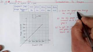
A line graph displays data that changes continuously over periods of time. When Renu fell sick, her doctor maintained a record of her body temperature, taken every four hours. It was in the form of a graph. We may call this a 'time-temperature graph'.
Detailed Explanation
A line graph connects individual data points with lines, representing continuous change. For Renu's temperature, each point corresponds to her temperature at a specific time, and by connecting these points, the line graph provides a clear visualization of how her body temperature varied over time. This helps in understanding not just the temperature at specific intervals, but the overall trend as well.
Examples & Analogies
Think of a line graph like a roller coaster ride. At certain points, you can see how high or low the roller coaster goes, which shows the ups and downs of the ride, similar to how a line graph shows the ups and downs of data over time.
Reading Line Graphs
Chapter 4 of 6
🔒 Unlock Audio Chapter
Sign up and enroll to access the full audio experience
Chapter Content
The horizontal line (usually called the x-axis) shows the timings at which the temperatures were recorded. The vertical line (usually called the y-axis) shows the values being measured, such as temperature.
Detailed Explanation
Understanding how to read a line graph is crucial. The x-axis typically represents the independent variable (like time), while the y-axis represents the dependent variable (like temperature). In Renu's case, time is listed along the x-axis and temperature along the y-axis. Practicing with these axes helps students gain confidence in interpreting any line graph effectively.
Examples & Analogies
Imagine you are reading a book where the pages tell you important time milestones in a story (like when a character catches a train or meets someone). The x-axis is like these pages, telling you when something happened, while the y-axis is the events that transpired, like temperatures or distances.
Understanding Data Patterns
Chapter 5 of 6
🔒 Unlock Audio Chapter
Sign up and enroll to access the full audio experience
Chapter Content
Each piece of data is shown by a point on the square grid. The points are then connected by line segments. The result is the line graph. What all does this graph tell you? For example, you can see the pattern of temperature.
Detailed Explanation
Analyzing the connected points allows students to see trends clearly. For instance, if the line graph shows that the temperature rose steadily before falling, learners can interpret that Renu's health fluctuated. It’s also essential to recognize gaps in data, as they still convey significant information even if not directly represented.
Examples & Analogies
Consider it like analyzing a puzzle. Even if some pieces are missing (like a gap in data), the image can still reveal much about the overall picture (the trend in temperature). Understanding these patterns helps in making educated assumptions.
Example of Data Interpretation
Chapter 6 of 6
🔒 Unlock Audio Chapter
Sign up and enroll to access the full audio experience
Chapter Content
Example 1: The given graph represents the total runs scored by two batsmen A and B, during each of the ten different matches in the year 2007.
Detailed Explanation
This example illustrates how to interpret graphs through comparative analysis. By examining the runs scored by both players visually, one can answer questions about their performance directly related to the data shown. Identifying trends in sports performance is common among teams and coaches.
Examples & Analogies
Think of following two friends in a race. By comparing their distances at intervals, you can see who is ahead or if one is catching up. Just like observing two batsmen’s scores, where seeing who has more runs can show who is performing better.
Key Concepts
-
Graphs: Visual tools for presenting data clearly.
-
Line Graph: A graph showing continuous data over time.
-
Axes: Essential components of graphs that categorize data.
Examples & Applications
When plotting temperatures over time, the highest temperature shows a key point in patient health monitoring.
Sports performance graphs can illustrate how well an athlete performs across multiple events, showing consistency and improvement.
Memory Aids
Interactive tools to help you remember key concepts
Rhymes
Graphs are neat for trends to show, numbers aligned in perfect flow.
Stories
Imagine a gardener plotting how his flowers bloom over time; his line graph tells him when to plant more seeds!
Memory Tools
G-Graph, R-Represents, A-Accurate, P-Presentation, H-Help.
Acronyms
G.R.A.P.H. stands for
Graphical Representation of Analytical Presentations of History.
Flash Cards
Glossary
- Graph
A visual representation of data used to illustrate numerical facts and trends.
- Line Graph
A type of graph that displays information as a series of data points connected by straight line segments.
- xaxis
The horizontal axis in a graph, typically represents independent variables.
- yaxis
The vertical axis in a graph, usually signifies dependent variables.
- Trend
The general direction in which something is developing or changing, often visualized in graph form.
Reference links
Supplementary resources to enhance your learning experience.