
Supply Schedule and Supply Curve
Enroll to start learning
You’ve not yet enrolled in this course. Please enroll for free to listen to audio lessons, classroom podcasts and take practice test.
Interactive Audio Lesson
Listen to a student-teacher conversation explaining the topic in a relatable way.
Introduction to Supply Schedule
🔒 Unlock Audio Lesson
Sign up and enroll to listen to this audio lesson

Today, we're going to explore the concept of a supply schedule. Who can tell me what a supply schedule is?

Isn't it a table that shows how much goods producers are willing to supply at different prices?
Exactly! The supply schedule displays various quantities that producers will supply at different price levels during a specific period. It’s crucial for understanding market behavior.

Can you provide an example?
Sure! Suppose the price of oranges increases. The supply schedule will show how many more oranges producers are willing to supply at that higher price.
Understanding the Supply Curve
🔒 Unlock Audio Lesson
Sign up and enroll to listen to this audio lesson

Now, let’s talk about the supply curve. How is it related to the supply schedule?

It's like a graph of the data from the supply schedule, right?
Absolutely! The supply curve is an upward-sloping line that reflects the direct relationship between price and quantity supplied. The higher the price, the greater the quantity supplied.

Why does it slope upwards?
Good question! Producers are incentivized to supply more when prices rise because higher prices can lead to greater revenue. This upward slope visually represents that relationship.
Application of the Supply Curve
🔒 Unlock Audio Lesson
Sign up and enroll to listen to this audio lesson
Let’s connect the supply curve to market equilibrium. What happens when we combine it with the demand curve?
I think it shows where supply equals demand, right?
Precisely! The intersection point of the supply and demand curves determines the market's equilibrium price and quantity. This is crucial for understanding how markets function.
So if supply increases, what happens?
If supply increases, the supply curve shifts to the right, potentially lowering the equilibrium price if demand remains unchanged. This illustrates the dynamics of market adjustments.
Significance of the Supply Curve
🔒 Unlock Audio Lesson
Sign up and enroll to listen to this audio lesson
Why do you think it's important to understand the supply schedule and the supply curve?
It helps us predict how producers will respond to price changes, right?
Exactly! Understanding these concepts allows businesses and policymakers to make informed decisions regarding production and economic policies. It’s about anticipating market reactions.
And it helps in understanding market trends!
Correct! It gives us a clearer picture of how different factors affect supply over time.
Introduction & Overview
Read summaries of the section's main ideas at different levels of detail.
Quick Overview
Standard
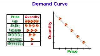
In this section, we learn about the supply schedule, which is a table displaying various quantities of a commodity that producers are willing to supply at different prices. Alongside the supply schedule, the supply curve visually represents this information as an upward-sloping graph, illustrating the direct relationship between price and quantity supplied.
Detailed
Supply Schedule and Supply Curve
Overview
The supply schedule provides a tabular representation of the quantities of a good that producers are willing to sell at various prices. It acts as a fundamental component of market analysis in economics.
Supply Schedule
- Definition: A supply schedule is essentially a table that correlates different prices with the quantities supplied by producers. It shows how much of a product would be supplied at different price levels during a specific period.
- Example: If the price of ice cream rises, the supply schedule might indicate that more ice cream will be produced and sold, reflecting the suppliers' responsiveness to price changes.
Supply Curve
- Definition: The supply curve is a graphical representation derived from the supply schedule, typically depicted as an upward-sloping curve. This upward slope signifies that as prices increase, the quantity supplied also increases, showcasing a direct relationship.
- Importance: Understanding the supply curve is vital for analyzing how changes in market conditions affect production levels. It serves as a crucial tool in identifying market equilibrium in conjunction with the demand curve.
Overall, both the supply schedule and curve are foundational concepts in economics, helping explain producer behavior and market dynamics.
Youtube Videos


Audio Book
Dive deep into the subject with an immersive audiobook experience.
Understanding Supply Schedule
Chapter 1 of 2
🔒 Unlock Audio Chapter
Sign up and enroll to access the full audio experience
Chapter Content
● Supply Schedule: A table showing different quantities supplied at different prices.
Detailed Explanation
A supply schedule is a structured table that displays how much of a product suppliers are willing to sell at various price levels. For example, it may show that at a price of $5, suppliers are willing to offer 10 units of a product, whereas at $10, they might offer 30 units. This relationship helps to illustrate how supply changes in response to different pricing.
Examples & Analogies
Think of a local farmer's market. If the price of apples is set low, the farmer may only bring a few baskets to sell. But if the prices rise due to demand, the farmer will be encouraged to bring more baskets of apples to meet potential sales, thus reflecting a supply schedule.
Understanding Supply Curve
Chapter 2 of 2
🔒 Unlock Audio Chapter
Sign up and enroll to access the full audio experience
Chapter Content
● Supply Curve: An upward-sloping curve showing the direct relation between price and quantity supplied.
Detailed Explanation
A supply curve is a graphical representation of the relationship indicated by the supply schedule. It typically slopes upwards from left to right, indicating that as the price increases, the quantity supplied also increases. This visual tool helps to quickly identify how variations in price can affect the amount of goods supplied.
Examples & Analogies
Imagine a balloon. When you inflate the balloon (increase the price), it expands (increases the quantity supplied). Similarly, suppliers will 'inflate' their output as prices rise, as they feel more motivated to produce and sell more.
Key Concepts
-
Supply Schedule: A table demonstrating how quantity supplied changes at varying price levels.
-
Supply Curve: A graph that depicts the upward slope reflecting the direct relationship between price and quantity supplied.
-
Market Equilibrium: The intersection of supply and demand curves indicating equilibrium price and quantity.
Examples & Applications
When the price of wheat increases, farmers are willing to supply more wheat, which can be shown through the supply schedule and depicted on the supply curve.
A rising price for housing tends to result in an increased quantity of homes available for sale, reflecting producer behavior.
Memory Aids
Interactive tools to help you remember key concepts
Rhymes
Price goes up, supply grows tall, producers respond to the call!
Stories
Imagine a pie shop. When prices for pies rise, the owner bakes more to meet the increase in demand, showcasing how supply responds to price changes.
Memory Tools
Remember: 'Silly Suppliers Supply'. It helps recall that suppliers supply more as prices increase.
Acronyms
P/Q means Price over Quantity leads to the Supply Curve's upward slope!
Flash Cards
Glossary
- Supply Schedule
A table showing different quantities supplied at different prices.
- Supply Curve
A graphical representation of the supply schedule, sloping upwards, showing the direct relationship between price and quantity supplied.
- Market Equilibrium
The point where quantity demanded equals quantity supplied, determining the equilibrium price and quantity.
Reference links
Supplementary resources to enhance your learning experience.