
Data Visualization and Dashboarding
Enroll to start learning
You’ve not yet enrolled in this course. Please enroll for free to listen to audio lessons, classroom podcasts and take practice test.
Interactive Audio Lesson
Listen to a student-teacher conversation explaining the topic in a relatable way.
Understanding Data Visualization
🔒 Unlock Audio Lesson
Sign up and enroll to listen to this audio lesson

Today, we’re going to discuss data visualization. Can anyone tell me why it’s important in analyzing data, especially IoT data?

It helps people understand complicated data better.
Exactly! Visualization simplifies complex data by representing it in graphical formats like charts and maps. This makes it easier for stakeholders to draw insights.

Can you give an example of how this might look in real life?
Sure! Imagine a heatmap showing the highest pollution levels in a city—this visual representation allows city planners to identify problem areas quickly. Remember, visuals make data intuitive!
The Role of Dashboards
🔒 Unlock Audio Lesson
Sign up and enroll to listen to this audio lesson

Now, let’s talk about dashboards. How do you think they help businesses in monitoring their IoT systems?

Dashboards can show alerts for issues in real-time, right?
Precisely! Dashboards integrate multiple visualizations and provide key metrics for instant monitoring, like alerts for abnormal events.

Are there different types of dashboards for different users?
Yes! Dashboards can have customizable views tailored to different user roles, allowing specific information to be highlighted as needed.
Tools for Visualization and Dashboarding
🔒 Unlock Audio Lesson
Sign up and enroll to listen to this audio lesson
What tools do you think are popular for creating visualizations and dashboards?
I've heard of Tableau and Power BI! Are they good for IoT data?
Great examples! Tableau, Power BI, Grafana, and Kibana are all capable of connecting to IoT data sources and providing customizable, real-time dashboarding options.
What does customizable mean?
Customizable means users can adjust elements, like the type of charts or the data displayed, based on their specific needs—making dashboards much more effective.
Importance of Visualization and Dashboards
🔒 Unlock Audio Lesson
Sign up and enroll to listen to this audio lesson
To wrap up, why do we emphasize visualization and dashboarding in IoT data management?
So that we can monitor systems effectively!
Correct! They enable decision-makers to act quickly on insights derived from data, optimizing overall performance and addressing issues before they escalate.
So, it’s about making sure the data we gather is usable?
Exactly! Without proper visualization, all that data could be overwhelming and lead to inaction. Great job today!
Introduction & Overview
Read summaries of the section's main ideas at different levels of detail.
Quick Overview
Standard
Effective data visualization and dashboarding enable stakeholders to interpret and act on insights derived from IoT data. This section discusses the importance of graphical representations and interactive dashboards that showcase key metrics for real-time monitoring and decision-making.
Detailed
Data Visualization and Dashboarding
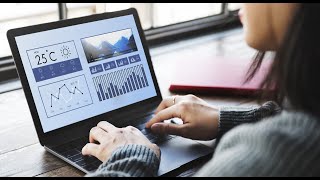
Data analysis is only useful if stakeholders can interpret and act on the insights produced from IoT data. Visualization transforms raw data into intuitive formats, such as graphs, charts, and maps, allowing users to quickly grasp information.
Key Elements of Data Visualization
Data visualization employs various graphical elements, such as line charts, bar graphs, heatmaps, and geo-maps, to represent data trends and relationships. For instance, a heatmap can illustrate areas with high pollution levels in a city, making it easy for city planners to pinpoint problem zones.
Importance of Dashboarding
Dashboards serve as interactive interfaces that consolidate multiple visualizations and key metrics, offering a live or near-real-time overview of system status. They enhance monitoring capabilities and facilitate quick decision-making. Key features of dashboards include:
- Alerts for abnormal events
- Customizable views for different user roles
- Drill-down capabilities for detailed exploration of data
Popular tools for creating dashboards include Grafana, Kibana, Tableau, and Power BI, which can connect to various IoT data sources and provide real-time analytics.
Conclusion
Visualizations and dashboards are essential in the IoT data paradigm, enabling stakeholders to monitor systems effectively, detect problems early, and optimize overall performance.
Youtube Videos

Audio Book
Dive deep into the subject with an immersive audiobook experience.
Understanding Data Visualization
Chapter 1 of 4
🔒 Unlock Audio Chapter
Sign up and enroll to access the full audio experience
Chapter Content
Data visualization transforms raw data into intuitive visual forms. It uses graphical elements like line charts, bar graphs, heatmaps, and geo-maps to represent data trends, relationships, and anomalies. For example, a heatmap can show which areas in a city have the highest air pollution levels.
Detailed Explanation
Data visualization is the practice of converting complex data sets into visual formats that are easier to understand and analyze. By using visual elements such as graphs and maps, stakeholders can quickly identify trends and patterns within the data. For instance, a line chart might show how sales figures have changed over time, while a heatmap provides a graphical representation of data density, which could highlight areas with higher levels of pollution. This simplification aids in making informed decisions based on the insights gathered from the visualized data.
Examples & Analogies
Think of data visualization like a restaurant menu. Just like a menu uses images and layouts to help you choose a dish easily, data visualizations use charts and graphs to convey options and data insights at a glance. A heatmap of air pollution can be likened to a spicy foods section on a menu; it highlights where the problems are most severe, guiding decisions on health measures or policy changes.
The Role of Dashboarding
Chapter 2 of 4
🔒 Unlock Audio Chapter
Sign up and enroll to access the full audio experience
Chapter Content
Dashboards are interactive interfaces combining multiple visualizations and key metrics in one place. They provide live or near-live views of system status, enabling monitoring and quick decision-making. Dashboards often include:
- Alerts or notifications on abnormal events.
- Customizable views based on user roles.
- Drill-down features to explore data in detail.
Detailed Explanation
Dashboards aggregate various data visualizations and present them in a single, cohesive interface, providing users with a comprehensive view of relevant metrics and system performance in real-time. This interactive nature allows users to customize how they see data, depending on their specific needs or roles within an organization. For example, a sales manager might focus on different sales metrics and trends than a product development team. Dashboards may also feature alerts that notify users when certain thresholds are exceeded, allowing for timely interventions.
Examples & Analogies
Imagine a car dashboard: it displays vital information such as speed, fuel level, and engine temperature all in one place, allowing a driver to monitor performance and make quick decisions, like stopping for gas. Similarly, a data dashboard gives users a quick overview of important metrics, enabling rapid responses to any alerts or trends requiring attention.
Popular Tools for Visualization
Chapter 3 of 4
🔒 Unlock Audio Chapter
Sign up and enroll to access the full audio experience
Chapter Content
Popular tools include Grafana, Kibana, Tableau, and Power BI, which can connect to various IoT data sources and offer customizable, real-time dashboards.
Detailed Explanation
Several tools are available for creating interactive visualizations and dashboards, each offering unique features and capabilities. Grafana excels in monitoring time-series data, Kibana is often used with Elasticsearch for big data visualizations, Tableau is renowned for its user-friendly interface and extensive analytics options, and Power BI integrates well with Microsoft services for business intelligence. These tools allow organizations to pull data from various sources and build customized dashboards that can adapt to their specific analysis requirements.
Examples & Analogies
Consider the variety of apps on a smartphone designed for different tasks, like social media, banking, or fitness tracking. Each app serves a purpose and offers tailored interfaces based on user needs. Similarly, visualization tools like Grafana and Tableau serve different analytics purposes, providing tailored experiences that help different users analyze their specific IoT datasets.
How Visualization and Dashboarding Fit IoT Data
Chapter 4 of 4
🔒 Unlock Audio Chapter
Sign up and enroll to access the full audio experience
Chapter Content
Processed data feeds into visualization tools and dashboards, enabling operators or business users to monitor systems, detect problems early, and optimize performance.
Detailed Explanation
After data is processed and refined, it flows into visualization tools and dashboards, which are the final stage in the data analysis pipeline. These tools enable users to oversee their systems and identify issues promptly, as well as track key performance indicators (KPIs) against business objectives. By having real-time access to visualized data, decisions can be made quickly and in an informed manner, ensuring efficient system operation and problem resolution.
Examples & Analogies
Think of the dashboard in an aircraft, which displays vital information about the plane's performance and environment to the pilots in real-time. This helps them monitor the plane’s status and allows them to respond swiftly to any issues, ensuring a safe flight. In IoT data processing, dashboards serve a similar purpose, providing clarity and enabling quick responses to operational challenges.
Key Concepts
-
Data Visualization: Graphical representation of data trends.
-
Dashboard: An interactive visual interface for monitoring metrics.
-
Real-time Monitoring: Instant observance of data as it arrives.
-
Customizable Views: Tailored dashboards for specific user needs.
-
Heatmap: A visual representation displaying data density through colors.
Examples & Applications
A heatmap showing air quality levels in a city to help visualize pollution hotspots.
A dashboard that displays machine performance metrics, alerts, and operational statuses in real-time.
Memory Aids
Interactive tools to help you remember key concepts
Rhymes
Data's not a chore, make it visual, explore!
Stories
Once upon a time, in a bustling city, planners struggled with traffic chaos until dashboards appeared, simplifying their data into visuals that told them where to send help!
Memory Tools
Remember the acronym V-DASH: Visualization, Dashboards, Alerts, Status, and Historical data for quick recall of key dashboard components.
Acronyms
Use 'VIEW' to remember - Visualization Improves Easy Understanding of data.
Flash Cards
Glossary
- Data Visualization
The graphical representation of information and data.
- Dashboard
An interactive interface that aggregates various metrics and visualizations.
- Heatmap
A data visualization technique that displays magnitude of a phenomenon as color in two dimensions.
- Realtime Monitoring
The immediate observation and response to data as it is generated.
- Customizable Views
The ability to alter dashboard displays based on user preferences.
Reference links
Supplementary resources to enhance your learning experience.