
JavaFX UI Controls
Enroll to start learning
You’ve not yet enrolled in this course. Please enroll for free to listen to audio lessons, classroom podcasts and take practice test.
Interactive Audio Lesson
Listen to a student-teacher conversation explaining the topic in a relatable way.
Overview of JavaFX UI Controls
🔒 Unlock Audio Lesson
Sign up and enroll to listen to this audio lesson

Today we'll explore JavaFX UI Controls, which allow us to create interactive elements in our applications. Let's start with basic controls. Can anyone name a control used for user input?

Is a TextField one of them?
Yes, exactly! The TextField is used for single-line input. A quick way to remember is to think of it as a line where text can flow in. Any other examples?

What about a Button?
Great! The Button is fundamental—it triggers actions when clicked. Remember: Buttons make things happen!

What does a Label do?
Good question! A Label is used for displaying text information that is not editable. Think of it as a name tag.
Does everyone understand what these three controls do? Let's summarize: TextField for input, Button for actions, and Label for display. Any questions?
Event Handling with Buttons
🔒 Unlock Audio Lesson
Sign up and enroll to listen to this audio lesson

Now that we know about some controls, let's dive into how we handle events, specifically with a Button. What do you think we need to do to respond when a button is clicked?

Do we have to set an action for it?
"Exactly! Setting an action involves using something called an EventHandler. Here’s an example:
Other UI Controls
🔒 Unlock Audio Lesson
Sign up and enroll to listen to this audio lesson
Now let's examine some more complex controls, starting with the CheckBox. Who can tell me when you might use a CheckBox?
For options that can be on or off, like agreeing to terms?
Exactly! CheckBoxes are perfect for boolean choices. What about RadioButtons?
Those allow you to pick one option from a group, right?
Yes! RadioButtons are mutually exclusive. Finally, the ComboBox allows users to select from a dropdown list. What are your thoughts on using these controls?
They seem user-friendly and efficient!
Great observation! UI controls enhance user interaction. To recap, CheckBoxes toggle states, RadioButtons select one from group, and ComboBoxes provide dropdown options.
Introduction & Overview
Read summaries of the section's main ideas at different levels of detail.
Quick Overview
Standard
This section explains JavaFX UI controls, detailing their functions and usage, and provides examples of how to implement buttons and event handling effectively.
Detailed
JavaFX UI Controls
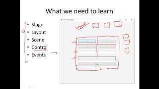
JavaFX offers a rich set of UI controls essential for creating interactive applications. Each control has a specific function that contributes to making the user interface intuitive and efficient. Key controls include:
- Button: An interactive element that triggers an action when clicked.
- Label: Displays non-editable text for information purposes.
- TextField: Allows users to enter single-line text input.
- TextArea: For multi-line text input, useful for larger text entries.
- CheckBox: A selection control that toggles a boolean state (checked/unchecked).
- RadioButton: Used within groups to select one option from multiple choices.
- ComboBox: Displays a dropdown list for selecting one option from several choices.
- Slider: Provides a graphical interface for selecting values from a range.
- ListView: Displays a scrollable list of items.
- TableView: Formats data into a table structure for easy accessibility.
Examples and Usage
An example of using a Button control and handling its event is provided:
This code creates a button that, when clicked, outputs a message to the console.
These UI controls are the building blocks of JavaFX applications, enabling the creation of user-friendly interfaces with responsive design.
Youtube Videos

Audio Book
Dive deep into the subject with an immersive audiobook experience.
Overview of JavaFX UI Controls
Chapter 1 of 3
🔒 Unlock Audio Chapter
Sign up and enroll to access the full audio experience
Chapter Content
JavaFX provides a wide range of UI components:
Detailed Explanation
JavaFX includes various UI components that can be used to create interactive applications. These components are essential for building a user-friendly interface, allowing users to interact with the application more effectively. Each component serves a different purpose in a GUI.
Examples & Analogies
Think of JavaFX UI components like different tools in a toolbox. Just as you use a hammer for nails and a screwdriver for screws, you use different JavaFX components to solve various tasks in your application.
Control Types and Descriptions
Chapter 2 of 3
🔒 Unlock Audio Chapter
Sign up and enroll to access the full audio experience
Chapter Content
Control Description
Button Triggers an action
Label Displays text
TextField Single-line input
TextArea Multi-line input
CheckBox Boolean toggle option
RadioButton Mutually exclusive option
ComboBox Dropdown list
Slider Graphical value slider
ListView Scrollable list
TableView Displays tabular data
Detailed Explanation
Each control in JavaFX is designed for specific tasks. For example:
- A Button is used to trigger actions when clicked.
- A Label simply displays text to users without any interaction.
- A TextField allows users to enter a single line of text, while a TextArea is meant for longer, multi-line text input.
- CheckBoxes and RadioButtons allow users to make selections, where CheckBoxes can toggle multiple options and RadioButtons are for selecting one from a group. Other controls like ComboBox, Slider, ListView, and TableView organize information in a user-friendly format.
Examples & Analogies
Imagine these controls as items at a restaurant. A Button is like a waiter taking your order, a Label is the menu telling you what's available, a TextField is your choice of one dish, and a CheckBox or RadioButton lets you customize your order - like adding extras or selecting a drink.
Example: Button and Event Handling
Chapter 3 of 3
🔒 Unlock Audio Chapter
Sign up and enroll to access the full audio experience
Chapter Content
Example: Button and Event Handling
Button btn = new Button("Click Me");
bt.setOnAction(e -> System.out.println("Button clicked!"));
Detailed Explanation
In this example, a Button is created with the label 'Click Me'. An event handler is then attached to this button using the setOnAction method. This event handler defines what happens when the button is clicked - in this case, it prints 'Button clicked!' to the console. This is an essential part of making an interactive interface, as it allows the app to respond to user actions.
Examples & Analogies
You can think of this Button and its event handling like a doorbell. When someone presses the doorbell (the button click), it sends a signal (the event handler) to notify the homeowner (the application) that someone is at the door, prompting a response.
Key Concepts
-
UI Controls: Essential components like Button, Label, TextField, and more that enhance user interaction.
-
Event Handling: Mechanism to execute a piece of code in response to user actions, typically involving UI elements.
Examples & Applications
An example of using a Button control and handling its event is provided:
Button btn = new Button("Click Me");
bt.setOnAction(e -> System.out.println("Button clicked!"));
This code creates a button that, when clicked, outputs a message to the console.
These UI controls are the building blocks of JavaFX applications, enabling the creation of user-friendly interfaces with responsive design.
Memory Aids
Interactive tools to help you remember key concepts
Rhymes
A Label shares, a Button dares; a TextField opens, a Slider scales, each UI control never fails!
Stories
Imagine you're building a virtual café. The Button is the go signal to serve drinks, the Label gives the names of drinks, and the CheckBox lets you select extras on your order—like whipped cream!
Memory Tools
To remember UI Controls: Button (B), Label (L), TextField (T), CheckBox (C) - B.L.T.C. – You can have a B.L.T.C. sandwich!
Acronyms
Remember your controls with **B.L.T.C.**
Button
Label
TextField
CheckBox.
Flash Cards
Glossary
- Button
An interactive element that triggers an action when clicked.
- Label
Displays non-editable text for information purposes.
- TextField
Allows single-line input from the user.
- TextArea
An input for multi-line text entries.
- CheckBox
A control that offers a boolean toggle option.
- RadioButton
A mutually exclusive option within a group.
- ComboBox
A dropdown list that allows selection from multiple options.
- Slider
A graphical control for selecting values from a range.
- ListView
Displays a scrollable list of selectable items.
- TableView
Displays data in a tabular format.
Reference links
Supplementary resources to enhance your learning experience.