
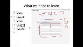
Layouts in JavaFX
Enroll to start learning
You’ve not yet enrolled in this course. Please enroll for free to listen to audio lessons, classroom podcasts and take practice test.
Interactive Audio Lesson
Listen to a student-teacher conversation explaining the topic in a relatable way.
Introduction to Layouts
🔒 Unlock Audio Lesson
Sign up and enroll to listen to this audio lesson

Good morning, everyone! Today, we’re discussing layouts in JavaFX. Can anyone tell me why layouts are important in GUI design?

Layouts help organize components logically, making the interface easier to navigate.
Exactly! Well-organized layouts provide a better user experience. Let’s start with the HBox layout. Who can explain how it works?

HBox arranges components in a horizontal row.
Great! Remember, the acronym **H**orizontal **B**ox for **HBox** helps you recall its function. Now, who can share where we might use HBox?

We could use it for placing buttons side by side!
Exactly! HBox is perfect for toolbars or button controls. Let’s summarize: HBox organizes components horizontally, and is useful for aligning controls like buttons.
VBox Layout
🔒 Unlock Audio Lesson
Sign up and enroll to listen to this audio lesson

Now, how about the VBox layout? Who knows its arrangement style?

It organizes components vertically!
That's right! Think of **V**ertical **B**ox for **VBox**. When might you use this layout?
For forms where we want to stack input fields one below the other, like a name and an email field.
Perfect example! With VBox, you can create user forms easily. The spacing you choose between elements can enhance readability. Let’s summarize: VBox is used for vertical arrangements, ideal for forms.
Advanced Layouts: BorderPane and GridPane
🔒 Unlock Audio Lesson
Sign up and enroll to listen to this audio lesson
Moving on, let’s dive into BorderPane and GridPane. Who can tell me what BorderPane does?
BorderPane divides the scene into five regions!
That’s correct! It has top, bottom, center, left, and right areas. Can someone think of a scenario where we’d use BorderPane?
Maybe an application where we have a menu at the top and a status bar at the bottom?
Very good! Now, what about GridPane? How does it differ?
GridPane allows for a grid layout, arranging components in rows and columns, like a table.
Exactly! Think about using it for a calculator app where buttons are aligned like a grid. Each layout serves specific needs. Let's recap: BorderPane has distinct regions for component organization, while GridPane offers a structured grid layout.
StackPane and AnchorPane
🔒 Unlock Audio Lesson
Sign up and enroll to listen to this audio lesson
Lastly, let’s discuss StackPane and AnchorPane. Starting with StackPane, how does it function?
StackPane overlaps components, stacking them on top of each other.
Correct! It’s useful for overlays. Can anyone think of how we use it?
For creating popup windows or adding effects!
Exactly! And what about the AnchorPane? What does it do?
It allows absolute positioning of components, anchoring them to the edges.
Right! It's great for precise layouts where positioning matters. To summarize, StackPane overlaps UI elements, while AnchorPane allows for absolute component placement.
Introduction & Overview
Read summaries of the section's main ideas at different levels of detail.
Quick Overview
Standard
Layouts in JavaFX are essential for structuring the interface of applications. Common layout managers include HBox, VBox, BorderPane, GridPane, StackPane, and AnchorPane, each serving a unique purpose in component organization. Understanding these layouts is crucial for designing responsive and user-friendly applications.
Detailed
Layouts in JavaFX
Layouts are fundamental in JavaFX as they help organize components within the application scene effectively. JavaFX offers a variety of layout managers, each suited for different organizational needs:
Common Layout Managers
- HBox: Arranges children in a horizontal row.
- VBox: Places children in a vertical column.
- BorderPane: Divides the scene into five distinct regions: top, bottom, center, left, and right.
- GridPane: Allows for a flexible grid-based layout similar to a table layout.
- StackPane: Stacks components on top of each other, allowing for easy overlaying.
- AnchorPane: Permits absolute positioning of child nodes where you can anchor components to the sides of the pane.
By utilizing these layouts, developers can create flexible and responsive user interfaces, making the application’s design more appealing and effective.
Youtube Videos

Audio Book
Dive deep into the subject with an immersive audiobook experience.
Overview of Layouts
Chapter 1 of 3
🔒 Unlock Audio Chapter
Sign up and enroll to access the full audio experience
Chapter Content
Layouts help organize components within the scene.
Detailed Explanation
In JavaFX, layouts are essential for arranging UI components in a visual interface. They dictate how elements like buttons, labels, and text fields are positioned on the screen. A well-chosen layout improves user experience by creating a clear and logical arrangement of components.
Examples & Analogies
Think of layouts like the furniture arrangement in a room. Just as you might position couches, tables, and chairs in a way that makes the room functional and inviting, layouts allow you to position UI components so that they’re easy for users to interact with.
Common Layout Managers
Chapter 2 of 3
🔒 Unlock Audio Chapter
Sign up and enroll to access the full audio experience
Chapter Content
🔲 Common Layout Managers:
| Layout | Description |
|---|---|
| HBox | Horizontal row |
| VBox | Vertical column |
| BorderPane | Top, bottom, center, left, right layout |
| GridPane | Grid-style layout |
| StackPane | Stacks components on top of each other |
| AnchorPane | Absolute positioning |
Detailed Explanation
JavaFX provides several layout managers to suit different design needs:
1. HBox: Arranges child components in a horizontal row.
2. VBox: Arranges child components in a vertical column.
3. BorderPane: Divides the area into five regions (top, bottom, center, left, right).
4. GridPane: Arranges components in a grid with rows and columns.
5. StackPane: Stacks components on top of each other, where the last added is on top.
6. AnchorPane: Allows for absolute positioning of components within the pane.
Examples & Analogies
Imagine using different types of containers for organizing items in your home. A basket (HBox) might be great for keeping things organized side-by-side, while a box with dividers (GridPane) allows you to sort items in rows and columns. Similarly, using the right layout manager in JavaFX helps organize your UI components effectively.
VBox Example
Chapter 3 of 3
🔒 Unlock Audio Chapter
Sign up and enroll to access the full audio experience
Chapter Content
🧱 VBox Example:
VBox root = new VBox(10); // 10 px spacing
root.getChildren().addAll(new Label("Name"), new TextField());
Detailed Explanation
In this example, a VBox layout is created with a spacing of 10 pixels between its children. Two UI elements— a Label that says 'Name' and a TextField where the user can input their name—are added to the VBox. This allows these elements to stack vertically with defined space between them, enhancing readability and usability.
Examples & Analogies
Consider a stack of books on a shelf where each book is slightly apart from the next, making it easy to see and pick up each one. Similarly, the VBox layout in this example places the label and text field vertically with space in between, ensuring they are easily distinguishable.
Key Concepts
-
HBox: A layout manager that arranges items in a horizontal row.
-
VBox: A layout manager that stacks items vertically.
-
BorderPane: A layout that divides space into five regions for better organization.
-
GridPane: A flexible grid layout for positioning components.
-
StackPane: A layout that stacks nodes on top of each other.
-
AnchorPane: It allows for positioning components relative to the pane's edges.
Examples & Applications
Using HBox to place navigation buttons in a row on a toolbar.
Using VBox to stack form inputs like name and email fields vertically.
Using BorderPane to create a user interface with a header, footer, and central content area.
Using GridPane for a chessboard layout where each piece can occupy specific grid positions.
Using StackPane to display a tooltip over an image.
Memory Aids
Interactive tools to help you remember key concepts
Rhymes
In rows so neat, the HBox lies, For buttons and tools right side by side.
Stories
Imagine a painter organizing a palette: HBox placing colors side by side, and VBox stacking brushes upright for easy access.
Memory Tools
Remember Bounds, Center, Top, Bottom, Left, Right for BorderPane's regions.
Acronyms
Use **S**tack for **S**tacked components and **A**nchor for **A**bsolute placement.
Flash Cards
Glossary
- HBox
A layout that arranges child components in a horizontal row.
- VBox
A layout that organizes child components in a vertical column.
- BorderPane
A layout that divides the scene into five regions: top, bottom, left, right, and center.
- GridPane
A layout that arranges components in a flexible grid defined by rows and columns.
- StackPane
A layout that stacks components on top of each other, allowing easy overlay.
- AnchorPane
A layout that allows absolute positioning of child nodes, anchoring them to the sides of the pane.
Reference links
Supplementary resources to enhance your learning experience.