
Tabulation and Classification of Data
Enroll to start learning
You’ve not yet enrolled in this course. Please enroll for free to listen to audio lessons, classroom podcasts and take practice test.
Interactive Audio Lesson
Listen to a student-teacher conversation explaining the topic in a relatable way.
Understanding Data and Information
🔒 Unlock Audio Lesson
Sign up and enroll to listen to this audio lesson

Good morning, class. Today we will discuss data, which is central to many aspects of our studies, especially in geography. What do you think data represents?

Isn't data just numbers?
That's right, Student_1! Data represents measurements, while a single unit is referred to as datum. Remember: 'Data is the dash between reality and comprehension.' Can anyone give examples of data in real life?

Like temperatures or distances?
Exactly! We see such data on weather reports or maps every day. And how important do you think this data is in geography studies?

It helps us understand patterns and distributions.
Good point! Data brings a clearer understanding of phenomena and their relationships across geography.
Importance and Sources of Data
🔒 Unlock Audio Lesson
Sign up and enroll to listen to this audio lesson

Now, let's explore how data is collected. Why do we need both primary and secondary sources?

Primary sources provide firsthand information, and secondary sources show compiled information!
Correct! Can anyone give an example of how we might collect primary data?
We can use surveys or conduct interviews.
Great job! Remember, surveys and interviews must be structured properly to avoid bias. This connects to our theme: 'Collecting reliable data leads to reliable conclusions.'
Processing Raw Data
🔒 Unlock Audio Lesson
Sign up and enroll to listen to this audio lesson
Today, we need to discuss how to make sense of raw data. What do we call the process that helps organize and present data?
Tabulation and classification?
Exactly! It's where we convert messy data into structured tables. Why is this important?
It makes it easier to compare and analyze!
Absolutely! Tables help distill large volumes of data. Let's practice creating a frequency distribution from some raw data examples to see this in action.
Presentation Techniques
🔒 Unlock Audio Lesson
Sign up and enroll to listen to this audio lesson
Lastly, how we present data can affect our understanding. What kinds of presentations can we use?
Bar graphs and tables?
Right, Student_4! Important metrics can be conveyed through graphs or indexed values as well. Can you recall a situation where a poor presentation led to misunderstandings?
Using averages without knowing the extremes can mislead us!
Exactly, such as how we learned about the river depth example! Always consider context when interpreting data. Remember to ask: 'What assumptions are we making?'
Introduction & Overview
Read summaries of the section's main ideas at different levels of detail.
Quick Overview
Standard
Data is an essential component across various disciplines, particularly in geography, where numerical information helps explain phenomena. The section details the process of collecting data from primary and secondary sources and discusses the significance of tabulating and classifying the data to derive informative conclusions. Techniques such as creating statistical tables, grouping raw data, and using frequency distributions are highlighted.
Detailed
Detailed Summary
Data consists of numbers representing real-world measurements, while mere numbers without context are referred to as datum. Without processing, raw data may be meaningless. Hence, it is crucial to gather data from dependable sources and present it effectively.
Need for Data
Maps and tables illustrate geographic patterns and relationships. Comprehensive statistical analysis assists in understanding complex interrelations—such as cropping patterns influenced by multiple factors, including rainfall and fertilizer use, highlighting the importance of data in geographical study.
Presenting Data
Proper presentation is vital; a significant concept illustrated in this learning is the story of a parent miscalculating river depth. This underscores the risk of drawing faulty conclusions from average data without understanding the full context. Effective data presentation includes using statistical methods throughout the analysis.
Data Sources
Data is derived from primary sources, where it is collected firsthand, and secondary sources, which compile previously gathered data. Methods for gathering primary data include personal observations, interviews, and structured questionnaires. Secondary data encompasses published materials, government documents, international reports, and electronic media.
Tabulation and Classification
Raw data lacks clarity and needs to be organized through tabulation. Statistical tables offer systematic arrangements of data, enabling straightforward comprehension. Data can be presented in absolute terms, percentages, or indices. Each technique serves a different purpose while ensuring data is easily interpretable.
The final goal of classification is to create meaningful frequency distributions that allow researchers to visualize relationships and interpret patterns effectively. Thus, the significance of tabulation and classification cannot be overstated; they are essential in transforming raw data into useful information.
Youtube Videos


Audio Book
Dive deep into the subject with an immersive audiobook experience.
Understanding Data
Chapter 1 of 7
🔒 Unlock Audio Chapter
Sign up and enroll to access the full audio experience
Chapter Content
The data are defined as numbers that represent measurements from the real world. Datum is a single measurement. We often read the news like 20 centimetres of continuous rain in Barmer or 35 centimetres of rain at a stretch in Banswara in 24 hours or information such as New Delhi – Mumbai distance via Kota – Vadodara is 1385 kilometres and via Itarsi - Manmad is 1542 kilometres by train. This numerical information is called data. It may be easily realised that there are large volume of data available around the world today. However, at times, it becomes difficult to derive logical conclusions from these data if they are in raw form.
Detailed Explanation
Data are numeric representations of information or measurements from the world. For example, if it rains 20 centimeters in one area, that's a data point. Similarly, distances between cities represent data. However, when we see large amounts of data, like rainfall or population statistics, they can be difficult to interpret or analyze if presented in their raw form because we need to organize them for clarity.
Examples & Analogies
Think of data as the ingredients of a recipe: just as you need to process and combine ingredients to create a dish, raw data needs to be organized (like making a table) to create useful information.
Need for Data
Chapter 2 of 7
🔒 Unlock Audio Chapter
Sign up and enroll to access the full audio experience
Chapter Content
Maps are important tools in studying geography. Besides, the distribution and growth of phenomena are also explained through the data in tabular form. We know that an interrelationship exists between many phenomena over the surface of the earth. These interactions are influenced by many variables which can be explained best in quantitative terms.
Detailed Explanation
Data is essential in geography as it helps us understand and visualize the relationships between various phenomena like population growth, resources, and environmental factors. For instance, to study how crops grow in an area, we need statistical data on rainfall and soil quality. This data can be presented in tables to allow easy comparison and analysis.
Examples & Analogies
Imagine trying to understand traffic patterns in your city: just like you need data on how many cars use each road to make decisions about traffic lights or road expansions, geographers use data to understand how the environment and human activities are interconnected.
Presentation of Data
Chapter 3 of 7
🔒 Unlock Audio Chapter
Sign up and enroll to access the full audio experience
Chapter Content
Today, the use of statistical methods in the analysis, presentation and in drawing conclusions plays a significant role in almost all disciplines, including geography, which use the data. It may therefore be inferred that the concentration of a phenomenon, e.g., population, forest or network of transportation or communication not only vary over space and time but may also be conveniently explained using the data.
Detailed Explanation
The way we display and analyze data matters greatly in understanding trends and making decisions. In geography, presenting data through various statistical methods—like graphs and tables—helps convey complex information clearly. This means we can observe changes in population or transportation networks over time and space effectively.
Examples & Analogies
Consider a weather app: it doesn’t just tell you the temperature; it may graph temperature changes over days. This helps you see trends, just as geography uses statistical presentation to show how things change over time.
Sources of Data
Chapter 4 of 7
🔒 Unlock Audio Chapter
Sign up and enroll to access the full audio experience
Chapter Content
The data are collected through the following ways: 1. Primary Sources, and 2. Secondary Sources. The data which are collected for the first time by an individual or the group of individuals, institution/organisations are called Primary sources of the data. On the other hand, data collected from any published or unpublished sources are called Secondary sources.
Detailed Explanation
Data can come from two main sources: Primary sources, which are original and collected firsthand (like surveys or experiments), and Secondary sources, which are summaries or analyses of primary data (like books or reports). Understanding where data comes from is crucial because it affects the reliability of the information.
Examples & Analogies
If you were writing a research paper, primary sources would be like interviewing someone directly; secondary sources would be reading a book that summarizes those interviews. Both are useful, but direct interviews often provide clearer insights.
Tabulation of Data
Chapter 5 of 7
🔒 Unlock Audio Chapter
Sign up and enroll to access the full audio experience
Chapter Content
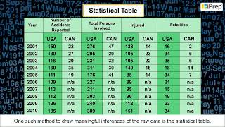
The data collected from primary or secondary sources initially appear as a big jumble of information with the least of comprehension. This is known as raw data. To draw meaningful inferences and to make them usable the raw data requires tabulation and classification. One of the simplest devices to summarise and present the data is the Statistical Table.
Detailed Explanation
Raw data can be overwhelming and hard to understand. Tabulation involves organizing this data into tables, which simplify the information, making it easier to read and compare. Statistical tables arrange data in rows and columns, allowing for quick access and analysis.
Examples & Analogies
Consider a messy closet filled with clothes. If you organize it by folding and sorting clothes into sections (like shirts, pants, etc.), it becomes much easier to find what you need, just as tabulation makes data easier to analyze.
Types of Data Presentation
Chapter 6 of 7
🔒 Unlock Audio Chapter
Sign up and enroll to access the full audio experience
Chapter Content
Data are collected, tabulated and presented in a tabular form either in absolute terms, percentages or indices.
Detailed Explanation
Data can be presented in various formats, such as absolute numbers (like total population), percentages (like literacy rates), or indices (which show changes over time). Each type of presentation helps to convey different aspects of the data effectively.
Examples & Analogies
Think of a report card: total marks show overall performance (absolute), percentages show performance in relation to total possible marks (percentages), and cumulative performance over the school year might be compared (indices). Each presentation tells a different story about performance.
Frequency Distribution
Chapter 7 of 7
🔒 Unlock Audio Chapter
Sign up and enroll to access the full audio experience
Chapter Content
The grouping of the raw data requires determining of the number of classes in which the raw data are to be grouped and what will be the class intervals. The selection of the class interval and the number of classes, however, depends upon the range of raw data.
Detailed Explanation
Frequency distribution is a way of organizing data into classes or groups, allowing us to see how often certain values occur. For example, if test scores range from 0 to 100, we might group them in ranges of 10 (0-10, 10-20, etc.) to simplify analysis and interpretation.
Examples & Analogies
Imagine counting how many people at a party prefer different types of snacks. Instead of listing every preference, you group them (like chips, sweets, fruits) to quickly see which snack is most popular.
Key Concepts
-
Data: Essential for studying trends and phenomena in geography.
-
Tabulation: Organizing raw data into tables for clarity.
-
Classification: Grouping data into categories helps simplify analysis.
-
Frequency Distribution: A key concept in summarizing how data is spread across categories.
Examples & Applications
Weather reports often encapsulate temperature data for easy understanding.
Statistical tables displaying population density can highlight geographical trends.
Memory Aids
Interactive tools to help you remember key concepts
Rhymes
Data is key, numbers so bright, organize them right, for knowledge in sight.
Stories
Imagine a librarian sorting books by genre, just like a researcher sorts data into tables and classes for better understanding.
Memory Tools
D-P-T-C: Data - Presentation - Tabulation - Classification helps us remember how to deal with data.
Acronyms
PATS
Primary sources
Absolute data
Tabulation
Secondary sources - all critical elements of data analysis.
Flash Cards
Glossary
- Data
Numerical information that is collected from real-world measurements.
- Datum
A single measurement or piece of data.
- Primary Sources
Data collected firsthand, such as through surveys or interviews.
- Secondary Sources
Data collected from previously published or compiled information.
- Tabulation
The process of organizing data into tables for better understanding.
- Classification
Grouping data into categories to simplify analysis.
- Frequency Distribution
A table that displays the frequency of various outcomes in a dataset.
Reference links
Supplementary resources to enhance your learning experience.