
Collection and Presentation of Data
Enroll to start learning
You’ve not yet enrolled in this course. Please enroll for free to listen to audio lessons, classroom podcasts and take practice test.
Interactive Audio Lesson
Listen to a student-teacher conversation explaining the topic in a relatable way.
Methods of Data Collection
🔒 Unlock Audio Lesson
Sign up and enroll to listen to this audio lesson

Let's start our discussion on how we can collect data. Can anyone tell me what methods we can use?

We can use surveys or conduct experiments!
Exactly! Surveys are great for collecting information from a large group, whereas experiments allow us to observe outcomes directly. Any other methods?

Observations can also be a method, right?
Yes! Observations can provide valuable insights, especially in natural settings. Remember a good way to summarize methods is the acronym 'S.E.O.' for Surveys, Experiments, and Observations. Now, how do you think we should present the data once we've collected it?
Data Presentation Formats
🔒 Unlock Audio Lesson
Sign up and enroll to listen to this audio lesson

Now that we have our data, we need to present it. Who can name some formats we might use?

We can make frequency distribution tables!
Spot on! Frequency distribution tables are fantastic for summarizing data at a glance. What other formats?

Bar graphs show data visually!
Correct! Bar graphs help in comparing different categories. What about data that is continuous?
Histograms!
Great! Histograms are indeed used for continuous data. Lastly, anyone knows another way to represent data?
We can also use pie charts to show proportions.
Absolutely! Pie charts are visually appealing and effective for showing parts of a whole. Remember, the right format depends on what you're analyzing!
Example and Practice
🔒 Unlock Audio Lesson
Sign up and enroll to listen to this audio lesson
Let's put our learning into practice with an example. I have the marks of 20 students: 45, 56, 67, 78, 89, and others. Can someone help me organize this data into a frequency distribution table?
First, we need to count how many times each mark occurs!
Exactly! The mark '45' occurs four times, while '56' also occurs four times. What about '67'?
'67' also appears four times!
"Good job! Now, let’s summarize: our frequency distribution table will start looking like this:
Introduction & Overview
Read summaries of the section's main ideas at different levels of detail.
Quick Overview
Standard
The section discusses different ways to collect data through surveys, experiments, and observations. It also outlines various methods for presenting data, such as frequency distribution tables, bar graphs, histograms, and pie charts, along with practical examples and solutions.
Detailed
Collection and Presentation of Data
In statistics, the collection and presentation of data are fundamental steps that guide our analysis and interpretation. Data can be harvested through several methods, including surveys, experiments, or direct observations. This variety enables statisticians to gather the necessary information relevant to their study or inquiry.
Data presentation is equally important as it helps in summarizing and interpreting the collected information effectively. This section highlights several methods of data presentation:
- Frequency distribution tables organize data based on frequency, allowing for easier comprehension of the distribution of values.
- Bar graphs visually represent categorical data with rectangular bars, where the length of each bar corresponds to the frequency of that category.
- Histograms (similar to bar graphs) are specifically used for continuous data, illustrating the frequency of data points within certain ranges.
- Pie charts depict percentage share relationships of a whole dataset, making it straightforward to visualize proportions.
An illustrative example included in this section utilizes student marks to demonstrate the organization of data into a frequency distribution table, showing how to systematically interpret and present data collected.
Youtube Videos


Audio Book
Dive deep into the subject with an immersive audiobook experience.
Methods of Data Collection
Chapter 1 of 3
🔒 Unlock Audio Chapter
Sign up and enroll to access the full audio experience
Chapter Content
● Data can be collected through surveys, experiments, or observations.
Detailed Explanation
Data collection is crucial in statistics as it forms the basis for analysis. Surveys are structured questionnaires distributed to gather opinions or data from individuals. Experiments involve controlled conditions to test hypotheses, while observations entail recording behaviors or events as they occur naturally. These methods help researchers gather relevant and accurate information.
Examples & Analogies
Think of data collection like gathering ingredients for a recipe. Just as you need to carefully select the right ingredients to ensure a tasty dish, you must gather accurate data using suitable methods to ensure valid statistics.
Forms of Data Presentation
Chapter 2 of 3
🔒 Unlock Audio Chapter
Sign up and enroll to access the full audio experience
Chapter Content
● Data can be presented in various forms:
○ Frequency distribution tables
○ Bar graphs
○ Histograms
○ Pie charts
Detailed Explanation
Once data is collected, it can be presented in different formats to make it easier to read and interpret. Frequency distribution tables summarize data by showing how often each value occurs. Bar graphs use bars to represent different categories and their frequencies. Histograms are similar to bar graphs but depict numerical ranges (bins) instead. Finally, pie charts represent the data as slices of a circle, showing proportions of a whole.
Examples & Analogies
Imagine you want to present your favorite fruits to your friends. You could list them in a table, draw a bar chart showing how many of each fruit you have, create a pie chart displaying the proportions, or use a histogram to show quantities over ranges. Each method helps your friends understand your preferences in a different way.
Organizing Data
Chapter 3 of 3
🔒 Unlock Audio Chapter
Sign up and enroll to access the full audio experience
Chapter Content
✦ Example:
Given the marks obtained by 20 students in an exam:
45,56,67,45,56,78,89,56,45,67,78,89,56,67,78,89,90,45,67,78
Organize the data in a frequency distribution table.
Solution:
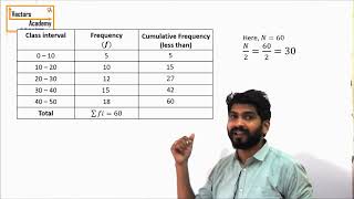
Marks Frequency
45 4
56 4
67 4
78 4
89 3
90 1
Detailed Explanation
To make it easier to analyze the data, we can organize it into a frequency distribution table. This table shows each unique mark and the number of times it appears in the data set. For example, the mark '45' appears 4 times, and '56' also appears 4 times. This organization allows for quick insights into how students performed on the exam.
Examples & Analogies
Think of it like organizing your clothes by color. If you have many red shirts, blue pants, and green hats, listing them in a table shows you how many of each item you have. Just like organizing clothes helps you decide what to wear, organizing data helps you decide how to analyze it.
Key Concepts
-
Methods of Data Collection: Surveys, experiments, observations.
-
Data Presentation Formats: Frequency distribution tables, bar graphs, histograms, pie charts.
Examples & Applications
Example of data collection through a student survey on study habits.
Example of presenting student exam scores in a frequency distribution table.
Memory Aids
Interactive tools to help you remember key concepts
Rhymes
When data is collected, make it neat, organize it well, that’s the feat!
Stories
Imagine collecting seashells on a beach. Each type of shell represents a different data type. You gather them, then group and display them to show their abundance—like creating graphs!
Memory Tools
Remember 'B.H.P.F.' for data presentation: Bar Graphs, Histograms, Pie Charts, Frequency tables.
Acronyms
Use 'S.E.O.' to remember methods of collection
Surveys
Experiments
Observations.
Flash Cards
Glossary
- Frequency Distribution Table
A table that displays the frequency of various outcomes in a dataset.
- Bar Graph
A chart that presents categorical data with rectangular bars, where the length of the bar is proportional to the values they represent.
- Histogram
A type of graph that represents the distribution of numerical data by showing the number of data points that fall within a specified range.
- Pie Chart
A circular statistical graphic that is divided into slices to illustrate numerical proportions.
Reference links
Supplementary resources to enhance your learning experience.