
Data Presentation
Enroll to start learning
You’ve not yet enrolled in this course. Please enroll for free to listen to audio lessons, classroom podcasts and take practice test.
Interactive Audio Lesson
Listen to a student-teacher conversation explaining the topic in a relatable way.
Introduction to Data Presentation
🔒 Unlock Audio Lesson
Sign up and enroll to listen to this audio lesson

Alright everyone, today we're diving into the world of data presentation specifically for rainfall data. Why do you think this is crucial for hydrology?

I think it helps us understand rainfall patterns better?
Exactly! Effective presentation lets us interpret rainfall trends, which aids in water resource management. We'll discuss three key formats: mass curves, hyetographs, and double mass curves.

What’s the difference between these formats?
Great question! Each format serves a unique purpose. Mass curves show cumulative totals while hyetographs depict rainfall intensity. Let’s break that down further.
Understanding Mass Curves
🔒 Unlock Audio Lesson
Sign up and enroll to listen to this audio lesson

Now let’s look at mass curves. Who can tell me what they represent?

They show cumulative rainfall over time, right?
Correct! They help visualize total precipitation and trends over different periods. When analyzing mass curves, what patterns should we look for?

We should look for any upward trends or anomalies!
Exactly! Identifying irregularities can pinpoint unusual rainfall events or potential errors in measurement.
Exploring Hyetographs
🔒 Unlock Audio Lesson
Sign up and enroll to listen to this audio lesson
Next up are hyetographs. Can anyone tell me what these graphs focus on?
They show how rainfall intensity changes over time!
Exactly! This format is useful for examining specific events, especially during storms. What kind of features would you look for in a hyetograph?
Maybe peaks where it rained heavily?
Right! Those peaks indicate periods of high intensity, crucial for analysis during storm events.
Double Mass Curves
🔒 Unlock Audio Lesson
Sign up and enroll to listen to this audio lesson
Lastly, let’s talk about double mass curves. What purpose do you think they serve in data continuity?
They compare data from different sources to identify inconsistencies?
Exactly! If the points deviate from the expected line, it indicates a discrepancy or error, ensuring reliable data collection. Why is this important for meteorologists?
It helps them ensure that the data they are using for analysis is accurate!
Correct! Accuracy in data is crucial for making informed decisions in water resource management.
Introduction & Overview
Read summaries of the section's main ideas at different levels of detail.
Quick Overview
Standard
Data presentation is vital in meteorological studies, as it helps interpret rainfall data effectively. Key formats such as mass curves, hyetographs, and double mass curves provide essential insights into precipitation patterns and consistency checks for hydrological assessments.
Detailed
Data Presentation
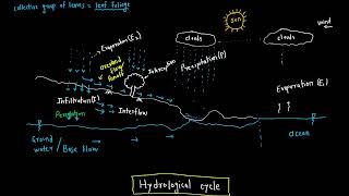
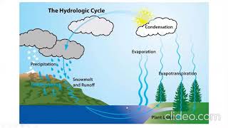
In the field of hydrology, effective data presentation is crucial for interpreting and communicating the implications of rainfall data. Proper representation aids in understanding patterns, intensities, and trends, which are essential for various hydrological applications. This section explores three primary formats for presenting rainfall data:
- Mass Curves: This format plots cumulative rainfall against time, illustrating total precipitation over a period. Mass curves are particularly useful for identifying trends and comparing different time intervals.
- Hyetographs: These graphs depict rainfall intensity versus time, highlighting how rainfall varies over short periods. Hyetographs allow for detailed analysis of rainfall events and are instrumental in assessing rainfall rates during storms.
- Double Mass Curves: Employed to ensure consistency checks between data sources, this presentation compares cumulative rainfall from different gauges or periods. Any deviations from the expected linear relationship indicate potential errors or discrepancies in measurements.
The significance of these formats extends beyond mere representation; they serve as foundational tools for decision-making in water resource management, flood forecasting, and urban planning. Understanding how to construct and interpret these presentations is vital for engineers and meteorologists alike.
Youtube Videos


Audio Book
Dive deep into the subject with an immersive audiobook experience.
Types of Rainfall Data Presentations
Chapter 1 of 1
🔒 Unlock Audio Chapter
Sign up and enroll to access the full audio experience
Chapter Content
Rainfall data from gauges is presented in formats like:
- Mass Curves (cumulative rainfall vs. time)
- Hyetographs (rainfall intensity vs. time)
- Double Mass Curves (used for consistency checks)
Detailed Explanation
Rainfall data can be visualized in different ways to help understand the patterns and distributions of precipitation over time. Three common formats for presenting rainfall data are: Mass Curves, Hyetographs, and Double Mass Curves.
- Mass Curves show the cumulative rainfall (total amount) against time, allowing observers to see how much rain has accumulated up to a certain point.
- Hyetographs illustrate the intensity of rainfall over time, showing how much it rained at specific intervals, which is crucial during heavy storm events.
- Double Mass Curves are particularly useful in checking the consistency of data over time. They compare two sets of cumulative data to identify any discrepancies or trends in the measurements.
Examples & Analogies
Think of Mass Curves like keeping track of your savings in a piggy bank. Each day, you add more coins, and over time you see how much you've saved. Hyetographs are similar to a speedometer in a car, showing how fast you're going (the intensity of rain) at different moments during your drive. Lastly, Double Mass Curves can be likened to comparing two people's weight loss journeys over time, where you can observe if one person consistently weighs less than the other and if there are any times when the trends reverse.
Key Concepts
-
Mass Curves: Visual representation of total rainfall over time.
-
Hyetographs: Graphs displaying how rainfall intensity changes.
-
Double Mass Curves: Comparison tool for data consistency checks.
Examples & Applications
A mass curve showing accumulated rainfall from a storm helps identify the total depth of rain during that event.
A hyetograph illustrating high intensity during a storm period aids in flood forecasting.
Memory Aids
Interactive tools to help you remember key concepts
Rhymes
Mass curves climb high, showing totals by and by, hyetographs dance with intensity, proving rainfall's propensity.
Stories
Imagine a farmer watching storm clouds. First, he notes the total rain over time with a mass curve. As raindrops fall faster, he sees the hyetograph reflect the storm's intensity. Finally, he checks his data with a double mass curve to ensure reliability.
Memory Tools
M-H-D: to remember Mass, Hyetograph, and Double Mass curves.
Acronyms
IMC
Intensity
Measurement
Consistency for analyzing data presentations.
Flash Cards
Glossary
- Mass Curves
Graphs that represent cumulative rainfall over time.
- Hyetographs
Graphs that depict rainfall intensity versus time.
- Double Mass Curves
Tools for comparing cumulative rainfall data from different sources to check for consistency.
Reference links
Supplementary resources to enhance your learning experience.