
Presentation of Data
Enroll to start learning
You’ve not yet enrolled in this course. Please enroll for free to listen to audio lessons, classroom podcasts and take practice test.
Interactive Audio Lesson
Listen to a student-teacher conversation explaining the topic in a relatable way.
Introduction to Data Presentation
🔒 Unlock Audio Lesson
Sign up and enroll to listen to this audio lesson

Today, we’re going to discuss how to present data effectively. Can anyone tell me why we need to present data?

To make it easier to understand!
Exactly! Presenting data helps us quickly comprehend and analyze information. So, how can we present data? Any ideas?

We can use tables and graphs!
Correct! We can use tabular methods like frequency distributions and graphical methods like histograms and bar graphs.

What’s a frequency distribution?
Great question! A frequency distribution organizes data into categories and shows how many observations fall into each category.

And how does that help us?
It allows us to see patterns and make comparisons more easily. Let’s move on to look at graphical representations.
Like bar graphs and pie charts?
Exactly! To summarize, data presentation includes tables for organization and graphs for visual insights.
Frequency Distributions
🔒 Unlock Audio Lesson
Sign up and enroll to listen to this audio lesson

Now, let’s focus on frequency distributions. Can someone give me an example of how we might group data?
Maybe by age groups, like 0-10, 11-20?
Perfect! By grouping data like that, we can create a frequency distribution table that shows how many fall into each age group. Why is this important?
It helps identify trends or the most common age range.
Exactly! This summary makes analysis much more straightforward. Remember the acronym FID – Frequency, Information, Distribution, which can help you recall its purpose.
Graphical Representation
🔒 Unlock Audio Lesson
Sign up and enroll to listen to this audio lesson
Let’s now discuss graphical representations. What is one type of graph you’re familiar with?
Bar graphs! They show comparisons between categories.
Great observation! Bar graphs allow easy comparison. How do they differ from histograms?
I think histograms show continuous data like ranges instead of separate categories.
Correct! Remember, histograms have bars that touch to indicate continuous data. Let’s not forget pie charts too. They show parts of a whole. Who can explain that?
A pie chart divides a whole into slices!
Excellent! In summarizing, bar graphs compare categories, histograms illustrate frequency of distributions for continuous data, and pie charts show proportions.
Practical Applications
🔒 Unlock Audio Lesson
Sign up and enroll to listen to this audio lesson
Why is it important to present data in real life? Can anyone think of a scenario?
In business, companies need to present sales data to make decisions.
Exactly! Data presentation helps in making informed decisions. What about in education?
Teachers use graphs to show student performance.
Correct! Presenting data effectively can highlight areas needing improvement. To wrap up, always remember that the way data is presented can impact understanding and decisions!
Introduction & Overview
Read summaries of the section's main ideas at different levels of detail.
Quick Overview
Standard
The presentation of data is crucial in statistics as it allows for easier interpretation and analysis. This section emphasizes how to represent data through tables, frequency distributions, histograms, bar graphs, and pie charts, providing clear visual insights that simplify complex data sets.
Detailed
Presentation of Data
In statistics, presenting data effectively is vital for understanding and drawing conclusions from it. This section delves into various methods of data presentation, which can be categorized into two main formats: tabular and graphical.
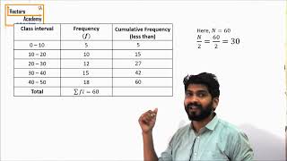
- Tabular Presentation: This involves organizing data into tables, such as frequency distributions, which provide a clear format for viewing data categories and their corresponding counts or percentages. Tables help in summarizing large amounts of data, making it easier for comparison and analysis.
-
Graphical Presentation: Visual aids such as histograms, bar graphs, and pie charts are integral tools in statistics. They allow for immediate visual comprehension of data sets and trends.
- Histograms are commonly used to represent frequency distributions of continuous data, illustrating how values are spread out across different intervals.
- Bar graphs are effective for comparing quantities across different categories or groups, with each bar's height corresponding to its value.
- Pie charts present data in a circular format, showing the proportion of each category relative to the whole, thus emphasizing relative sizes.
Utilizing these methods ensures data is not only organized but also accessible and understandable, making them indispensable in the field of statistics.
Youtube Videos


Audio Book
Dive deep into the subject with an immersive audiobook experience.
Introduction to Data Presentation
Chapter 1 of 3
🔒 Unlock Audio Chapter
Sign up and enroll to access the full audio experience
Chapter Content
Data can be presented in tabular form such as frequency distributions, or graphically using histograms, bar graphs, and pie charts to provide visual insights.
Detailed Explanation
This chunk introduces how data can be displayed. When we collect data, it's often necessary to present it in a way that's easy to understand. One common method is using tables, such as frequency distributions, which summarize how often certain values occur. Additionally, graphical representations like histograms, bar graphs, and pie charts make it easier to visualize the relationships within the data.
Examples & Analogies
Imagine you are a teacher who has just collected test scores from your students. Presenting these scores in a table helps you quickly see who scored what. If you create a pie chart, it shows you how many students scored in different ranges (like above 80%, between 60-80%, and below 60%). This visual representation allows for quicker comprehension and decision-making about how to help students improve.
Tabular Presentation of Data
Chapter 2 of 3
🔒 Unlock Audio Chapter
Sign up and enroll to access the full audio experience
Chapter Content
Data can be presented in tabular form such as frequency distributions.
Detailed Explanation
Tabular presentation involves organizing data into structured tables. A frequency distribution is one such table that lists each unique value or category and shows how often each one appears in the data set. This method helps to highlight trends and patterns, allowing for easier comparisons and analyses than raw data.
Examples & Analogies
Think of a survey conducted to find out the favorite fruits of your classmates. You can create a frequency distribution table that lists each fruit and how many classmates chose it. This helps you quickly grasp which fruit is the most popular without sifting through all individual responses.
Graphical Presentation of Data
Chapter 3 of 3
🔒 Unlock Audio Chapter
Sign up and enroll to access the full audio experience
Chapter Content
Graphically using histograms, bar graphs, and pie charts to provide visual insights.
Detailed Explanation
Graphical representations of data convert numbers into visuals, which can often make information more accessible. Histograms display the frequency of data in intervals, bar graphs show comparisons between different categories, and pie charts illustrate proportions of a whole. Each type of graph serves a unique purpose and can be best suited for different kinds of data analysis.
Examples & Analogies
Imagine you want to show how often different activities take place in a week: studying, playing sports, watching TV, etc. A bar graph can clearly show the time spent on each activity compared to others, allowing anyone looking at it to quickly see which activity takes the most time. Similarly, a pie chart can illustrate what fraction of your week each activity represents, providing a visual of your weekly routine.
Key Concepts
-
Tabular Presentation: Organizing data into tables for better analysis.
-
Graphical Presentation: The use of charts like bar graphs and pie charts to visualize data.
-
Frequency Distribution: A table that shows the frequency of different categories within a data set.
-
Histogram: A graph showing the distribution of numerical data, emphasizing how frequently values occur.
-
Bar Graph: A graph that uses bars to compare quantities across different categories.
-
Pie Chart: A circular chart that represents proportions of a whole based on the data.
Examples & Applications
Example of a frequency distribution table showing student grades categorized by letter grades (A, B, C, etc.).
A pie chart illustrating the market share of different smartphone manufacturers in a specific year.
Memory Aids
Interactive tools to help you remember key concepts
Rhymes
In a histo-gram we stack, data's spread is shown, no lack!
Stories
Imagine a baker dividing a pie into slices, where each slice shows how much of the pie each friend eats. That's how pie charts help us see parts of a whole.
Memory Tools
To remember the charts: P for Pie, B for Bar, H for Histogram. PBH - Perfectly Balanced Help for data!
Acronyms
TAB - Tables Are Best. This reminds us to start presenting data with tables.
Flash Cards
Glossary
- Tabular Format
A method of presenting data in rows and columns, such as tables.
- Frequency Distribution
A summary of data showing the frequency of each category.
- Histogram
A graphical representation showing the distribution of numerical data, where bars represent frequency.
- Bar Graph
A chart that compares different categories using rectangular bars.
- Pie Chart
A circular graph divided into slices that represent numerical proportions.
Reference links
Supplementary resources to enhance your learning experience.