Statistics
Enroll to start learning
You’ve not yet enrolled in this course. Please enroll for free to listen to audio lessons, classroom podcasts and take practice test.
Interactive Audio Lesson
Listen to a student-teacher conversation explaining the topic in a relatable way.
Introduction to Statistics
🔒 Unlock Audio Lesson
Sign up and enroll to listen to this audio lesson

Today, we're starting our journey through statistics! Statistics is all about collecting, organizing, analyzing, and interpreting data. Why do you think this is important?

I think it's important because we need data to make decisions!

Yeah, like in business or science!

Exactly! Making informed decisions is key, and that's where statistics comes into play. Remember the acronym 'COAP': Collect, Organize, Analyze, Present. Can anyone tell me what it means?

It means we collect data, organize it into something usable, analyze it for insights, and present it in a way others can understand!

Great explanation! So, let's look at some practical uses of statistics...
Collection and Classification of Data
🔒 Unlock Audio Lesson
Sign up and enroll to listen to this audio lesson

Now, let's delve into how data is collected and classified. Can anyone give me an example of raw data and grouped data?

Raw data could be scores from a test, and grouped data might be those scores organized into ranges, like 0-50, 51-75, etc.

Exactly! This categorization helps us analyze data more effectively. Can someone explain why we might want to group data?

It makes it easier to see trends and patterns!

Exactly right! Grouping helps us visualize and summarize information. Keep in mind 'GAO': Group, Analyze, Organize.
Presentation of Data
🔒 Unlock Audio Lesson
Sign up and enroll to listen to this audio lesson

Let’s move on to how we can present our data. What are some ways you have seen data presented?

I've seen bar graphs and pie charts.

Yeah, and tables too!

Great suggestions! Each format has its benefits. For instance, pie charts show parts of a whole, while bar graphs are great for comparisons. Remember, 'TAGS': Tables, Axes, Graphs, Summaries for presentation.

That’s a good way to remember it!

Awesome! Let's apply these concepts and look at examples of each format next.
Measures of Central Tendency
🔒 Unlock Audio Lesson
Sign up and enroll to listen to this audio lesson

We’re now transitioning to measures of central tendency, which summarize a data set. Who can tell me what the mean is?

It’s the average!

Correct! And how do we calculate it?

By adding all the values and dividing by the number of values.

Perfect! Now, what about the median?

It's the middle value when the data is sorted!

Exactly! And how does the mode differ?

The mode is the most frequently occurring value!

Great job, everyone! Remember the acronym 'MMM': Mean, Median, Mode. It helps in remembering these measures.
Application of Measures of Central Tendency
🔒 Unlock Audio Lesson
Sign up and enroll to listen to this audio lesson

Let's discuss where we might use these measures in real life. Can anyone think of examples?

In sports, like calculating the average score!

Or in a survey to find the most common answer.

Exactly! They each provide quick insights into data. The median helps in understanding incomes because it isn’t skewed by very high or low values. Let's ensure we recap with 'Real Life Application: RLA.' What are the insights we get from applying mean, median, and mode in our examples?
Introduction & Overview
Read summaries of the section's main ideas at different levels of detail.
Quick Overview
Standard
Statistics is essential for effectively managing data through its collection, classification, presentation, and interpretation. This section delves into key concepts like measures of central tendency—mean, median, and mode—to help summarize data effectively.
Detailed
Statistics
Statistics is the science of collecting, organizing, analyzing, and interpreting data to enable informed decision-making. In this section, we will explore important aspects of statistics, notably:
- Collection and Classification of Data: Data can be categorized as raw data (unprocessed) or grouped data. Proper organization allows for better data analysis and visualization.
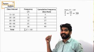
- Presentation of Data: Statistics facilitates the presentation of data in various forms, including tables (frequency distributions) and graphical representations (histograms, bar graphs, pie charts), enhancing our understanding.
- Measures of Central Tendency: These measures help us find the center of a data set:
- Mean: The average, calculated by summing all data values and dividing by their count.
- Median: The middle value of an ordered set, splitting the dataset into two halves.
- Mode: The most frequently occurring value within a dataset.
- Measures of Dispersion (Optional): Although optional, understanding measures like range and standard deviation can provide insights into the variability of data, which is essential for comprehensive data analysis.
Youtube Videos


Audio Book
Dive deep into the subject with an immersive audiobook experience.
Introduction to Statistics
Chapter 1 of 7
🔒 Unlock Audio Chapter
Sign up and enroll to access the full audio experience
Chapter Content
Statistics is the science of collecting, organizing, analyzing, and interpreting data to make informed decisions.
Detailed Explanation
Statistics is an essential branch of mathematics that involves several key processes such as collecting data from various sources, organizing this data in a structured manner, analyzing the data to find patterns or insights, and interpreting the results to make decisions. Essentially, it allows us to make sense of large amounts of information and draw conclusions based on that information.
Examples & Analogies
Imagine trying to decide where to go for a vacation. You might gather data on various locations including weather, costs, and attractions. After organizing this data (like creating a chart), you can analyze it to see which destination is best based on your interests and budget, thus using statistics to make an informed decision.
Collection and Classification of Data
Chapter 2 of 7
🔒 Unlock Audio Chapter
Sign up and enroll to access the full audio experience
Chapter Content
Data can be raw or grouped. Organizing data into classes or categories helps in better analysis and visualization.
Detailed Explanation
Data collection is the first step in the statistical process, and it refers to gathering raw data, which is unprocessed information. Once collected, it can be grouped into categories or classes for easier analysis. Organizing data allows us to identify patterns, trends, and helps visualize what the data is telling us. For example, rather than looking at individual ages, you might group age data into ranges (like 0-10, 11-20, etc.) to make conclusions more apparent.
Examples & Analogies
Think of sorting socks by color. If you have a pile of mixed socks, it can be hard to find a pair. However, if you classify them by color (red, blue, black, etc.), it becomes much easier to see how many of each color you have, and it helps in deciding which color to wear or buy next.
Presentation of Data
Chapter 3 of 7
🔒 Unlock Audio Chapter
Sign up and enroll to access the full audio experience
Chapter Content
Data can be presented in tabular form such as frequency distributions, or graphically using histograms, bar graphs, and pie charts to provide visual insights.
Detailed Explanation
Once data is collected and organized, it is important to present it in a clear and understandable manner. Tables can display numerical data effectively using frequency distributions, which show how often each value occurs. Graphical representations like histograms, bar graphs, and pie charts can illustrate data trends visually, making it simpler to understand at a glance. These tools help in identifying strengths, weaknesses, or changes in data which might not be obvious from raw numbers alone.
Examples & Analogies
If you want to show how many students prefer different sports, a bar graph can show this information visually. Instead of reading through a list of numbers, a quick glance at the graph allows you to see which sport is most popular among students, making it easier to communicate the findings.
Measures of Central Tendency
Chapter 4 of 7
🔒 Unlock Audio Chapter
Sign up and enroll to access the full audio experience
Chapter Content
Measures that represent the center or average of a data set. The key measures are:
Detailed Explanation
Measures of central tendency are statistical measures that describe the center point or typical value of a dataset. They include mean, median, and mode. The mean is the average calculated by adding all values and dividing by the count. The median is the middle value when data is ordered, dividing the dataset into two equal halves. The mode is the most frequently occurring value in the dataset. Each measure provides different insights about the data's characteristics.
Examples & Analogies
Consider a class taking a test. If the scores were: 70, 80, 80, 90, and 100, the mean score would show the average performance, helping to understand how students did overall. The median score tells us that half the class scored below a certain level (80), and the mode indicates which score appeared most frequently, showing common performance among students.
Mean
Chapter 5 of 7
🔒 Unlock Audio Chapter
Sign up and enroll to access the full audio experience
Chapter Content
The arithmetic average calculated by summing all data values and dividing by the number of values.
Detailed Explanation
The mean is one of the most commonly used measures of central tendency. To calculate it, you add up all the values in a dataset and then divide that sum by the total number of values. This calculation provides a single value that represents the typical amount in the dataset, giving a generalized view of the information represented.
Examples & Analogies
If you have a set of five test scores: 85, 90, 95, 80, and 70, to find the mean score, you would add them all together (85 + 90 + 95 + 80 + 70 = 420) and then divide by 5. The mean score of 84 reflects the overall performance of students in a clear and concise way.
Median
Chapter 6 of 7
🔒 Unlock Audio Chapter
Sign up and enroll to access the full audio experience
Chapter Content
The middle value in an ordered data set, dividing the data into two equal halves.
Detailed Explanation
The median is the value that separates the higher half from the lower half of a dataset. To find the median, you first need to arrange the data in ascending order. If there is an odd number of values, the median is the middle number, while for an even number of values, the median is the average of the two middle numbers. This measure is useful for understanding the distribution of data and is often less affected by outliers than the mean.
Examples & Analogies
If you were looking at test scores of students and you had scores of 70, 80, 90, and 100, you first sort these: 70, 80, 90, 100. There are four values (even number), so the median would be the average of 80 and 90 (which is 85). This median gives a clearer picture of the central performance than the mean would if an extreme value were included.
Mode
Chapter 7 of 7
🔒 Unlock Audio Chapter
Sign up and enroll to access the full audio experience
Chapter Content
The value that occurs most frequently in a data set.
Detailed Explanation
The mode is the value that appears most often in a dataset. Unlike the mean and median, which involve numerical calculations, the mode is simply a count of the number of times each value appears. A dataset can have one mode (unimodal), more than one mode (bimodal or multimodal), or no mode at all. Finding the mode is helpful for understanding trends in data, particularly in categorical datasets.
Examples & Analogies
Imagine a popular snack among friends – if Mike buys chips, Anna buys chips, and Rachel buys cookies, the mode of their purchases is chips since it appears more frequently. This gives you insight into the most liked snack among the group.
Key Concepts
-
Data: The raw facts and figures collected for analysis.
-
Mean: The average value calculated from a data set.
-
Median: The middle value of an ordered data set.
-
Mode: The most frequently occurring data point.
-
Frequency Distribution: The organization of data values to show frequencies of occurrence.
Examples & Applications
If the scores in a class are 70, 75, 80, 85, and 90, the mean score can be calculated as (70+75+80+85+90)/5 = 80.
In a survey asking students their most preferred subject, if 'Math' appears 10 times, 'Science' appears 8 times, and 'History' appears 5 times, the mode is 'Math'.
Memory Aids
Interactive tools to help you remember key concepts
Rhymes
Data’s a set, mean is the average, median’s the middle, and mode is the trend!
Stories
Imagine a group of friends scoring in a game. They need to find out who performed best: the average score reveals the mean, the middle score tells the median, and most frequent score shows who is the mode!
Memory Tools
Use 'MMM' to remember Mean, Median, Mode for measures of central tendency.
Acronyms
GAO
Group
Analyze
Organize helps visualize the importance of data handling.
Flash Cards
Glossary
- Data
Facts and statistics collected for reference or analysis.
- Mean
The arithmetic average of a set of values.
- Median
The middle value in a sorted list of numbers.
- Mode
The value that appears most frequently in a data set.
- Frequency Distribution
A summary of how often different values occur within a dataset.
Reference links
Supplementary resources to enhance your learning experience.
