
Drawing Conclusions
Enroll to start learning
You’ve not yet enrolled in this course. Please enroll for free to listen to audio lessons, classroom podcasts and take practice test.
Interactive Audio Lesson
Listen to a student-teacher conversation explaining the topic in a relatable way.
Introduction to Data Analysis
🔒 Unlock Audio Lesson
Sign up and enroll to listen to this audio lesson

Today, we will cover the basics of drawing conclusions from data. After you collect data, what do you think is the next step?

I think we analyze the data?
Exactly! When we analyze data, we use statistical methods. Can anyone share what they think statistical methods are?

Are they the procedures used to interpret the data?
Great insight! Statistical methods allow us to verify our hypotheses. Remember the acronym 'SPEAK' for Statistical Procedures for Effective Analysis of Knowledge. Now, why do you think it's important to analyze data before drawing conclusions?

To ensure our conclusions are accurate?

And to show that our hypothesis is valid or not!
Exactly! Analyzing data helps us make informed decisions. Let's summarize today: Analyze data using statistical methods to verify your hypothesis!
Graphical Representations
🔒 Unlock Audio Lesson
Sign up and enroll to listen to this audio lesson

Now, let’s dive into graphical representations like pie charts and bar diagrams. How have you encountered these in your studies?
I’ve seen pie charts in presentations showing parts of a whole!
Exactly! Pie charts are excellent for illustrating proportions. Can you think of a situation where a bar diagram might be more useful?
Maybe when comparing quantities?
Correct! Bar diagrams are great for showing comparisons between categories. Remember 'PARE' – Pie for All Ratios Equal. Visual tools make data easier to understand and conclusions clearer. Let’s summarize: Use pie charts for proportions and bar diagrams for comparisons!
Hypothesis Verification
🔒 Unlock Audio Lesson
Sign up and enroll to listen to this audio lesson
Let’s focus on why we analyze data. Why is it important to verify a hypothesis?
To check if our prediction was correct?
Exactly! Verifying hypothesis means we are scientifically validating our assumptions. Can someone give an example of a hypothesis we might want to test?
If planting seeds in sunlight produces more plants than in the dark?
Perfect example! We would analyze the growth data to verify or refute that hypothesis using statistical methods. Don’t forget 'TEST' – Test Evidence to Support Theory. Summarizing today’s goal, we analyze to verify hypotheses and make informed conclusions.
Introduction & Overview
Read summaries of the section's main ideas at different levels of detail.
Quick Overview
Standard
In this section, students learn that drawing conclusions involves analyzing collected data using various statistical techniques and visual representations like pie charts and bar diagrams. This analysis is crucial for verifying hypotheses and understanding data significance.
Detailed
Detailed Summary
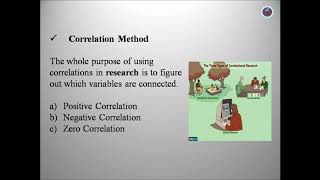
Drawing conclusions is a critical part of the data analysis process. Once data is collected, the next step is to analyze it thoroughly. This involves using various statistical methods and graphical representations, such as pie charts, bar diagrams, and cumulative frequencies.
The primary purpose of this analysis is to verify a hypothesis and derive meaningful conclusions from the data. By employing statistical procedures, researchers can ensure their findings are not merely coincidental but are based on systematic observation and analysis. Understanding the data in a comprehensive manner is essential for making informed decisions and drawing valid conclusions.
Youtube Videos


Audio Book
Dive deep into the subject with an immersive audiobook experience.
Concept of Drawing Conclusions
Chapter 1 of 2
🔒 Unlock Audio Chapter
Sign up and enroll to access the full audio experience
Chapter Content
The next step is to analyse data so collected through the use of statistical procedures to understand what the data mean. This can be achieved through graphical representations (such as preparation of pie-chart, bar-diagram, cumulative frequencies, etc.) and by the use of different statistical methods. The purpose of analysis is to verify a hypothesis and draw conclusions accordingly.
Detailed Explanation
Drawing conclusions means interpreting the data collected in research to determine what they signify. After gathering data, researchers analyze it using statistical methods, which help summarize the data and visualize it through graphs like pie-charts or bar diagrams. This step is crucial because it allows researchers to check whether their initial predictions (hypotheses) about the data were accurate. For example, if a researcher hypothesized that increased study time improves test scores, analyzing the collected data will reveal whether their hypothesis is supported or not.
Examples & Analogies
Imagine you are baking cookies. You follow a recipe and measure ingredients carefully. After mixing them, you might want to see how many cookies you made. Counting and organizing them visually, perhaps in a jar or on a plate, allows you to see if you followed the recipe successfully. Similarly, researchers organize and visualize their data to see if their initial predictions about the effects of study time on test scores were correct.
Verifying Hypotheses
Chapter 2 of 2
🔒 Unlock Audio Chapter
Sign up and enroll to access the full audio experience
Chapter Content
After analysing the data, the researcher may have begun the study with a hypothesis that there exists a relationship between viewing violence on television and aggression among children. S/he has to see whether the conclusions support this hypothesis. If they do, the existing hypothesis/theory is confirmed. If not, s/he will revise or state an alternative hypothesis/theory and again test it based on new data and draw conclusions which may be verified by future researchers.
Detailed Explanation
This step involves checking the original assumption or hypothesis formed before the study began. If data analysis shows that there is indeed a connection between watching violent TV shows and aggressive behavior in children, the researcher can confirm their hypothesis. If, however, the data do not support this assumption, the researcher may need to change their hypothesis and retest it to find the actual relationship. This is an iterative process where conclusions can lead to new questions and further studies.
Examples & Analogies
Consider a teacher believing that students learn better with visual aids. After observing a class without aids and a class with aids, the teacher analyzes the exam performance. If students with visual aids perform better, the initial belief is supported. But if the performance is similar, the teacher might reconsider the effectiveness of visual aids, perhaps adjusting teaching methods based on the new data, showing how hypotheses evolve with evidence.
Key Concepts
-
Data Analysis: The process of inspecting and interpreting collected data.
-
Statistical Procedures: Techniques used to analyze and draw conclusions from data.
-
Graphical Tools: Visual representations such as charts that help understand data.
Examples & Applications
A researcher analyzes test scores using a bar graph to compare performance across different groups.
A survey result is depicted using a pie chart to show the share of respondents who prefer a particular product.
Memory Aids
Interactive tools to help you remember key concepts
Rhymes
To analyze is to realize, data tells you no lies.
Stories
Imagine a detective analyzing clues (data) to solve a case (conclude).
Memory Tools
Remember 'PADS' - Pie chart And Data Science.
Acronyms
Use 'SPEAK'
Statistical Procedures for Effective Analysis of Knowledge.
Flash Cards
Glossary
- Hypothesis
A testable statement that predicts the relationship between variables.
- Statistical Methods
Procedures used to analyze and interpret data.
- Graphical Representation
Visual methods, such as charts and graphs, used to display data.
Reference links
Supplementary resources to enhance your learning experience.