
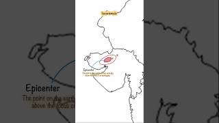
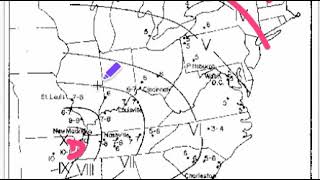
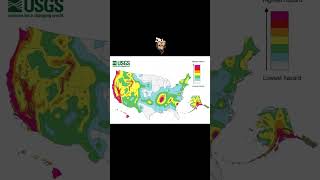
Isoseismal Maps
Enroll to start learning
You’ve not yet enrolled in this course. Please enroll for free to listen to audio lessons, classroom podcasts and take practice test.
Interactive Audio Lesson
Listen to a student-teacher conversation explaining the topic in a relatable way.
Introduction to Isoseismal Maps
🔒 Unlock Audio Lesson
Sign up and enroll to listen to this audio lesson

Today, we will discuss isoseismal maps. These maps show us lines connecting points of equal shaking intensity during an earthquake. Can anyone tell me why understanding these maps is important?

Maybe because it helps us know which areas are affected more?
Exactly! By visualizing the distribution of shaking, we can assess potential damage in different locations. This helps in urban planning and emergency response. Now, what might affect how we interpret these maps?

The type of soil or the terrain, right?
Exactly! Areas with soft soil can amplify shaking. We call this local amplification. Let's remember that variation can change how intense the shaking feels. A helpful acronym is SOIL: 'Soft soil increases level of shaking.' Anyone else have questions?
Analyzing Isoseismal Maps
🔒 Unlock Audio Lesson
Sign up and enroll to listen to this audio lesson

Now that we understand what an isoseismal map represents, how can we analyze one effectively? What do we look for?

The distribution of lines...like how close they are?
Exactly! Closely spaced lines indicate a steep intensity drop-off, while widely spaced lines suggest a more uniform intensity. Why do you think this might be important?

It shows how quickly the shaking diminishes as you move away from the epicenter!
Yes! And understanding this helps in assessing risk areas. Let’s keep that in mind when looking at actual isoseismal maps in future exercises.
Applications of Isoseismal Maps
🔒 Unlock Audio Lesson
Sign up and enroll to listen to this audio lesson
How do you think isoseismal maps are used in engineering and disaster response?
To help design buildings that can withstand earthquakes?
Absolutely! Engineers use this data to inform building codes and strengthen constructions. What about during an earthquake event?
They could help emergency services know where damage is likely to be worse?
Exactly right! This kind of information can prioritize resource allocation and ensure quicker response. Remember, the acronym SURE: 'Seismic Understanding Reassures Everyone.' Are we all clear on their applications?
Introduction & Overview
Read summaries of the section's main ideas at different levels of detail.
Quick Overview
Standard
Isoseismal maps are crucial tools in understanding the intensity distribution during an earthquake. They connect areas of similar shaking intensity, aiding in the identification of local amplification effects due to geological and terrain variations.
Detailed
Detailed Summary
Isoseismal maps are graphical representations that depict areas with uniform earthquake shaking intensity by connecting points of equal intensity values with lines known as isoseismal lines. These maps are essential in visualizing the spatial distribution of seismic effects, allowing researchers and engineers to identify how earthquakes impact different regions in terms of ground shaking.
The significance of isoseismal maps lies in their ability to illustrate local amplification effects caused by variations in soil and terrain. For instance, areas with soft soil may experience more intense shaking compared to those on bedrock. By analyzing isoseismal maps, engineers and disaster response teams can assess potential damage, inform building codes, and improve urban planning and emergency preparedness. Understanding these maps aids in seismic hazard assessments, ultimately contributing to enhanced public safety.
Youtube Videos


Audio Book
Dive deep into the subject with an immersive audiobook experience.
Definition of Isoseismal Maps
Chapter 1 of 3
🔒 Unlock Audio Chapter
Sign up and enroll to access the full audio experience
Chapter Content
• Isoseismal lines connect points of equal intensity.
Detailed Explanation
Isoseismal maps are graphical representations that use lines to connect points on a map that have experienced the same level of shaking intensity during an earthquake. These lines help us understand where the earthquake's effects were felt to a similar degree, effectively creating a contour map of the earthquake's impact.
Examples & Analogies
Think of an isoseismal map like a weather map that shows temperature zones. Just as a weather map might show areas with the same temperature—like how some regions are warmer and others cooler—an isoseismal map shows areas where people experienced the same intensity of shaking from an earthquake.
Visualization of Shaking Distribution
Chapter 2 of 3
🔒 Unlock Audio Chapter
Sign up and enroll to access the full audio experience
Chapter Content
• Help in visualizing spatial distribution of shaking.
Detailed Explanation
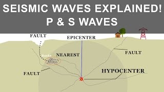
By depicting isoseismal lines, these maps allow us to visualize how the shaking intensity changes across different geographical areas. Areas closer to the epicenter, where the earthquake originated, tend to show stronger shaking and therefore have higher intensity levels compared to areas farther away, where shaking diminishes.
Examples & Analogies
Imagine dropping a stone into a pond. The ripples spread outward, and the waves are strongest at the point of impact and gradually diminish as you move away. Similarly, an isoseismal map shows this pattern of intensity, helping us understand where the earthquake's shaking was strongest.
Identification of Local Amplification Effects
Chapter 3 of 3
🔒 Unlock Audio Chapter
Sign up and enroll to access the full audio experience
Chapter Content
• Useful in identifying local amplification effects due to soil and terrain.
Detailed Explanation
Isoseismal maps can also reveal how different types of soil and terrain influence the shaking experienced in various locations. For example, soft soils may amplify shaking more than hard rock, leading to greater intensity in certain areas. By examining these maps, engineers and geologists can identify spots that might be particularly vulnerable to shaking.
Examples & Analogies
Consider how sound travels in different environments. For instance, when you shout in an empty room (hard surfaces), the sound echoes differently compared to shouting in a forest (soft, absorbent surfaces). Similarly, the geological conditions of an area affect how earthquake waves are amplified, and isoseismal maps help illustrate these variations.
Key Concepts
-
Isoseismal Lines: Lines connecting points of equal earthquake intensity, crucial for visual representation.
-
Intensity Distribution: Understanding how intensity varies geographically, which can relate to local soil types.
-
Local Amplification: Increased shaking intensity in certain areas due to conditions like soft soil.
Examples & Applications
An isoseismal map of the 2010 Haiti earthquake shows significantly higher intensity in certain urban areas due to ground conditions.
The 2011 Japan earthquake isoseismal map indicated stronger shaking in regions with softer sediments, leading to increased structural damage.
Memory Aids
Interactive tools to help you remember key concepts
Rhymes
Isoseismal lines so neat, tell where the shaking does greet.
Stories
Once in a town that shook one day, an isoseismal map showed them the way. Areas on soft soil felt more dread, while those on rock were safe in bed.
Memory Tools
I.S.O.S. - Isoseismal Shows Our Shaking.
Acronyms
S.A.F.E. - Soil Amplifies Force of Earthquakes.
Flash Cards
Glossary
- Isoseismal Map
A visual representation that connects points of equal shaking intensity during an earthquake.
- Intensity
The perceived strength of ground shaking at a specific location.
- Local Amplification
The increase in shaking intensity due to local geological conditions, such as soft soil.
Reference links
Supplementary resources to enhance your learning experience.