
The Profit Maximisation Problem: Graphical Representation
Enroll to start learning
You’ve not yet enrolled in this course. Please enroll for free to listen to audio lessons, classroom podcasts and take practice test.
Interactive Audio Lesson
Listen to a student-teacher conversation explaining the topic in a relatable way.
Understanding Profit Maximisation in Graphical Form
🔒 Unlock Audio Lesson
Sign up and enroll to listen to this audio lesson

Today, we will explore how firms maximise profits using graphical representation. Can anyone explain what we mean by profit maximisation?

I think it means producing the amount of goods that makes the most money or profit.
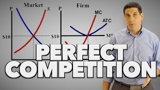
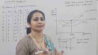
Exactly! Profit maximisation occurs when a firm's revenue exceeds its costs as much as possible. In a perfectly competitive market, this happens where the marginal cost equals the marginal revenue. Does anyone know why?

Because if you produce one more unit and it costs more than the revenue it brings, you lose money?
Precisely! This concept revolves around the equation MR = MC. We will see how this relationship plays out graphically.
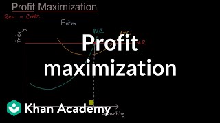
Graphical Representation of Total Revenue and Costs
🔒 Unlock Audio Lesson
Sign up and enroll to listen to this audio lesson

Let's look at how total revenue varies with different levels of output. Can someone explain what the total revenue curve looks like?

It’s a straight line because the price is constant in perfect competition, right?
Exactly! The total revenue rises as we increase output, forming a straight line graph. Now, what about total cost?

The total cost curve goes up more steeply, especially when more units are produced.
Correct! The area between total revenue and total cost represents profit. Can anyone summarise how we locate the profit maximisation point?
It’s where the total revenue curve is above the total cost curve, and the difference is the highest.
Great summary! Remember, at the profit maximising point, marginal revenue equals marginal cost too!
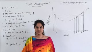
Conditions for Profit Maximisation
🔒 Unlock Audio Lesson
Sign up and enroll to listen to this audio lesson
We've talked about MR = MC. Can anyone list the conditions that need to be met for a firm to maximise profits?
The price must equal marginal cost, and marginal cost needs to be non-decreasing.
Exactly! And what about the third condition?
The price has to be greater than the average variable cost in the short run?
Correct! These three conditions must hold for profit maximisation. Let’s ensure we keep these in mind as we move forward.
Graphical Representation of Profit Areas
🔒 Unlock Audio Lesson
Sign up and enroll to listen to this audio lesson
Now, let's focus on how to identify the profit area on our graphs. Who can explain how to determine this visually?
The profit area is the rectangle formed between total revenue and total cost curves?
Exactly! It’s the area where total revenue exceeds total cost. What happens if these curves meet?
Then the firm breaks even, with no profit.
Well said! Recognising this area helps in comprehending firm behaviour under perfect competition.
Key Insights and Recap
🔒 Unlock Audio Lesson
Sign up and enroll to listen to this audio lesson
What have we covered regarding graphical representation and profit maximisation today?
We learned about how firms maximise profit by ensuring MR equals MC.
And how to graph total revenue and total cost for finding the profit area.
Also, the conditions for profit maximisation are critical to understand.
Fantastic recap! Let’s continue reinforcing these insights as we move ahead in our study of economics.
Introduction & Overview
Read summaries of the section's main ideas at different levels of detail.
Quick Overview
Standard
The section explains how, under perfect competition, firms aim to produce at a level where their marginal cost equals the market price to maximise profits. It illustrates the relationship between total revenue and total cost graphically, highlighting key conditions for profit maximisation.
Detailed
In this section, we delve into the profit maximisation problem for firms operating under perfect competition by employing graphical representations. We begin by understanding that a firm's objective is to produce at an output level where marginal revenue (MR) equals marginal cost (MC). The graphical representation helps in visualising this relationship: the total revenue curve, which demonstrates a straight upward slope due to the constant market price, contrasts against the average cost curves. The area representing profit is highlighted as the difference between total revenue and total cost, facilitating a clearer understanding of how profits change with varying levels of output. We also discuss conditions under which profit maximisation occurs and how graphical analysis aids in determining the optimal output level for firms.
Youtube Videos

Audio Book
Dive deep into the subject with an immersive audiobook experience.
Graphical Representation of Profit Maximisation
Chapter 1 of 2
🔒 Unlock Audio Chapter
Sign up and enroll to access the full audio experience
Chapter Content
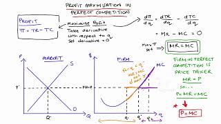
Using the material in sections 3.1, 3.2 and 3.3, let us graphically represent a firm’s profit maximisation problem in the short run. Consider Figure 4.6. Notice that the market price is p. Equating the market price with the (short run) marginal cost, we obtain the output level q₀. At q₀, observe that SMC slopes upwards and p exceeds AVC. Since the three conditions discussed in sections 3.1-3.3 are satisfied at q₀, we maintain that the profit-maximising output level of the firm is q₀.
Detailed Explanation
In this chunk, we are looking at how we can visualize the process by which a firm maximizes its profits. The graph essentially plots the relationship between price, marginal costs, and average variable costs. The firm will continue to produce as long as the price they receive for their product (p) is greater than their average variable costs (AVC) and marginal cost (MC) equals the price. If we draw the demand curve (which is horizontal for a price-taker) at price p and compare it with the marginal cost curve (which generally slopes upwards), we can find the quantity q₀ where these two curves intersect, showing the optimal output level for profit maximization. This is an important concept in economic theory because it shows firms will not produce if they cannot at least cover their variable costs, which is essential for staying in business in the short run.
Examples & Analogies
Think of a pizza shop deciding how many pizzas to make for the evening. The shop knows that it can sell pizzas at $10 each. They calculate their costs, and it turns out that the cost to make each additional pizza is $7. To maximize their profit, they will continue to make pizzas as long as they can sell them for $10 (which is greater than their $7 cost). If they reach a point where the cost to make another pizza exceeds $10, they will stop making more because they would be losing money. The graphically identified quantity (q₀) ensures they generate the highest profit under these conditions.
Understanding Revenue and Profit at Output Level
Chapter 2 of 2
🔒 Unlock Audio Chapter
Sign up and enroll to access the full audio experience
Chapter Content
What happens at q₀? The total revenue of the firm at q₀ is the area of rectangle OpAq₀ (the product of price and quantity) while the total cost at q₀ is the area of rectangle OEBq₀ (the product of short run average cost and quantity). So, at q₀, the firm earns a profit equal to the area of the rectangle EpAB.
Detailed Explanation
In this chunk, we delve into the financial aspect of profit maximization. At the profit-maximizing output level (q₀), we can calculate the total revenue and total costs geometrically based on rectangular areas in the graph. Total revenue (TR) is calculated by multiplying the price (p) by the quantity sold (q₀), which represents the area of rectangle OpAq₀. On the other hand, total cost (TC) takes into account the average cost (AC) of production times the same quantity, giving us the area of rectangle OEBq₀. Profit is then derived by subtracting total costs from total revenues, visually represented as the area EpAB in the graph. Profit maximization occurs where this area is largest.
Examples & Analogies
Imagine the same pizza shop again. If the shop sells 15 pizzas at $10 each, their total revenue will be $150 (15 * $10). If it costs them $5 per pizza for ingredients and labor (amounting to $75 for 15 pizzas), they realize a profit of $75. In terms of our area metaphor, if the revenue rectangle is $150 and the cost rectangle is $75, the area that represents profit would be everything in between, coloring in a visual rectangle of size $75, signifying the shop's profit.
Key Concepts
-
Marginal Cost: The cost of producing one additional unit.
-
Marginal Revenue: The revenue gained from selling one additional unit.
-
Total Revenue Curve: A straight line indicating total revenue based on output.
-
Profit Area: The space between the total revenue and total cost curves that indicates profit.
Examples & Applications
If a firm has a market price of Rs 20 and produces 10 units at a total cost of Rs 150, its total revenue would be Rs 200, resulting in a profit of Rs 50.
When price equals MC at Rs 20, the firm maximises its profit by producing 10 units because producing more would incur higher costs than revenue gained.
Memory Aids
Interactive tools to help you remember key concepts
Rhymes
To find where profit peaks, MR and MC must speak!
Stories
Imagine a baker who sells cookies at a fixed price. To maximise profit, she adjusts her production until the cost of baking one more cookie equals the price she receives. That’s how she knows she’s hit her sweet spot!
Memory Tools
P-MR-MC-PA: Profit-Maximising Requirement = Marginal Revenue = Marginal Cost = Profit Area.
Acronyms
TRAP
Total Revenue Above Costs = Profit maximisation.
Flash Cards
Glossary
- Profit maximisation
The process of determining the output level at which a firm achieves the highest possible profit.
- Marginal Cost (MC)
The additional cost incurred from the production of one more unit.
- Marginal Revenue (MR)
The additional revenue generated from the sale of one more unit.
- Total Revenue (TR)
The total income generated from the sale of goods or services.
- Total Cost (TC)
The total expenses incurred in the production of goods or services.
Reference links
Supplementary resources to enhance your learning experience.