
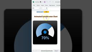
Animated Charts
Enroll to start learning
You’ve not yet enrolled in this course. Please enroll for free to listen to audio lessons, classroom podcasts and take practice test.
Interactive Audio Lesson
Listen to a student-teacher conversation explaining the topic in a relatable way.
Introduction to Animated Charts
🔒 Unlock Audio Lesson
Sign up and enroll to listen to this audio lesson

Today, we are going to discuss animated charts. Can anyone tell me why we might want to use an animated chart instead of a static one?

I think animated charts might show changes over time better.
Exactly! Animated charts effectively illustrate how trends evolve. They can highlight patterns that static charts might miss.

What tools can we use to create these animated charts?
Great question! Tools like Plotly, Matplotlib, and Flourish are commonly used for creating animated visualizations.

Are there any specific benefits to using animations in charts?
Absolutely! Animations can capture viewers' attention, making the understanding of complex data much easier. They help narrate the story behind the data.
In summary, animated charts are beneficial for showcasing trends and enhancing storytelling in data visualization.
Tools for Creating Animated Charts
🔒 Unlock Audio Lesson
Sign up and enroll to listen to this audio lesson

Let's dive deeper into the tools that can help us create animated charts. Can anyone name a tool they might have heard of for data visualization?

I’ve heard of Plotly and that it’s interactive.
Yes, Plotly is fantastic for creating interactive visualizations, including animation. What about Matplotlib?
Isn't Matplotlib primarily for static charts?
It is known for static charts, but it also has animation capabilities. Finally, Flourish offers a user-friendly interface specifically for creating data stories, making it easy to incorporate animations.
So, can you use these tools in combination?
Yes, you can integrate them depending on your needs! Different tools excel in different aspects of data visualization. Remember the 'three Ps': Plotly for interactive, Python for customization, and Flourish for straightforward storytelling.
In summary, Plotly, Matplotlib, and Flourish are great tools for creating animated charts. Each has unique strengths that can enhance your data storytelling.
Introduction & Overview
Read summaries of the section's main ideas at different levels of detail.
Quick Overview
Standard
This section discusses animated charts as a crucial tool for illustrating the evolution of trends in datasets. By utilizing various tools such as Plotly and Matplotlib animation, these charts enhance data storytelling, making complex datasets more accessible and engaging for viewers.
Detailed
Animated Charts
Animated charts serve as a powerful enhancement for data visualization, making it possible to depict how trends unfold over time. This section emphasizes the significance of animated charts in the context of storytelling with data, showing that moving visuals can effectively convey changes, patterns, and insights in a way that static charts may not be able to achieve.
Key Points:
- Purpose of Animated Charts: Animated charts provide a dynamic means of showcasing how data changes over a specified time frame, helping viewers to observe trends and make connections more effectively.
- Tools for Creating Animated Charts: Popular tools for creating animated charts include Plotly, which is excellent for interactive visualization, Matplotlib for animation features, and Flourish for user-friendly data storytelling interfaces.
- Benefits: The use of animations not only captivates the audience's attention but also aids in understanding the narrative behind the data, facilitating better decision-making and engagement with the material.
With the growing importance of data-driven storytelling, animated charts are becoming an indispensable part of data visualization techniques.
Youtube Videos

Audio Book
Dive deep into the subject with an immersive audiobook experience.
Purpose of Animated Charts
Chapter 1 of 2
🔒 Unlock Audio Chapter
Sign up and enroll to access the full audio experience
Chapter Content
• Show how trends evolve over time.
Detailed Explanation
Animated charts are designed to visually represent trends as they develop over a period. This means that, instead of viewing static data points on a chart, the viewer can watch how the data changes, allowing for a more dynamic and engaging way to understand trends. By using animation, viewers can more easily spot increases, decreases, or patterns that occur over time, which might be missed in static visual representations.
Examples & Analogies
Imagine watching a video of a plant growing. You see each stage of its growth, from a small seed to a blooming flower. This progression is similar to what animated charts do for data—they show how things change and evolve, making it much easier to grasp complex changes over time.
Tools for Creating Animated Charts
Chapter 2 of 2
🔒 Unlock Audio Chapter
Sign up and enroll to access the full audio experience
Chapter Content
• Tools: Plotly, Matplotlib animation, Flourish.
Detailed Explanation
There are several software tools available for creating animated charts. Each tool has its unique features and benefits. Plotly is known for its interactive capabilities and web readiness, making it easy to share animated charts online. Matplotlib offers animation functionalities that can be customized in Python, great for programmers who want detailed control. Flourish provides user-friendly templates that allow non-programmers to create animated charts quickly. Depending on your needs and technical skills, you can choose the appropriate tool to create the best animated charts.
Examples & Analogies
Think of these tools like different paints for an artist. Just as an artist can choose from watercolors, acrylics, or oil paints, a data analyst can select from Plotly, Matplotlib, or Flourish based on the job at hand. Each tool offers a unique way to bring data to life, much like how different paints can create different effects in artwork.
Key Concepts
-
Animation in Data Visualization: Techniques that allow for the dynamic representation of data to show changes over time.
-
Tools for Animation: Plotly, Matplotlib, and Flourish, important for creating engaging animated visualizations.
-
Data Storytelling: The integration of data visualization with narrative elements to better communicate insights.
Examples & Applications
Using Plotly to create an animated scatter plot that shows how a dataset evolves over certain periods.
Creating an animated bar chart in Matplotlib that displays changes in a company's revenue over the last decade.
Memory Aids
Interactive tools to help you remember key concepts
Rhymes
In charts that move, insights improve, seeing data trends that we can groove.
Stories
Once upon a time, a static chart showed a country's growth in a foggy way. But when it started to move, people saw clearly how things evolved over the years, making decisions easier.
Memory Tools
Remember 'Panic is Flourishing with Data'; P for Plotly, I for Interactive, F for Flourish that brings stories!
Acronyms
TAP
Time Animation Presentations - to remember the key function of animated charts.
Flash Cards
Glossary
- Animated Charts
Visual representations of data that illustrate how trends and patterns evolve over time using motion.
- Data Storytelling
The practice of using data-driven narratives to communicate insights effectively to an audience.
- Plotly
A Python graphing library that makes interactive, publication-quality graphs online.
- Matplotlib
A comprehensive library for creating static, animated, and interactive visualizations in Python.
- Flourish
An online platform that allows users to create and share data visualizations, including interactive charts and animations.
Reference links
Supplementary resources to enhance your learning experience.