
Example 4
Enroll to start learning
You’ve not yet enrolled in this course. Please enroll for free to listen to audio lessons, classroom podcasts and take practice test.
Interactive Audio Lesson
Listen to a student-teacher conversation explaining the topic in a relatable way.
Understanding Bar Graphs
🔒 Unlock Audio Lesson
Sign up and enroll to listen to this audio lesson

Today, we're going to discuss bar graphs. They represent data with rectangular bars. What are some of the advantages of using bar graphs, anyone?

I think they make it easy to see comparisons between different categories.
Exactly! They allow you to compare how many belong to each category at a glance. For example, if we have birth months of students like in our earlier example, which month had the most students born?

August had the most students!
Correct! The height of the bar for August would reflect that number. Let’s remember: **B.A.R** - **B**ars **A**re **R**elative. They show the relationship easily.
Histograms
🔒 Unlock Audio Lesson
Sign up and enroll to listen to this audio lesson

Now, let's discuss histograms. They are similar to bar graphs but are used for continuous class intervals. Does anyone know when we'd use a histogram?

When the data can fall into ranges, right?
Right! For example, when we measure weights or marks, we can group them into ranges. Histograms lack gaps between bars, unlike bar graphs. To help us remember this, think: **H.I.S.** - **H**istograms **I**gnore **S**paces.

So we just connect the bars directly?
Precisely. Each bar represents how many data points fall into each interval.
Drawing Frequency Polygons
🔒 Unlock Audio Lesson
Sign up and enroll to listen to this audio lesson
Next, let’s talk about frequency polygons. Can someone explain how we could create one from a histogram?
Do we connect the midpoints of the histogram bars?
Exactly! By joining the midpoints of the histogram's rectangles, we create a frequency polygon. This helps in visualizing the distribution more smoothly. Remember: **P.O.L.Y.** for **P**olygon **O**btains **L**ines **Y**onder.
Can we also draw a frequency polygon without a histogram?
Yes, you can plot the class midpoints and their frequencies directly, creating a smoother connection.
Misleading Graphs
🔒 Unlock Audio Lesson
Sign up and enroll to listen to this audio lesson
It is crucial to know that graphs can sometimes be misleading. Can anyone give an example of when this might happen?
When the width of bars in a histogram varies?
Correct! If the widths vary, the areas may not accurately represent the frequencies. Let's recall: **G.R.A.P.H.** for **G**raphs **R**equire **A**ccurate **P**roportions for **H**onesty.
Application of Graphical Representations
🔒 Unlock Audio Lesson
Sign up and enroll to listen to this audio lesson
Finally, let’s discuss why we use these representations. How do they enhance our understanding of data?
They make it easier to see trends and compare different sets of data.
Exactly! We can visually compare two sets of data, like performance across two classes, using frequency polygons. Remember our acronym **C.R.E.A.T.E.** - **C**lear **R**epresentation **E**nhances **A**nalysis **T**hrough **E**ase.
So, we can use these graphs to make more informed decisions based on data.
Precisely! Good job, everyone!
Introduction & Overview
Read summaries of the section's main ideas at different levels of detail.
Quick Overview
Standard
The section delves into graphical data representations, primarily bar graphs for categorical data, histograms for continuous data, and frequency polygons for illustrating distributions. Examples are provided to reinforce the concepts and illustrate how to construct and analyze these graphs effectively.
Detailed
In this section, we explore several key forms of graphical representations used to showcase statistical data effectively. Graphs offer a visual understanding of data compared to tables, making it easier to see trends and comparisons.
- Bar Graphs: Used for displaying categorical data. Each category is represented by a bar, with its height corresponding to the frequency of the category.
- Histograms: These are similar to bar graphs but are utilized for continuous data that is grouped into class intervals. It displays the frequency of data points within these ranges, signifying its distribution.
- Frequency Polygons: They are plotted by connecting the midpoints of the top of the bars in histograms. This graph showcases the frequency of corresponding data values, making it suitable for comparing distributions.
The significance of using graphical representations lies in their ability to provide a clear, immediate visual summary of relationships within data that raw numerical data can't convey as effectively.
Youtube Videos


Audio Book
Dive deep into the subject with an immersive audiobook experience.
Introduction to the Frequency Distribution Table
Chapter 1 of 6
🔒 Unlock Audio Chapter
Sign up and enroll to access the full audio experience
Chapter Content
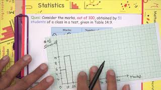
Consider the marks, out of 100, obtained by 51 students of a class in a test, given in Table 12.5.
Table 12.5
| Marks | Number of students |
|---|---|
| 0 - 10 | 5 |
| 10 - 20 | 10 |
| 20 - 30 | 4 |
| 30 - 40 | 6 |
| 40 - 50 | 7 |
| 50 - 60 | 3 |
| 60 - 70 | 2 |
| 70 - 80 | 2 |
| 80 - 90 | 3 |
| 90 - 100 | 9 |
| Total | 51 |
Detailed Explanation
In this chunk, we are given a frequency distribution table that shows the marks obtained by 51 students. Each row represents a range of marks (e.g., 0 - 10) and how many students scored within that range. The table summarizes the data in a way that makes it easy to see how many students fell into each score range.
Examples & Analogies
Imagine a teacher who wants to find out how well her students are performing in a recent test. Instead of looking at each student's individual score, she creates a table that shows how many students scored within certain ranges (like grading bands). This table helps her quickly gauge where most students are scoring.
Drawing the Histogram
Chapter 2 of 6
🔒 Unlock Audio Chapter
Sign up and enroll to access the full audio experience
Chapter Content
Let us first draw a histogram for this data and mark the mid-points of the tops of the rectangles as B, C, D, E, F, G, H, I, J, K, respectively.
Detailed Explanation
We begin the process of visualizing this data by creating a histogram. In a histogram, we draw rectangular bars for each mark range, where the height of each bar represents the number of students. The mid-points of these bars will be labeled for reference, making it easier to interpret the visual data.
Examples & Analogies
Think of a histogram as a carnival game where you have to knock down cans. Each can represents a score range, and the number of cans you knock down relates to how many students scored in that range. The taller the stack of cans (the taller the bar), the more students that scored in that range.
Adding Points for Zero Frequency
Chapter 3 of 6
🔒 Unlock Audio Chapter
Sign up and enroll to access the full audio experience
Chapter Content
Here, the first class is 0-10. So, to find the class preceding 0-10, we extend the horizontal axis in the negative direction and find the mid-point of the imaginary class-interval (–10) - 0.
Detailed Explanation
To complete the frequency polygon, we need to account for classes with zero frequency. Since marks range doesn’t include a class before 0-10, we imagine a class that has zero students to ensure the graph connects smoothly. This helps create a more accurate visual representation of the data.
Examples & Analogies
It's like when you’re drawing a line connecting dots on a paper. If your first dot (0-10) does not have a second dot prior to it, you can imagine placing a blank dot (0 frequency) just before it so that your line can continue smoothly along.
Completing the Frequency Polygon
Chapter 4 of 6
🔒 Unlock Audio Chapter
Sign up and enroll to access the full audio experience
Chapter Content
Let L be the mid-point of the class succeeding the last class of the given data. Then OABCDEFGHIJKL is the frequency polygon, which is shown in Fig. 12.7.
Detailed Explanation
After plotting mid-points for each class and connecting them, we form a clear visual representation known as a frequency polygon. This polygon gives us a better understanding of the distribution of student scores by showing trends and frequencies visually.
Examples & Analogies
Imagine a mountain range where each peak represents the number of students scoring within specific ranges. As you draw the lines connecting these peaks, you create a slope that visually tells you where the most students scored and where they scored the least, just like the way hills rise and fall on a landscape.
Finding Class Marks
Chapter 5 of 6
🔒 Unlock Audio Chapter
Sign up and enroll to access the full audio experience
Chapter Content
To find the class-mark of a class interval, we find the sum of the upper limit and lower limit of a class and divide it by 2.
Detailed Explanation
Class-marks are the midpoints of the class intervals. To find a class-mark, you add the lower and upper limits of a range (e.g., for the range 0-10, we add 0 and 10, then divide by 2). This provides a single representative value for each interval that we can use on the X-axis of a graph.
Examples & Analogies
Consider class-marks like finding the average score of all students in a group. Instead of looking at every individual score, you compute an average (in this case, the midpoint) that gives you a fair idea of where the group stands overall.
Drawing the Frequency Polygon Directly
Chapter 6 of 6
🔒 Unlock Audio Chapter
Sign up and enroll to access the full audio experience
Chapter Content
Now we can draw a frequency polygon by plotting the class-marks along the horizontal axis, the frequencies along the vertical-axis, and then plotting and joining the points.
Detailed Explanation
This final step involves taking all the previously calculated class-marks and corresponding frequencies and plotting them on a graph. We join these points with line segments to form the frequency polygon, providing a clear visual representation of the students' scores.
Examples & Analogies
Think of this process as assembling a connect-the-dots puzzle. Each dot represents a specific mark and the number of students scoring in that range. By connecting them, you see the overall pattern of performance across all students, just like completing a beautiful picture.
Key Concepts
-
Bar Graphs: Used to compare categorical data visually.
-
Histograms: Represent continuous data frequency distribution without gaps.
-
Frequency Polygons: Connect midpoints of histogram bars for a smooth representation.
Examples & Applications
{'example': 'Example for Bar Graph Construction', 'solution': 'Given data: Grocery = 4 (thousand rupees), Rent = 5, Education = 5, etc. The bar heights for each category are drawn proportional to these values.'}
{'example': 'Histogram Example: Student Weights', 'solution': 'For a given data of weights (like 30.5 to 35.5 kg with frequency 9), create intervals, and plot bars proportional to these frequencies.'}
Memory Aids
Interactive tools to help you remember key concepts
Rhymes
Bars rise high, their heights tell a tale, Comparing categories, we set sail.
Stories
Imagine a fruit market, where apples, oranges, and bananas compete in height representing their quantity.
Memory Tools
B.A.R.: Bars Are Relative.
Acronyms
H.I.S. - **H**istograms **I**gnore **S**paces.
Flash Cards
Glossary
- Bar Graph
A graphical representation where rectangular bars are used to display the frequency of different categories.
- Histogram
A bar graph that represents the frequency distribution of continuous data in specified intervals.
- Frequency Polygon
A line graph created by connecting the midpoints of the top of the bars in a histogram.
- Class Interval
A range of values within which data points are grouped for analysis.
Reference links
Supplementary resources to enhance your learning experience.