
Exercises
Enroll to start learning
You’ve not yet enrolled in this course. Please enroll for free to listen to audio lessons, classroom podcasts and take practice test.
Interactive Audio Lesson
Listen to a student-teacher conversation explaining the topic in a relatable way.
Understanding Bar Graphs
🔒 Unlock Audio Lesson
Sign up and enroll to listen to this audio lesson

Today, we are going to review how to create bar graphs. Can anyone tell me what a bar graph is?

It's a way to show data using bars that represent different categories!
Exactly! We use the height of each bar to represent the value of the data for that category. Let's think about the exercise where we need to represent the causes of female fatalities. If we were to create a bar graph for this data, what would we need?

We need the categories and their corresponding values.
Correct! We categorize by the causes and then plot their percentages. Now, remember, the space between bars is important. Can anyone tell me why?

To make sure it's easy to separate one bar from another!
Precisely! The spacing enhances clarity. Now, let's summarize: Bars represent categories, their height shows values, and gaps ensure readability.
Creating Histograms
🔒 Unlock Audio Lesson
Sign up and enroll to listen to this audio lesson

Now, let's shift our focus to histograms. Who can explain how a histogram is different from a bar graph?

Histograms are for continuous data while bar graphs are for categorical data!
That's a great distinction! In a histogram, we don’t have spaces between the bars. Can someone tell me why that is?
Because the data represents a continuous range!
Exactly! Next, we need to ensure the width of the bars reflects the class intervals correctly. Let's practice by drawing a histogram for the weights of students in our exercises.
Analyzing Frequency Polygons
🔒 Unlock Audio Lesson
Sign up and enroll to listen to this audio lesson
Who remembers what a frequency polygon is?
It connects the midpoints of a histogram!
Correct! Frequency polygons help in comparing distributions. Let’s say we create one . Why do we need to include points for zero frequencies?
To keep the shape of the polygon and show the full distribution.
Perfectly said! Now, let's draw a frequency polygon based on the histograms we created earlier, ensuring to plot all necessary points.
Introduction & Overview
Read summaries of the section's main ideas at different levels of detail.
Quick Overview
Standard
In this section, students are tasked with a variety of exercises that reinforce their understanding of graphical representations in statistics. These exercises ask them to create and analyze bar graphs, histograms, and frequency polygons based on provided data sets, fostering both application and analytical skills.
Detailed
Exercises
This section provides a comprehensive set of exercises aimed at reinforcing the concepts learned in graphical representations of data. The exercises are categorized into three difficulty levels: easy, medium, and hard. Each exercise involves practical applications such as creating bar graphs, histograms, and frequency polygons based on real-world data. Students will encounter various types of questions, including short answer, reflective, case-based, and application-based problems.
The exercises cover key concepts such as:
1. Constructing bar graphs from categorical data.
2. Drawing histograms for continuous data and ensuring accuracy in representation.
3. Creating frequency polygons to visualize distribution.
4. Analyzing trends and making comparisons based on graphical representations.
By engaging with the exercises, students deepen their understanding of data visualization techniques and enhance their analytical skills.
Youtube Videos


Audio Book
Dive deep into the subject with an immersive audiobook experience.
Exercise 1: Survey on Women’s Health
Chapter 1 of 9
🔒 Unlock Audio Chapter
Sign up and enroll to access the full audio experience
Chapter Content
- A survey conducted by an organisation for the cause of illness and death among the women between the ages 15 - 44 (in years) worldwide, found the following figures (in %):
S.No. Causes Female fatality rate (%)
1. Reproductive health conditions 31.8
2. Neuropsychiatric conditions 25.4
3. Injuries 12.4
4. Cardiovascular conditions 4.3
5. Respiratory conditions 4.1
6. Other causes 22.0
(i) Represent the information given above graphically.
(ii) Which condition is the major cause of women’s ill health and death worldwide?
(iii) Try to find out, with the help of your teacher, any two factors which play a major role in the cause in (ii) above being the major cause.
Detailed Explanation
This exercise focuses on analyzing a survey regarding women's health issues. It provides a list of causes of mortality and morbidity, along with their respective percentage contributions to the overall rates. The task requires students to represent these data visually, which helps in understanding the proportions of each cause. The second part asks for the identification of the leading cause, which guides students to interpret data meaningfully. Finally, students are encouraged to explore underlying factors that lead to these health issues, promoting critical thinking.
Examples & Analogies
Imagine if you were planning a health campaign targeting young women. Understanding the causes of health issues is like knowing the ingredients in a recipe; it helps you figure out what to change to make things better. Just like how a pizza might be healthier with less cheese and more veggies, knowing that reproductive health conditions are a major issue means you might want to focus your efforts there first.
Exercise 2: Number of Girls per Thousand Boys
Chapter 2 of 9
🔒 Unlock Audio Chapter
Sign up and enroll to access the full audio experience
Chapter Content
- The following data on the number of girls (to the nearest ten) per thousand boys in different sections of Indian society is given below:
Section Number of girls per thousand boys
Scheduled Caste (SC) 940
Scheduled Tribe (ST) 970
Non SC/ST 920
Backward districts 950
Non-backward districts 920
Rural 930
Urban 910
(i) Represent the information above by a bar graph.
(ii) In the classroom discuss what conclusions can be arrived at from the graph.
Detailed Explanation
This exercise examines the gender ratio across different social segments. The data is represented in terms of the number of girls per thousand boys. Students are tasked with constructing a bar graph, which aids in visualizing the disparities between different groups. After plotting the graph, they must engage in a discussion about the implications of the data, interpreting what the numbers might indicate about gender bias or societal issues in various communities.
Examples & Analogies
Think about a fruit basket where each type of fruit represents a different group in society. If you have more apples (girls) than oranges (boys) in some baskets and fewer in others, making a chart to visualize it, helps you see which groups are healthier and more diverse. Just like how we can compare the quantities of fruit, we can compare the number of girls in different sections of society to see where we need to improve.
Exercise 3: Political Party Seat Distribution
Chapter 3 of 9
🔒 Unlock Audio Chapter
Sign up and enroll to access the full audio experience
Chapter Content
- Given below are the seats won by different political parties in the polling outcome of a state assembly elections:
Political Party A B C D E F
Seats Won 75 55 37 29 10 37
(i) Draw a bar graph to represent the polling results.
(ii) Which political party won the maximum number of seats?
Detailed Explanation
In this exercise, students are given data regarding the outcomes of a state assembly election. The task is to represent this political data visually by creating a bar graph. This not only helps in illustrating the seats won by each party but also makes it easier to identify which party performed the best. By interpreting the graph, students enhance their analytical skills while also engaging with the civic aspect of electoral results.
Examples & Analogies
Think of this like a sports game, where each team (political party) is competing for points (seats). Just like you would use a scoreboard to quickly see who has the most points, a bar graph allows you to quickly see which party won the most seats. If one team consistently scores higher, you know they're the standout player in this game of politics!
Exercise 4: Length of Leaves
Chapter 4 of 9
🔒 Unlock Audio Chapter
Sign up and enroll to access the full audio experience
Chapter Content
- The length of 40 leaves of a plant is measured correct to one millimetre, and the obtained data is represented in the following table:
Length (in mm) Number of leaves
118 - 126 3
127 - 135 5
136 - 144 9
145 - 153 12
154 - 162 5
163 - 171 4
172 - 180 2
(i) Draw a histogram to represent the given data. [Hint: First make the class intervals continuous]
(ii) Is there any other suitable graphical representation for the same data?
(iii) Is it correct to conclude that the maximum number of leaves are 153 mm long? Why?
Detailed Explanation
This exercise requires students to work with continuous data regarding the lengths of leaves. Students must draw a histogram, which is appropriate for displaying continuous data, and ensure the class intervals are made continuous for accurate representation. Additionally, the exercise prompts critical questioning about data interpretation. Students should assess whether the statement about the maximum number of leaves accurately reflects the frequency distribution shown in the histogram.
Examples & Analogies
Imagine sorting a collection of colored pencils by length. Creating a histogram is like organizing these pencils into buckets according to their sizes, where each bucket helps you see how many fit in that range. If a bucket labeled 140-150 mm has the most pencils, you wouldn't just look at the longest pencil, you'd want to recognize that the majority fall into that bucket – just as with the leaves, where their distributions tell a fuller story about their lengths.
Exercise 5: Life Times of Neon Lamps
Chapter 5 of 9
🔒 Unlock Audio Chapter
Sign up and enroll to access the full audio experience
Chapter Content
- The following table gives the life times of 400 neon lamps:
Life time (in hours) Number of lamps
300 - 400 14
400 - 500 56
500 - 600 60
600 - 700 86
700 - 800 74
800 - 900 62
900 - 1000 48
(i) Represent the given information with the help of a histogram.
(ii) How many lamps have a life time of more than 700 hours?
Detailed Explanation
In this exercise, students are analyzing data on the lifetimes of neon lamps. They will use a histogram to represent the frequency distribution visually. In addition to constructing the histogram, students must calculate how many lamps last more than 700 hours based on the frequency data. This helps reinforce their understanding of cumulative frequency and data interpretation.
Examples & Analogies
Think of this scenario as assessing the battery life of several gadgets. You want to know how long most of them last before needing a recharge. By plotting a histogram, you can clearly visualize which gadgets last the longest. If most sit in the longer-life range, this suggests they are reliable – just as certain neon lamps shine longer than others.
Exercise 6: Marks Distribution of Two Sections
Chapter 6 of 9
🔒 Unlock Audio Chapter
Sign up and enroll to access the full audio experience
Chapter Content
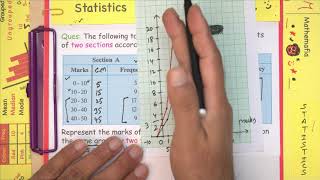
- The following table gives the distribution of students of two sections according to the marks obtained by them:
Section A Section B
Marks Frequency Marks Frequency
0 - 10 3 0 - 10 5
10 - 20 9 10 - 20 19
20 - 30 17 20 - 30 15
30 - 40 12 30 - 40 10
40 - 50 9 40 - 50 1
Represent the marks of the students of both sections on the same graph by two frequency polygons. From the two polygons compare the performance of the two sections.
Detailed Explanation
This exercise presents data from two sections of students based on their scores. Students are required to create frequency polygons for both sections on the same graph, which allows for an easy comparison of performances between them. Creating overlaid polygons enables visual analysis of the data, showing where one section may excel or lag behind the other in terms of scores.
Examples & Analogies
Imagine two friends participating in a chess tournament. If one friend usually wins the first few rounds but suffers in the later rounds, their performance can be graphed to compare how they did overall. By analyzing the match outcomes visually with a frequency polygon, you can quickly see who won more games over the entire tournament!
Exercise 7: Cricket Match Runs Data
Chapter 7 of 9
🔒 Unlock Audio Chapter
Sign up and enroll to access the full audio experience
Chapter Content
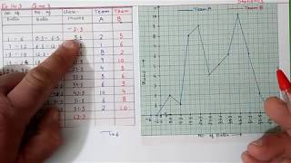
- The runs scored by two teams A and B on the first 60 balls in a cricket match are given below:
Number of balls Team A Team B
1 - 6 2 5
7 - 12 1 6
13 - 18 8 2
19 - 24 9 10
25 - 30 4 5
31 - 36 5 6
37 - 42 6 3
43 - 48 10 4
49 - 54 6 8
55 - 60 2 10
Represent the data of both the teams on the same graph by frequency polygons. [Hint : First make the class intervals continuous.]
Detailed Explanation
This exercise involves comparing the performance of two cricket teams across a defined set of intervals. Students will convert the runs scored into frequency polygons, which help visualize performance trends over time. The instruction to make the class intervals continuous emphasizes the importance of ensuring clarity in the graph, leading to better interpretations of the data.
Examples & Analogies
Consider this scenario like tracking the progress of two marathon runners over a race course. Just as we would look at how each runner performs at different mile markers, plotting their progress on a graph enables us to see who is ahead at any point and how their speeds compare throughout the race.
Exercise 8: Children’s Age Groups in a Park
Chapter 8 of 9
🔒 Unlock Audio Chapter
Sign up and enroll to access the full audio experience
Chapter Content
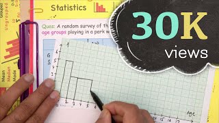
- A random survey of the number of children of various age groups playing in a park was found as follows:
Age (in years) Number of children
1 - 2 5
2 - 3 3
3 - 5 6
5 - 7 12
7 - 10 9
10 - 15 10
15 - 17 4
Draw a histogram to represent the data above.
Detailed Explanation
In this exercise, students will work with age group data to create a histogram. This visual representation enables students to quickly assess the distribution of children by age within the park. By interpreting the resulting histogram, students can glean insights into which age groups are more prevalent in the park, fostering a better understanding of demographics.
Examples & Analogies
Picture a playground filled with kids of varying ages. If you were to walk through it with a clipboard noting how many kids are in each age range, making a histogram would help you visualize where the most kids are playing. Just like how you can plan activities based on ages, this graph lets you understand which age group is most common in the park.
Exercise 9: Surnames Letter Distribution
Chapter 9 of 9
🔒 Unlock Audio Chapter
Sign up and enroll to access the full audio experience
Chapter Content
- 100 surnames were randomly picked up from a local telephone directory and a frequency distribution of the number of letters in the English alphabet in the surnames was found as follows:
Number of letters Number of surnames
1 -4 6
4 -6 30
6 -8 44
8 - 12 16
12 - 20 4
(i) Draw a histogram to depict the given information.
(ii) Write the class interval in which the maximum number of surnames lie.
Detailed Explanation
This exercise focuses on the analysis of surnames based on the number of letters they contain. By creating a histogram, students can visualize how surnames are categorized according to their letter counts. It enhances understanding of the distribution of surname lengths in the dataset, allowing students to see which lengths are most common.
Examples & Analogies
Imagine collecting nicknames among your friends to see which are the longest. By organizing them from shortest to longest, you can visually display which lengths are most common, much like a histogram does with surnames. This way, you can decide the best name to use during fun activities based on how many syllables or letters they each have!
Key Concepts
-
Bar Graph: A visual representation using bars to depict data categories.
-
Histogram: A bar graph for continuous data, with no gaps between bars.
-
Frequency Polygon: A shape formed by connecting midpoints of histogram bars.
Examples & Applications
{'example': 'Create a bar graph for the causes of female fatalities based on the provided data.', 'solution': '1. Identify causes and fatality percentages, plot on vertical axis and causes on horizontal axis.'}
{'example': 'Draw a histogram for the distribution of weights of students in the given ranges.', 'solution': '1. Identify ranges, plot frequencies accordingly on a continuous axis without gaps.'}
Memory Aids
Interactive tools to help you remember key concepts
Rhymes
Bars go up high, for categories nigh, with gaps in between, clarity is seen.
Memory Tools
B.H.F. - Bar, Histogram, Frequency Polygon are types of data displays.
Acronyms
B.H.F. helps recall
Bar graphs for categories
Histograms for continuity
Frequency polygons for shape.
Flash Cards
Glossary
- Bar Graph
A graphical representation of data using bars of different heights to show the values of categories.
- Histogram
A graphical representation for continuous data showing the frequency of data points in specified intervals.
- Frequency Polygon
A graphical representation connecting the midpoints of the tops of histogram bars, effectively showing distribution.
Reference links
Supplementary resources to enhance your learning experience.