
Modification of Histogram
Enroll to start learning
You’ve not yet enrolled in this course. Please enroll for free to listen to audio lessons, classroom podcasts and take practice test.
Interactive Audio Lesson
Listen to a student-teacher conversation explaining the topic in a relatable way.
Introduction to Histograms
🔒 Unlock Audio Lesson
Sign up and enroll to listen to this audio lesson

Today, we are going to learn about histograms. Unlike bar graphs, histograms represent continuous data and emphasize the importance of class intervals. Can anyone tell me what they think a histogram looks like?

I think it's like a bar graph but without spaces between the bars.
Exactly! Histograms are closely packed with bars that represent data ranges or intervals. Remember, the area of each bar represents the frequency of values within that interval.

Are the widths of the bars always the same?
Good question! While they can be uniform, we often modify widths when intervals vary. This is crucial for accurately representing the frequencies. We'll explore this more as we continue.
Constructing a Standard Histogram
🔒 Unlock Audio Lesson
Sign up and enroll to listen to this audio lesson

Let's look at a dataset for student weights. The first thing we do is identify our class intervals and their frequencies. Who can summarize how we begin constructing a histogram?

We plot the class intervals on the x-axis and frequencies on the y-axis.
Correct! After plotting the axes, we draw the bars according to each class's frequency. Remember, the width must match the class interval across all bars.

What if the intervals are not the same size?
That's where it gets interesting! We need to adjust the bar lengths to accurately reflect frequencies in relation to their class sizes. Let's look at an example!
Modifying Histograms for Freedom in Class Width
🔒 Unlock Audio Lesson
Sign up and enroll to listen to this audio lesson
Now, let's imagine we have class intervals with varying sizes. For each class, we first identify the smallest width. Does anyone remember how we handle this?
We compare all the other widths to it!
Yes! We will modify the bar lengths so that they’re proportional to this smallest class size. Let's work through some calculations together.
Can we see how that changes the histogram?
Absolutely! This adjustment helps prevent misleading visuals in our histogram.
Interpreting Histograms Accurate Representation
🔒 Unlock Audio Lesson
Sign up and enroll to listen to this audio lesson
Now that we've learned how to modify histograms, let's review a completed example and interpret it. What do the bar heights tell us?
They show how many students fall into each weight range!
Correct! And how does modifying the widths affect our understanding?
It makes sure we're seeing the correct frequency representation, right?
That's the key—accurate representation leads to correct conclusions about the dataset.
Wrap-Up & Key Takeaways
🔒 Unlock Audio Lesson
Sign up and enroll to listen to this audio lesson
Let’s summarize what we learned today! Can anyone list the main differences between histograms and bar graphs?
Histograms represent continuous data without spaces, while bar graphs show categorical data with spacing!
Perfect! And why is it important to modify bar widths in histograms?
To ensure the areas correctly reflect the frequencies!
Well done! Keeping these principles in mind will help us effectively analyze and interpret data.
Introduction & Overview
Read summaries of the section's main ideas at different levels of detail.
Quick Overview
Standard
In this section, scholars learn about histograms as a method for visually presenting continuous data. The focus is on understanding the importance of bar widths and modifications required when dealing with varying class sizes to ensure accurate representation of frequencies.
Detailed
In this section, we explore the graphical representation of data through histograms, which are used for continuous data grouped into intervals. Unlike bar graphs, histograms utilize bars of varying widths, where each bar's area represents frequency. A key aspect is ensuring that the lengths of bars are proportional to the frequency relative to the class size. We start by constructing a standard histogram and then learn how to modify it when class sizes may differ. This involves recalculating bar lengths based on a selected standard width for accurate visual representation. Understanding these modifications is crucial for ensuring that data interpretation from histograms is precise and non-misleading.
Youtube Videos


Audio Book
Dive deep into the subject with an immersive audiobook experience.
Introduction to Histograms with Variable Widths
Chapter 1 of 6
🔒 Unlock Audio Chapter
Sign up and enroll to access the full audio experience
Chapter Content
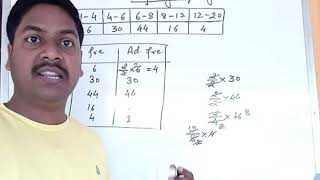
Now, consider a situation different from the one above. Example 3: A teacher wanted to analyse the performance of two sections of students in a mathematics test of 100 marks. Looking at their performances, she found that a few students got under 20 marks and a few got 70 marks or above. So she decided to group them into intervals of varying sizes as follows: 0 - 20, 20 - 30, . . ., 60 - 70, 70 - 100. Then she formed the following table:
Detailed Explanation
In this chunk, we discuss the situation where students' test scores are grouped into varying intervals. This is a standard practice when analyzing data to understand distributions better. Here, the scores are categorized into ranges—for example, 0 to 20, 20 to 30, etc.—which helps to visualize how many students fall into each category.
Examples & Analogies
Imagine a teacher who collects data on students' test scores just like a baker who collects various sizes of cookies. Just like the baker might group cookies by size (small, medium, large), the teacher groups students by their scores to see which group has the most students.
Identifying the Frequency Table
Chapter 2 of 6
🔒 Unlock Audio Chapter
Sign up and enroll to access the full audio experience
Chapter Content
Table 12.3: Marks Number of students 0 - 20 7 20 - 30 10 30 - 40 10 40 - 50 20 50 - 60 20 60 - 70 15 70 - above 8 Total 90
Detailed Explanation
This frequency table summarizes the number of students that fall into each marks interval. For example, 7 students scored between 0 and 20 marks, while 20 students scored between 40 and 50 marks. This clear representation allows one to quickly see how many students performed within each range, giving insights into the performance distribution.
Examples & Analogies
Think of a sports coach analyzing players’ running times. If the coach creates intervals for timing, it would showcase how many players completed their runs in under 10 minutes, between 10 and 15 minutes, and so on, helping to identify training needs.
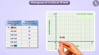
Constructing the Histogram
Chapter 3 of 6
🔒 Unlock Audio Chapter
Sign up and enroll to access the full audio experience
Chapter Content
A histogram for this table was prepared by a student as shown in Fig. 12.4. Carefully examine this graphical representation.
Detailed Explanation
A histogram is constructed using the frequency table. Each interval on the horizontal axis corresponds to a range of marks, and the height of the bar shows the number of students in that range. The absence of gaps between bars indicates that the intervals are continuous, making it easier to visualize how data is distributed across different score ranges.
Examples & Analogies
This is similar to stacking blocks where each block represents students' scores. If you had blocks representing how many scored between 0-20, 20-30, and so forth, the combined height of nearby blocks reflects overall performance in the class.
Misleading Histogram with Varying Widths
Chapter 4 of 6
🔒 Unlock Audio Chapter
Sign up and enroll to access the full audio experience
Chapter Content
No, the graph is giving us a misleading picture. As we have mentioned earlier, the areas of the rectangles are proportional to the frequencies in a histogram. Earlier this problem did not arise, because the widths of all the rectangles were equal. But here, since the widths of the rectangles are varying, the histogram above does not give a correct picture.
Detailed Explanation
In this chunk, we discuss the issue of misrepresentation in a histogram where the widths of the bars vary. Since the area represented should be proportional to the frequency of students within each interval, having unequal widths can lead to inaccurate interpretations. The areas of the rectangles must reflect the frequency correctly, not just their heights.
Examples & Analogies
It’s like comparing two cups of water: if one cup is wide and shallow and the other is tall and narrow, you can't directly determine which one holds more just by looking at their heights. Instead, you must consider both their height and volume.
Modifying Rectangle Lengths for Accuracy
Chapter 5 of 6
🔒 Unlock Audio Chapter
Sign up and enroll to access the full audio experience
Chapter Content
So, we need to make certain modifications in the lengths of the rectangles so that the areas are again proportional to the frequencies.
Detailed Explanation
To correct the previous misrepresentation, we adjust the length of the rectangles to ensure that their areas align with the frequencies they represent. This process involves selecting a common minimum class size, ensuring that the dimensions of each rectangle reflect this fixed proportion.
Examples & Analogies
Imagine you are organizing a bookshelf. If you want to display books that vary significantly in size, you need to use equal-height shelves for a fair comparison. If one shelf is much taller but houses fewer books compared to a shorter shelf, this visual disparity can mislead viewers about the popularity of each book.
Conclusion on Proper Histogram Construction
Chapter 6 of 6
🔒 Unlock Audio Chapter
Sign up and enroll to access the full audio experience
Chapter Content
The correct histogram with varying width is given in Fig. 12.5.
Detailed Explanation
This concluding chunk emphasizes the importance of properly constructing histograms, especially when dealing with variable widths. A correctly constructed histogram enables better understanding and accurate representation of data, highlighting important trends within the student performance data.
Examples & Analogies
Think of a well-organized toolbox: when each tool is in its right space, it’s easy to see what you have and how to access it. Similarly, an accurate histogram effectively organizes data, allowing immediate insight into performance trends.
Key Concepts
-
Histograms: Graphical representation where bars represent frequencies for continuous data.
-
Varying Class Widths: Adjusting bar widths according to designated intervals to maintain accurate frequency representation.
Examples & Applications
{'example': 'Constructing a Histogram from Student Weights', 'solution': 'Given class intervals and their frequencies, one should create bars with widths proportional to class ranges and heights corresponding to frequencies. For instance, for intervals 30-35 with frequency 10, the histogram bar would represent this accurately when widths are adjusted correctly.'}
Memory Aids
Interactive tools to help you remember key concepts
Rhymes
In a histo-gram, bars there stand, to show frequencies across the land.
Stories
Imagine a gardener (the histogram) stacking boxes (the bars) of vegetables by weight (the class intervals). Each stacked box must fit snugly together to represent how many vegetables fit in each weight category.
Memory Tools
Remember: H - Height for frequency, I - Interval for class range, S - Solid bars with no gaps, T - True representation!
Acronyms
HISTO - Height Indicates Statistical Tally Observed.
Flash Cards
Glossary
- Histogram
A graphical representation of the frequency distribution of numerical data, using bars to denote frequencies for continuous intervals.
- Class Interval
A range of values that the data is grouped into for frequency distribution.
- Frequency
The number of occurrences of a particular value or range of values in a dataset.
Reference links
Supplementary resources to enhance your learning experience.