
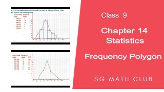
Frequency Polygon
Enroll to start learning
You’ve not yet enrolled in this course. Please enroll for free to listen to audio lessons, classroom podcasts and take practice test.
Interactive Audio Lesson
Listen to a student-teacher conversation explaining the topic in a relatable way.
Introduction to Frequency Polygons
🔒 Unlock Audio Lesson
Sign up and enroll to listen to this audio lesson

Today, we will explore frequency polygons. Who can tell me what a frequency polygon is?

Is it a type of graph?
Exactly! A frequency polygon visually represents data. It connects the midpoints of the histogram's bars with lines. Why do you think it might be useful?

Maybe to compare datasets?
That's right! It helps in comparing distributions more effectively. Let's build on that. Can anyone tell me how we calculate class midpoints?

You add the upper and lower limits and divide by 2, right?
Perfect! Remember, we need to include any zero-frequency classes too, which helps complete the polygon.
To summarize, a frequency polygon connects midpoints of histogram bars to display frequency distributions.
Constructing a Frequency Polygon
🔒 Unlock Audio Lesson
Sign up and enroll to listen to this audio lesson

Let's go through the steps of constructing a frequency polygon. First, we start with a histogram. What do we do next?
Find the midpoints and plot them?
Exactly! After we find midpoints, we plot them corresponding to their frequencies. Can anyone remind me about classes without data?

We include points for zero frequencies at the ends!
Correct! This keeps the polygon accurate. Again, remember to connect those points with straight lines.
So, the key steps are: draw the histogram, find midpoints, plot, and connect points - including zero frequencies!
Applications of Frequency Polygons
🔒 Unlock Audio Lesson
Sign up and enroll to listen to this audio lesson
Now, let's consider where frequency polygons can be used. Can someone give me an example?
Comparing test scores between two classes?
Great example! It helps visualize which class performed better. What about other scenarios?
Maybe in market research to compare different products?
Exactly! They are very helpful in many fields, including education and economics. Let's summarize the applications: color graphs, healthcare statistics, and more.
Introduction & Overview
Read summaries of the section's main ideas at different levels of detail.
Quick Overview
Standard
In this section, we explore frequency polygons, how to construct them from histograms, and their significance in representing continuous data visually. The section details the steps for creating a frequency polygon, including adjustments for class intervals without preceding or succeeding data.
Detailed
Frequency Polygon
A frequency polygon is a method to visually represent quantitative data. It is created by joining the midpoints of the upper sides of adjacent bars in a histogram with line segments. This representation offers an alternative way to visualize frequency distributions, making it easier to understand and compare different data sets.
To construct a frequency polygon:
1. Draw a Histogram: Begin by drawing a histogram to present your data visually. The histogram will show the frequencies of each class interval.
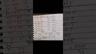
2. Find Class Midpoints: Calculate the midpoints (also called class marks) of each class interval. The class marks are determined by the formula:
Class-mark = (Upper limit + Lower limit) / 2
3. Plot the Points: Plot the class marks on the horizontal axis and their corresponding frequencies on the vertical axis.
4. Connect the Points: Join these points with straight lines to form the frequency polygon.
5. Include Zero Frequency Classes: To complete the polygon, it's important to include additional points for classes with zero frequencies at either end of the data set, ensuring the polygon accurately mirrors the histogram's area.
This method proves beneficial for comparing two sets of data, analyzing trends, and recognizing variations in frequency distribution. It also provides a clearer visual understanding than histograms alone, allowing for quicker insights into data patterns.
Youtube Videos


Audio Book
Dive deep into the subject with an immersive audiobook experience.
Understanding Frequency Polygons
Chapter 1 of 6
🔒 Unlock Audio Chapter
Sign up and enroll to access the full audio experience
Chapter Content
There is yet another visual way of representing quantitative data and its frequencies. This is a polygon. To see what we mean, consider the histogram represented by Fig. 12.3. Let us join the mid-points of the upper sides of the adjacent rectangles of this histogram by means of line segments. Let us call these mid-points B, C, D, E, F and G. When joined by line segments, we obtain the figure BCDEFG (see Fig. 12.6).
Detailed Explanation
A frequency polygon is a graphical representation that connects the midpoints of the top edges of bars in a histogram with straight lines. It effectively summarizes the data distribution represented by the histogram, helping visualize trends and patterns.
Examples & Analogies
Imagine the frequency polygon as a line graph that tracks the movement of a roller coaster. Each peak represents a high frequency in the dataset, showing that a lot of data points fall within that category.
Completing the Frequency Polygon
Chapter 2 of 6
🔒 Unlock Audio Chapter
Sign up and enroll to access the full audio experience
Chapter Content
To complete the polygon, we assume that there is a class interval with frequency zero before 30.5 - 35.5, and one after 55.5 - 60.5, and their mid-points are A and H, respectively. ABCDEFGH is the frequency polygon corresponding to the data shown in Fig. 12.3. We have shown this in Fig. 12.6.
Detailed Explanation
To ensure the frequency polygon represents the total area of the histogram, we add two hypothetical intervals at the beginning and end with a frequency of zero. This allows the polygon to extend smoothly and reflect the entire range of data.
Examples & Analogies
Think of this step like placing end caps on a tunnel. If your tunnel (graph) doesn't have secure ends, people might think it leads nowhere. Including zero-frequency intervals keeps the graph consistent and complete, representing reality accurately.
Constructing a Frequency Polygon Without a Histogram
Chapter 3 of 6
🔒 Unlock Audio Chapter
Sign up and enroll to access the full audio experience
Chapter Content
Frequency polygons can also be drawn independently without drawing histograms. For this, we require the mid-points of the class-intervals used in the data. These mid-points of the class-intervals are called class-marks.
Detailed Explanation
A frequency polygon can be created directly using the midpoints (class-marks) of the class intervals and their corresponding frequencies. This method is useful when histograms are not needed or desired, allowing for a simpler representation.
Examples & Analogies
Picture trying to create a map of your favorite restaurants without drawing the actual streets. You can still show where the concentrated areas of your favorite spots are located, much like plotting points for the frequency polygon.
Finding the Class Marks
Chapter 4 of 6
🔒 Unlock Audio Chapter
Sign up and enroll to access the full audio experience
Chapter Content
To find the class-mark of a class interval, we find the sum of the upper limit and lower limit of a class and divide it by 2. Thus, Class-mark = Upper limit + Lower limit / 2.
Detailed Explanation
To determine the midpoint of a class interval, simply add the lower and upper values and divide by two. This gives us a single point that represents where most of the data within that interval lies.
Examples & Analogies
It’s like finding the average age of a group of friends. If one friend is 20 and another is 30, saying they 'average the age of 25' helps you capture the essence of their ages without listing everyone.
Drawing a Frequency Polygon
Chapter 5 of 6
🔒 Unlock Audio Chapter
Sign up and enroll to access the full audio experience
Chapter Content
We can now draw a frequency polygon by plotting the class-marks along the horizontal axis, the frequencies along the vertical axis, and then plotting and joining the points B(145, 5), C(155, 10), D(165, 20), E(175, 9), F(185, 6) and G(195, 2) by line segments.
Detailed Explanation
To create the frequency polygon, you plot the calculated midpoints on the x-axis and the corresponding frequencies on the y-axis. Then connect these points with straight lines, forming the frequency polygon.
Examples & Analogies
This process is akin to connecting the dots in a drawing. Each dot corresponds to critical data points, and when you connect them, a clear picture emerges, showing trends and relationships between pieces of information.
Applications of Frequency Polygons
Chapter 6 of 6
🔒 Unlock Audio Chapter
Sign up and enroll to access the full audio experience
Chapter Content
Frequency polygons are used when the data is continuous and very large. It is very useful for comparing two different sets of data of the same nature, for example, comparing the performance of two different sections of the same class.
Detailed Explanation
Frequency polygons are particularly advantageous for visualizing large datasets, especially when comparing different groups. They allow for an easy visual comparison of distributions, showing where one group may outperform another.
Examples & Analogies
Think of frequency polygons as colorful ribbons draped over park benches during a festival. Each ribbon (dataset) can be seen side by side, allowing attendees to easily note which bench (data group) is the most popular for sitting.
Key Concepts
-
Frequency Polygon: A graph connecting midpoints of a histogram to show frequency distribution.
-
Class Mark: The midpoint value of a class interval.
-
Histogram: A type of graph representing frequencies using bars.
Examples & Applications
If a histogram shows class intervals of test scores, the frequency polygon would connect the midpoints of the bars to visualize trends.
In a population study, a frequency polygon can compare demographic data effectively.
Memory Aids
Interactive tools to help you remember key concepts
Rhymes
To find a midpoint, don't miss the beat, add limits, divide, and you’ll have a feat!
Stories
Imagine a polygon as a journey around a neighborhood. Each house is a class mark, and you connect them with strings, making sure to include the empty lots at the ends for a complete route.
Memory Tools
Polygon Process: H - Histogram -> M - Midpoints -> P - Plot -> C - Connect!
Acronyms
PLOT
Plotting Lines Of Trends for your frequency polygon.
Flash Cards
Glossary
- Frequency Polygon
A graphical representation that connects the midpoints of the upper sides of the bars in a histogram.
- Class Mark
The midpoint of a class interval, calculated by averaging the upper and lower limits.
- Histogram
A graphical representation of the frequency distribution of continuous data using rectangular bars.
Reference links
Supplementary resources to enhance your learning experience.