
Epicentre vs Isoseismal and Intensity Maps
Enroll to start learning
You’ve not yet enrolled in this course. Please enroll for free to listen to audio lessons, classroom podcasts and take practice test.
Interactive Audio Lesson
Listen to a student-teacher conversation explaining the topic in a relatable way.
Understanding Isoseismal Maps
🔒 Unlock Audio Lesson
Sign up and enroll to listen to this audio lesson

Today, we're going to learn about isoseismal maps. Does anyone know what they might be used for?

Are they used to show areas affected by earthquakes?
Exactly! Isoseismal maps connect points of equal seismic intensity. They visually represent how strong the shaking was in different locations.

So, the epicentre is where the shaking is strongest?
Correct! The epicentre usually lies at or near the innermost contour on an isoseismal map. Remember, 'I for Isoseismal and I for Intensity!'

What happens to intensity as we move away from the epicentre?
Good question! The intensity decreases radially outward from the epicentre. As distance increases, the shaking reduces, highlighted by the outer isoseismal contours.

How do we use these maps practically?
These maps help validate our epicentre calculations and inform urban planning, aiding in effective disaster preparedness.
To summarize, isoseismal maps show seismic intensity distribution, with the epicentre being the point of maximum intensity. Understanding this relationship helps us predict and prepare for seismic events.
Intensity vs Distance Relationship
🔒 Unlock Audio Lesson
Sign up and enroll to listen to this audio lesson

Now, let’s dive deeper into the intensity vs distance relationship. Can anyone explain why this relationship matters?
It helps us understand how much shaking different areas experience?
Exactly right! The closer you are to the epicentre, the stronger the shaking you feel. This principle is critical for assessing potential damage.
And does this help in validating measurements?
Yes! Comparing calculated epicentres with intensity data from isoseismal maps enables seismologists to check accuracy.
Are there specific formulas for this?
While there are models to estimate intensity based on distance, the simplest understanding is that intensity diminishes inversely with distance from the epicentre.
Can this help in emergency response?
Absolutely! Knowing where the epicentre is and how intensity changes aids in directing resources effectively.
Let’s summarize: The intensity of shaking decreases with distance from the epicentre, which is pivotal for validating epicentre measurements and planning responses effectively.
Introduction & Overview
Read summaries of the section's main ideas at different levels of detail.
Quick Overview
Standard
It elaborates on how isoseismal maps are created to connect points of equal seismic intensity, indicating that the epicentre generally lies at or near the strongest intensity contour on these maps. Additionally, it highlights the significance of the intensity-distance relationship in verifying epicentre calculations.
Detailed
Epicentre vs Isoseismal and Intensity Maps
This section addresses the crucial concepts of isoseismal maps and their relationship with earthquake epicentres.
Isoseismal Maps
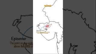
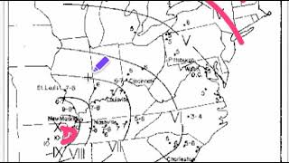
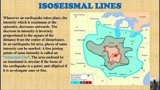
Isoseismal maps are contour maps that represent areas experiencing equal seismic intensity during an earthquake. They aid in visualizing the distribution of shaking intensity across a region. Importantly, the epicentre is typically found at or near the innermost isoseismal contour, indicating the zone of the highest intensity and ground motion.
Intensity vs Distance Relationship
The intensity of shaking is highest directly at the epicentre and decreases radially outward. This relationship is vital for confirming calculated epicentres against observational data from isoseismal maps, underscoring its importance in seismology and hazard assessment. Accurate understanding of how intensity diminishes with distance allows for improved early warning systems and urban planning, emphasizing the role of this data in validating modern seismic models.
Youtube Videos

Audio Book
Dive deep into the subject with an immersive audiobook experience.
Isoseismal Maps
Chapter 1 of 2
🔒 Unlock Audio Chapter
Sign up and enroll to access the full audio experience
Chapter Content
• Isoseismal Maps
• Contour maps connecting points of equal seismic intensity.
• Epicentre lies at or near the innermost, most intense isoseismal contour.
Detailed Explanation
Isoseismal maps are essential tools in the study of earthquakes. They appear as contour maps, which are similar to topographic maps but instead of showing elevation, they represent seismic intensity. In these maps, lines connect points where people experienced similar levels of shaking during an earthquake. The center point, or the epicentre, is often located at or very close to the innermost contour line, indicating the area where seismic waves were strongest.
Examples & Analogies
Think of an isoseismal map like a temperature map of a city where certain areas are shaded to show which regions are hotter or cooler. Just like the hottest area will be at the center, the strongest shaking from an earthquake will be closest to the epicentre, where the heat of the earthquake is felt the most.
Intensity vs Distance Relationship
Chapter 2 of 2
🔒 Unlock Audio Chapter
Sign up and enroll to access the full audio experience
Chapter Content
• Intensity vs Distance Relationship
• Epicentral intensity highest, decreases radially outward.
• Helps in validating calculated epicentre against field observations.
Detailed Explanation
The intensity of the seismic waves is highest at the epicentre and gradually decreases with distance from that point. This radial decrease is crucial for understanding the impact an earthquake has on different areas. By measuring the intensity of shaking at various locations, seismologists can validate their calculations of the epicentre's position based on these observations. This relationship is fundamental in earthquake studies as it helps engineers and scientists create safety measures and building codes to protect structures and populations in different zones.
Examples & Analogies
Imagine dropping a stone into a still pond. The ripples are strongest right at the point where the stone hits the water, creating the largest waves. As you move further away from the point of impact, the water gets calmer, similar to how the shaking from an earthquake diminishes as you move away from the epicentre.
Key Concepts
-
Isoseismal Maps: Contour maps that indicate areas of equal seismic intensity.
-
Epicentre: The point of maximum intensity in an earthquake.
-
Intensity-Distance Relationship: Intensity diminishes with distance from the epicentre, critical for validation.
Examples & Applications
Example of an isoseismal map indicating intensity levels during the 2015 Nepal earthquake, showcasing how intensity decreased with distance.
A case where the epicentre of an earthquake was confirmed against intensity reports, aiding in emergency response.
Memory Aids
Interactive tools to help you remember key concepts
Rhymes
At the epicentre, the shake is greater, isoseismal maps show where it's later.
Stories
Imagine an earthquake party where the center is the DJ; it's the loudest spot around, and as you move away, the sound fades, just like shaking intensity.
Memory Tools
Remember 'ISO' as 'Intensity Shows On'. It helps in recalling isoseismal maps' function.
Acronyms
I.E. - Intensity Equals - means that intensity decreases the further you get from the epicentre.
Flash Cards
Glossary
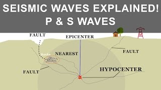
- Epicentre
The point on the Earth's surface directly above the hypocentre of an earthquake.
- Hypocentre
The actual location beneath the Earth's surface where an earthquake originates.
- Isoseismal Map
A contour map that connects points of equal seismic intensity.
- Intensity
The measure of shaking experienced during an earthquake, varying with distance from the epicentre.
Reference links
Supplementary resources to enhance your learning experience.