
Advanced Techniques in Thematic Cartography
Enroll to start learning
You’ve not yet enrolled in this course. Please enroll for free to listen to audio lessons, classroom podcasts and take practice test.
Interactive Audio Lesson
Listen to a student-teacher conversation explaining the topic in a relatable way.
Dynamic and Animated Maps
🔒 Unlock Audio Lesson
Sign up and enroll to listen to this audio lesson

Today we’re going to talk about dynamic and animated maps. Dynamic maps update their data in real-time. Can anyone think of examples where this might be important?

Maybe for tracking traffic?

Or monitoring air quality!
Great examples! Dynamic maps are crucial for real-time scenarios. Animated maps, on the other hand, show changes over time, such as urban development. Have any of you seen an animated map like this?

Yes! I saw one showing how cities grew from 1990 to 2020.
Exactly! Tools like Tableau and ArcGIS Dashboards help create these maps. Remember the acronym D.A.A. for Dynamic and Animated Maps, which can help you recall their importance.

D.A.A. helps us remember that both provide crucial insights into changes.
To wrap up this session, dynamic maps are essential for real-time updates, while animated maps effectively visualize changes over time. Make sure to explore tools like Tableau!
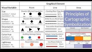
Multivariate Mapping
🔒 Unlock Audio Lesson
Sign up and enroll to listen to this audio lesson

Now, let’s discuss multivariate mapping. Who can tell me what that means?
Does it mean using multiple data sets on one map?
Exactly! It allows for complex visualizations. For instance, if we show rainfall patterns through color gradients and crop yields with proportional symbols. Why do you think this could be useful?
It helps in decision-making, especially in agriculture!
And civil engineering projects too!
Right! This technique is crucial for multi-criteria decision analysis in projects. To remember, use the mnemonic 'M.A.P.' for Multivariate Analysis in Projects.
That’s a clever way to remember it!
In summary, multivariate mapping combines multiple datasets for richer insights and is extremely valuable in various fields.
3D and Virtual Cartography
🔒 Unlock Audio Lesson
Sign up and enroll to listen to this audio lesson
Next, we’ll be talking about 3D and virtual cartography. Why do you think 3D maps are important?
They make it easier to visualize terrain!
Absolutely! They aid in planning infrastructures, especially in hilly terrains. Can you think of the tools used for creating 3D maps?
I think QGIS has a 3D view feature!
And Google Earth Pro is great for this too!
Correct! Software like ArcScene and BlenderGIS are also used. Remember ‘T.E.A.M.’ for Tools for Elevation Analysis in Mapping. This will help you recall the tools involved.
That’s a great way to remember various software!
In summary, 3D cartography enhances terrain visualization and is vital for accurate infrastructure planning.
Cartographic Automation
🔒 Unlock Audio Lesson
Sign up and enroll to listen to this audio lesson
Finally, let's dive into cartographic automation. What do you think this includes?
Using software to speed up map creation?
Exactly! Automation, such as using Python scripting with ArcPy, can make batch map creation easier. Can someone explain how this might help?
It saves time and reduces manual errors!
Plus, it can apply the same styles across many maps!
Right! You can remember the term 'A.C.T' for Automation in Cartography Techniques. This will help you associate it with the purpose.
That’s clever, I’ll use A.C.T. to remember it!
In summary, cartographic automation enhances the efficiency and accuracy of creating maps. Explore these tools to make your work easier!
Introduction & Overview
Read summaries of the section's main ideas at different levels of detail.
Quick Overview
Standard
Advanced techniques in thematic cartography emphasize innovative approaches such as dynamic and animated maps that provide real-time updates, multivariate mapping that combines multiple datasets, and 3D visualization that enhances terrain representation. Furthermore, automation is discussed through tools and scripting that streamline the map creation process.
Detailed
Advanced Techniques in Thematic Cartography
This section details advanced techniques in thematic cartography, designed to enhance the visualization and analysis of spatial data.
Dynamic and Animated Maps
- Dynamic Maps provide real-time updates, facilitating monitoring of situations like traffic flows and air quality.
- Animated Maps illustrate temporal changes, for example, depicting urban sprawl over different decades. Tools like Tableau, TimeSlider in QGIS, and ArcGIS Dashboards support these techniques.
Multivariate Mapping
- This technique integrates two or more datasets into one map, exemplifying complex information visually. For instance, presenting rainfall patterns as a color gradient while utilizing proportional symbols for crop yield effectively demonstrates multi-criteria decision-making (MCDA) in civil engineering projects.
3D and Virtual Cartography
- Utilizing Digital Elevation Models (DEMs) and LiDAR data, 3D cartography offers enhanced terrain visualization, critical for infrastructure planning, flood simulation, and slope analysis. Software tools like ArcScene, QGIS 3D View, BlenderGIS, and Google Earth Pro are instrumental in this area.
Cartographic Automation
- Automation tools such as Python scripting with ArcPy and ModelBuilder facilitate batch map creation, applying symbology, and exporting maps efficiently, reducing manual workload.
These advanced techniques not only improve the effectiveness and efficiency of cartographic practices but also push the boundaries of how spatial data can be represented and integrated in thematic mapping.
Youtube Videos


Audio Book
Dive deep into the subject with an immersive audiobook experience.
Dynamic and Animated Maps
Chapter 1 of 4
🔒 Unlock Audio Chapter
Sign up and enroll to access the full audio experience
Chapter Content
• Dynamic Maps update data in real-time, commonly used in monitoring traffic, air quality, and disaster situations.
• Animated Maps depict changes over time (e.g., urban sprawl from 1990 to 2025).
• Tools: Tableau, TimeSlider in QGIS, ArcGIS Dashboards.
Detailed Explanation
Dynamic maps continuously refresh data to display the most current information. For instance, they can show live traffic conditions or air quality levels that update as conditions change. On the other hand, animated maps present data in a time sequence, illustrating how certain variables evolve over a specified period. An example is visualizing urban development from 1990 to 2025, showing how the city has expanded. Tools like Tableau help create these visuals quickly and effectively by integrating datasets that can illustrate changes dynamically.
Examples & Analogies
Imagine a weather app on your phone: it continuously updates the current temperature and air quality index in your area, just like a dynamic map shows real-time information. Now think about a time-lapse video that shows a city being built over the years; that’s what an animated map does, showing how a location transforms over time.
Multivariate Mapping
Chapter 2 of 4
🔒 Unlock Audio Chapter
Sign up and enroll to access the full audio experience
Chapter Content
• Combines two or more datasets in a single map.
• Example: Showing rainfall patterns (color gradient) and crop yield (proportional symbols) together.
• Complex but powerful for multi-criteria decision analysis (MCDA) in civil projects.
Detailed Explanation
Multivariate mapping is a technique where more than one type of data is represented on the same map. For instance, a map might use color gradients to indicate rainfall levels in one area while using circles of varying sizes to represent the crop yield in those same regions. This layering of data can be complicated but provides a comprehensive view that aids in decision-making processes like resource allocation for agriculture or infrastructural development.
Examples & Analogies
Think of a dish that combines multiple flavors – for instance, a colorful fruit salad. Each fruit adds its own taste and color, creating a richer experience. Similarly, in multivariate mapping, combining different datasets allows for a deeper understanding of how various factors, like rainfall and crop yield, interact and influence each other in agricultural planning.
3D and Virtual Cartography
Chapter 3 of 4
🔒 Unlock Audio Chapter
Sign up and enroll to access the full audio experience
Chapter Content
• Use of Digital Elevation Models (DEMs) and LiDAR data for terrain visualization.
• 3D maps are essential in:
– Infrastructure planning in hilly terrain
– Flood simulation models
– Slope analysis for road alignment
• Software: ArcScene, QGIS 3D View, BlenderGIS, Google Earth Pro.
Detailed Explanation
3D and virtual cartography involve using advanced technologies like Digital Elevation Models (DEMs) and LiDAR data to create three-dimensional visualizations of terrain. These 3D maps help planners visualize landscapes, which is crucial for designing infrastructure in challenging terrains, such as mountains and valleys. For instance, when planning a highway, a 3D view can show how the road should curve around hills, ensuring safer and more efficient designs. This type of mapping is also used in simulations for flood risk assessments and analyzing slopes for construction projects.
Examples & Analogies
Consider the difference between looking at a flat map of a mountain region and a 3D model of that same region. The flat map merely shows you 2D information, while the 3D model helps you see the steepness of hills and valleys, making it easier to understand where to build a road or where a flood might occur – much like how architects use 3D models of buildings to visualize how a structure will look and fit within its environment.
Cartographic Automation
Chapter 4 of 4
🔒 Unlock Audio Chapter
Sign up and enroll to access the full audio experience
Chapter Content
• Use of Python scripting (e.g., with ArcPy) and ModelBuilder for batch map creation.
• Automates:
– Map generation
– Symbology application
– Exporting and publishing.
Detailed Explanation
Cartographic automation involves using scripts and tools to streamline map-making processes, making them faster and more efficient. For example, Python scripting allows cartographers to write code that automatically generates maps based on pre-defined templates and datasets. This reduces the time it takes to create maps manually and ensures consistency across multiple maps. ModelBuilder is another tool that provides a visual way to automate complex workflows in GIS. By automating tasks like applying symbology or exporting maps, cartographers can focus on analyzing the data rather than getting bogged down in repetitive tasks.
Examples & Analogies
Imagine using a photocopier: you only have to set it up once, and it can churn out page after page of the same document without you having to do anything else. Similarly, with automation in cartography, once everything is set up, the computer can produce numerous maps quickly and accurately on command, making the process much like creating multiple copies of a well-prepared document.
Key Concepts
-
Dynamic Maps: Maps that dynamically update with real-time data.
-
Animated Maps: Maps that visualize data changes over time.
-
Multivariate Mapping: Mapping that combines multiple datasets for comprehensive analysis.
-
3D Cartography: Visualization of terrain and features in three dimensions.
-
Cartographic Automation: Use of automated tools and scripts for efficient map creation.
Examples & Applications
Dynamic Maps can be utilized to monitor air quality in urban areas where pollution levels fluctuate throughout the day.
Animated maps can illustrate the growth of cities by showing changes in land use over the decades.
Multivariate mapping can associate rainfall patterns with agricultural productivity on a single map.
3D cartography can help urban planners visualize hilly terrains for infrastructure projects.
Cartographic automation can help create hundreds of maps quickly and consistently using Python scripts.
Memory Aids
Interactive tools to help you remember key concepts
Rhymes
Dynamic and animated maps, keep changes in sight, they show us the world, both day and night.
Stories
Imagine a city that grows every year. A series of animated maps show how parks appear, roads expand, and neighborhoods change—allowing planners to keep track of their work with ease.
Memory Tools
Remember 'D.A.A.' for Dynamic and Animated Maps, emphasizing their importance in monitoring and visualizing change.
Acronyms
Use 'M.A.P.' for Multivariate Analysis in Projects, a reminder of combining data insights in mapping.
Flash Cards
Glossary
- Dynamic Maps
Maps that update data in real-time.
- Animated Maps
Maps that visually depict changes over time.
- Multivariate Mapping
Combining multiple datasets into a single map to present complex information.
- 3D Cartography
The representation of spatial features in three dimensions, enhancing terrain visualization.
- Cartographic Automation
The use of software tools and scripts to create maps automatically.
Reference links
Supplementary resources to enhance your learning experience.