
Types of Thematic Maps
Enroll to start learning
You’ve not yet enrolled in this course. Please enroll for free to listen to audio lessons, classroom podcasts and take practice test.
Interactive Audio Lesson
Listen to a student-teacher conversation explaining the topic in a relatable way.
Choropleth Maps
🔒 Unlock Audio Lesson
Sign up and enroll to listen to this audio lesson

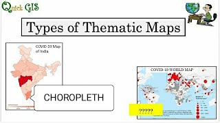
Let's start with choropleth maps. These maps represent statistical data through shaded regions. They are particularly effective for displaying normalized data, such as population density.

What do you mean by 'normalized data'?
Great question! Normalized data means adjusting values measured on different scales to a common scale, which helps avoid misleading interpretations. For example, when showing population density, we divide the population by the area to get a standardized measure.

Could a choropleth map be misleading?
Yes! If not properly normalized, it can exaggerate differences. It's all about how we display the data. Remember the acronym 'GOLD'—Gather, Organize, Legitimize, and Display—to ensure data integrity.

Can you give us an example of where these maps are used?
Absolutely! They are widely used in politics for election results, showing how many votes each candidate received per region.
In summary, choropleth maps are important for representing statistical data but watch for normalization to prevent misleading graphics.
Dot Density Maps
🔒 Unlock Audio Lesson
Sign up and enroll to listen to this audio lesson

Now let's move on to dot density maps. These maps use dots to represent a fixed quantity of occurrence. Each dot might represent, say, 1,000 people.

How do these help us understand spatial distribution?
They provide a visual representation of data density, making it easy to see where concentrations of the phenomenon exist. It's like seeing the population laid out point by point.
Are there any downsides to using them?
Certainly! They can get crowded if too many dots are placed in a small area, which can confuse the reader. The mnemonic 'DOTS'—Density Of The Spatial distribution—can help you remember their purpose.
Let’s recap: Dot density maps visualize quantities through dots—to see distribution but be cautious of crowding. Remember, less can be more!
Proportional Symbol Maps
🔒 Unlock Audio Lesson
Sign up and enroll to listen to this audio lesson
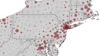
Next on our agenda are proportional symbol maps. On these maps, symbols—often circles—are scaled according to the magnitude of the data values.
What kind of data do we typically use with these maps?
We usually use quantitative values, such as population size or sales revenue at various locations. They help viewers quickly compare data points.
Can they become confusing if a lot of data is present?
Definitely! Overlap and clutter can obscure important insights. Keep in mind the three Cs of cartography—Clarity, Conciseness, and Communication, to maintain effectiveness.
To summarize, proportional symbol maps are effective for comparing quantitative data visually but be wary of clustering. Clarity is vital!
Isoline Maps
🔒 Unlock Audio Lesson
Sign up and enroll to listen to this audio lesson
Now let's discuss isoline maps. These maps are used to display continuous data with lines connecting points of equal value—like elevation or temperature.
How exactly do these maps function?
Isoline maps present a clearer understanding of gradients. For instance, in a temperature map, lines connect areas with the same temperature, illustrating how it changes across regions.
What should we watch out for with these maps?
You need to ensure that the intervals between the lines are appropriate to avoid misleading representations. Remember the phrase 'Equal Isolated' to recall that each line connects equal values.
In conclusion, isoline maps effectively show continuous changes through equal lines, but be cautious of interval representation.
Introduction & Overview
Read summaries of the section's main ideas at different levels of detail.
Quick Overview
Standard
In this section, we explore several types of thematic maps including choropleth maps, dot density maps, proportional symbol maps, isoline maps, cartograms, flow maps, and heat maps. Each type is discussed in terms of its definition, usage, advantages, and potential pitfalls.
Detailed
Types of Thematic Maps
Thematic maps are specialized visual representations that focus on a specific theme, highlighting spatial patterns and relationships. Here are the primary types:
Choropleth Maps
- Represent statistical data through shaded or colored regions. Particularly useful for normalized data, such as population density but can mislead if not normalized properly.
Dot Density Maps
- Visualize the distribution of phenomena using dots, where each dot represents a fixed quantity. They’re effective for showing spatial distributions like population.
Proportional Symbol Maps
- Use symbols, typically circles, scaled according to the magnitude of data values. These maps allow for comparisons across different locations but can become cluttered with too much data.
Isoline Maps
- Display continuous variables (e.g., temperature, elevation) with lines connecting points of equal value. Are essential for physical and environmental sciences.
Cartograms
- Distort geographic regions to convey information by size, such as illustrating population distributions; effective for thematic storytelling.
Flow Maps
- Represent the movement of goods, people, or data, using arrows where width signifies quantity and direction, aiding in understanding flow dynamics.
Heat Maps (Density Maps)
- Utilize color gradients to represent the density of occurrences, commonly used in contexts like crime mapping and retail analysis.
These diverse types of thematic maps are crucial for visualizing spatial data, aiding in analysis and decision-making across various fields.
Youtube Videos


Audio Book
Dive deep into the subject with an immersive audiobook experience.
Choropleth Maps
Chapter 1 of 7
🔒 Unlock Audio Chapter
Sign up and enroll to access the full audio experience
Chapter Content
Choropleth Maps
• Represent statistical data using shaded or colored regions.
• Suitable for normalized data (e.g., population density).
• Pitfalls: Misleading if not normalized.
Detailed Explanation
Choropleth maps are a type of thematic map where specific areas (like countries, states, or districts) are shaded or colored to represent statistical data. For instance, areas with higher population densities might be shown in a darker color, while less populated areas are shown in a lighter shade. These maps are effective for representing normalized data such as population density, which adjusts figures to account for the size of the areas being represented. However, it is crucial to ensure that the data is normalized; otherwise, the maps can present a misleading impression of the data, suggesting trends or differences that don't truly exist.
Examples & Analogies
Imagine you are looking at a map that colors each state in the U.S. based on the number of people living there. If California is darkly shaded and Wyoming is lightly shaded, you might quickly assume that California is far more populated—this is true. But if California's population was described without considering its large land area, it might seem overly stark compared to a smaller state's density, leading to a misinterpretation of how crowded each area truly is.
Dot Density Maps
Chapter 2 of 7
🔒 Unlock Audio Chapter
Sign up and enroll to access the full audio experience
Chapter Content
Dot Density Maps
• Use dots to represent a fixed quantity.
• Useful for visualizing spatial distribution of phenomena like population.
Detailed Explanation
Dot density maps are another form of thematic mapping that uses dots to represent a specific quantity of a phenomenon. Each dot stands for a set amount, such as 1,000 people, and is randomly distributed within geographical boundaries. This visual approach enables viewers to see the concentration and distribution of the variable being represented, making it easy to identify patterns across different regions.
Examples & Analogies
Think of a dot density map as a chocolate chip cookie—each chocolate chip represents a certain number of people in a neighborhood. When you look at the cookie, you can see where most of the chocolate chips (representing the higher population) are clustered, giving you a clear visual of where the most people live, just as you can see where there are more chocolate chips in the cookie!
Proportional Symbol Maps
Chapter 3 of 7
🔒 Unlock Audio Chapter
Sign up and enroll to access the full audio experience
Chapter Content
Proportional Symbol Maps
• Symbols (usually circles) scaled in proportion to data values.
• Effective for comparing quantitative values between locations.
Detailed Explanation
Proportional symbol maps use symbols, commonly circles, whose sizes vary according to the value they represent. For example, a larger circle might indicate a city with a larger population, while a smaller circle could represent a city with a smaller population. This method allows for easy visual comparison between different locations to see which areas have larger or smaller values at a glance.
Examples & Analogies
Imagine a bubble bath—each bubble represents a city with a population, and the size of each bubble reflects how many people live there. A large bubble means a big city, while a tiny bubble indicates a smaller town. By looking at the bath, you can immediately tell which 'cities' are large and which are small, just like a proportional symbol map helps you see how communities measure up against each other.
Isoline Maps
Chapter 4 of 7
🔒 Unlock Audio Chapter
Sign up and enroll to access the full audio experience
Chapter Content
Isoline Maps
• Show continuous data (e.g., elevation, temperature) with lines of equal value.
• Include contour maps, isobars, isotherms.
Detailed Explanation
Isoline maps feature lines that connect points of equal value, whether representing elevation, temperature, or other continuous data. For example, a contour map of a mountain would show lines representing different elevations, helping hikers understand the terrain. Similarly, isotherm lines represent areas of equal temperature, useful in meteorology for weather forecasting.
Examples & Analogies
Imagine you're on a hiking trip in the mountains and you look at a map with lines drawn across it. These lines show how high the ground is—all the points on the same line are the same elevation. It's like creating a 3D landscape on flat paper; instead of cliffs and valleys, you see lines that tell you where the slopes go up and down, making it easier to find your way.
Cartograms
Chapter 5 of 7
🔒 Unlock Audio Chapter
Sign up and enroll to access the full audio experience
Chapter Content
Cartograms
• Distort geographic space to represent a variable (e.g., resizing states based on population).
• Useful for emphasis in thematic storytelling.
Detailed Explanation
Cartograms take a conventional map and distort its shapes to emphasize specific data. For example, if a state like Texas has a significantly larger population than Vermont, in a cartogram, Texas would appear much larger than its true size, making it clear how population distribution contrasts across states. This technique helps viewers quickly grasp the importance of the data being presented.
Examples & Analogies
Think of a balloon animal—if you inflate the balloon part for Texas and keep Vermont's tiny, you get a cartoonish version of the U.S. map that helps everyone see where the 'large' populations are just by looking. It's an exaggerated, fun way to show how significant that data is without needing to rely on exact measurements or numbers.
Flow Maps
Chapter 6 of 7
🔒 Unlock Audio Chapter
Sign up and enroll to access the full audio experience
Chapter Content
Flow Maps
• Represent movement of goods, people, or data using arrows.
• Width and direction indicate quantity and direction.
Detailed Explanation
Flow maps illustrate the movement and flow of resources, people, goods, or data between locations, using arrows that vary in size to reflect the volume. The direction of the arrows shows the flow's direction, while their thickness indicates how much is being transported. These maps are particularly useful in understanding trade routes, migration paths, or traffic patterns.
Examples & Analogies
Imagine a busy highway map where arrows represent cars traveling. A thick arrow means heavy traffic (lots of cars), while a thin arrow indicates less congestion. Just like seeing arrows on your GPS, flow maps help you visualize how things move from one place to another, making it easier to plan your journey or understand trade routes!
Heat Maps (Density Maps)
Chapter 7 of 7
🔒 Unlock Audio Chapter
Sign up and enroll to access the full audio experience
Chapter Content
Heat Maps (Density Maps)
• Represent intensity of occurrences with color gradients.
• Commonly used in crime mapping, traffic accidents, and retail planning.
Detailed Explanation
Heat maps use color gradients to show the density or intensity of a particular phenomenon across a geographical area. Areas with higher occurrences are displayed in hotter colors (like red or orange), while areas with fewer occurrences are shown in cooler colors (like blue or green). This type of mapping is widely used in various fields, including urban planning, public safety, and market analysis, to visualize where events or characteristics are concentrated.
Examples & Analogies
Think of a restaurant’s popularity over a week. If the restaurant is very busy, the 'heat' map would reflect that in bright red where most tables are filled, while areas with fewer patrons might show a softer blue. It’s an easy way to see where attention (or in this case, people) is concentrated, just like looking at a school attendance report for hotspots of activity!
Key Concepts
-
Choropleth Maps: Maps that visualize statistical data by shading geographic regions based on data values.
-
Dot Density Maps: Use dots to represent varied quantities in a given area, visualizing distribution effectively.
-
Proportional Symbol Maps: Employ symbols of varying sizes to represent quantities, allowing comparison.
-
Isoline Maps: Depict continuous data by connecting points of equal value with lines.
-
Cartograms: Maps that distort geographic areas based on data, often useful for thematic storytelling.
-
Flow Maps: Represent the movement and directionality of data or objects across spaces using arrows.
-
Heat Maps: Use color gradients to provide a visual scale of occurrence intensity.
Examples & Applications
Choropleth maps are often used in election analysis to display voter distribution across regions.
Dot density maps can show the distribution of pet license registrations in a city, visually representing where people are more likely to own pets.
Proportional symbol maps might display the volume of sales revenue by varying the size of circles representing different stores.
Isoline maps are used in meteorology to visualize temperature spread across geographical areas.
Cartograms can be used to show electoral votes where states are enlarged or shrunk based on population size.
Flow maps visually illustrate the routes taken by goods transported from one location to another, useful in logistics and transportation analysis.
Heat maps can be used to highlight areas of high traffic accidents in a city, indicating where safety measures may be required.
Memory Aids
Interactive tools to help you remember key concepts
Rhymes
For data displayed in shades and colors bright, choropleth maps show us the statistical light.
Stories
Imagine a city where each dot represents a pet. As we place dots on the map, we visualize where pets are most frequent—this is the magic of dot density maps.
Memory Tools
To remember the types of maps, think 'CPID FCD'—Choropleth, Proportional Symbols, Isolines, Dot Density, followed by Flow and Cartograms.
Acronyms
For selecting effective maps, use the acronym 'Scene'
for Size
for Clarity
for Encapsulation
for Navigation
and E for Engagement.
Flash Cards
Glossary
- Choropleth Map
A thematic map using shades or colors to represent statistical data for defined geographic areas.
- Dot Density Map
A map that uses dots to represent the presence or quantity of a phenomenon in a given area.
- Proportional Symbol Map
A thematic map where symbols are scaled in proportion to the data values they represent.
- Isoline Map
A map that uses continuous lines to connect points of equal value, typically for data such as temperature or elevation.
- Cartogram
A map that distorts the shapes and sizes of geographic regions based on a chosen variable.
- Flow Map
A map that uses arrows to show the movement of data, people, or goods between locations.
- Heat Map
A visual representation of data that uses color gradients to indicate the intensity of a variable.
Reference links
Supplementary resources to enhance your learning experience.