
Correlation Analysis
Enroll to start learning
You’ve not yet enrolled in this course. Please enroll for free to listen to audio lessons, classroom podcasts and take practice test.
Interactive Audio Lesson
Listen to a student-teacher conversation explaining the topic in a relatable way.
Introduction to Correlation
🔒 Unlock Audio Lesson
Sign up and enroll to listen to this audio lesson

Welcome class! Today we're going to explore correlation analysis. Can anyone tell me what correlation means?

Isn't it about how two things are related to each other?
Exactly, Student_1! Correlation measures the degree and direction of relationship between two variables.

Why is that important?
Great question! Understanding correlation helps us make predictions and decisions based on data. It informs us about how strongly related these variables are.

So, what types of correlation are there?
There are three main types: positive correlation, where both variables move in the same direction; negative correlation, where one variable increases as the other decreases; and no correlation, indicating no recognizable relationship.

Can you give an example of positive correlation?
Sure! Think of height and weight — generally, as height increases, weight tends to increase as well. Remember: 'Height and weight go hand in hand!'
To summarize, correlation analysis is critical for understanding and interpreting the relationship between variables.
Types of Correlation
🔒 Unlock Audio Lesson
Sign up and enroll to listen to this audio lesson

Let's dig deeper into the types of correlation. Can anyone recall what positive correlation means?
It’s when both variables increase or decrease together.
Correct! How about negative correlation?
That's when one variable increases while the other decreases.
Absolutely right! Now, what about no correlation?
That means there's no noticeable relationship!
Exactly! Let's visualize this using scatter diagrams. What do you think a scatter diagram shows?
It shows the relationship between two variables using dots!
Yes! Each point represents a pair of values. So, if we plot our height and weight, we can see the type of correlation visually. Remember: positive correlation looks like an upward slope, while negative correlation looks like a downward slope.
Correlation Coefficient
🔒 Unlock Audio Lesson
Sign up and enroll to listen to this audio lesson
Now, let’s move on to the correlation coefficient. Who knows what this is?
Is it a number that tells us how strong the correlation is?
Exactly! The correlation coefficient ranges from -1 to 1. A value close to 1 indicates strong positive correlation, while a value close to -1 shows strong negative correlation.
And a value near 0 means...?
It indicates weak or no correlation! Let's look at how we can calculate it. There are methods for raw and grouped data. Who can tell me which method would you choose for specific data types?
Raw data for individual values and grouped data for summarized information?
Perfect! It’s essential to use the correct method for accurate results. Remember: the right calculation method leads to the correct interpretation.
Interpreting the Correlation Coefficient
🔒 Unlock Audio Lesson
Sign up and enroll to listen to this audio lesson
Now, let's summarize how to interpret the correlation coefficient. What do values closer to 1 or -1 tell us?
It means there's a strong positive or negative correlation!
Right! And values around 0 indicate what?
Weak or no correlation!
Exactly! Understanding these interpretations helps in making predictions based on data relationships. To conclude our session, what is the main takeaway about correlation analysis?
Correlation analysis helps us understand and quantify relationships between variables!
Well done! Always remember that correlation does not imply causation; it merely shows a relationship!
Introduction & Overview
Read summaries of the section's main ideas at different levels of detail.
Quick Overview
Standard
This section introduces correlation's definition, types, visual representation through scatter diagrams, and the correlation coefficient, which quantifies the relationship between variables.
Detailed
Correlation Analysis
Correlation analysis serves as a foundational concept in statistics, primarily focusing on the relationship between two quantitative variables. Understanding this relationship is crucial for interpreting data influenced by these variables. The section outlines the types of correlation, such as positive, negative, and no correlation, each depicting how the variables interact. Key graphical tools, like the scatter diagram, are utilized to visually represent these relationships, allowing for easier interpretation. Moreover, the correlation coefficient is introduced as a numerical measure quantifying the strength and direction of a linear relationship, ranging from -1 to 1. Methods for calculating the correlation coefficient, both for raw and grouped data, are also detailed. Finally, the interpretation of the correlation coefficient provides insight into the significance and nature of the correlations observed.
Youtube Videos


Audio Book
Dive deep into the subject with an immersive audiobook experience.
Introduction to Correlation Analysis
Chapter 1 of 6
🔒 Unlock Audio Chapter
Sign up and enroll to access the full audio experience
Chapter Content
Correlation analysis studies the relationship between two quantitative variables to determine whether and how strongly they are related.
Detailed Explanation
Correlation analysis is a statistical method used to understand how two numerical variables interact with each other. When analyzing data, we often want to know if changes in one variable correspond with changes in another. For example, if we observe that as a student's study time increases, their exam scores tend to improve, we are looking at a correlation. The process helps quantify this relationship and assess the strength of the connection between the two variables.
Examples & Analogies
Imagine a farmer who grows crops. If the farmer notices that every time they water the plants more, the plants grow taller, they are seeing a correlation. If they keep a record of water amounts and plant heights, they can analyze the degree to which these two variables are linked. This insight can lead to better farming practices.
Types of Correlation
Chapter 2 of 6
🔒 Unlock Audio Chapter
Sign up and enroll to access the full audio experience
Chapter Content
Correlation can be:
● Positive Correlation: Both variables increase or decrease together.
● Negative Correlation: One variable increases as the other decreases.
● No Correlation: No recognizable relationship between the variables.
Detailed Explanation
There are three main types of correlation:
1. Positive Correlation occurs when two variables increase or decrease together. For instance, if studying more hours leads to higher test scores, those two variables have a positive correlation.
2. Negative Correlation happens when one variable increases while the other decreases. An example could be the relationship between exercise time and weight; more exercise might lead to lower weight.
3. No Correlation indicates that there is no clear connection between the variables; changes in one do not predict changes in the other.
Examples & Analogies
Think of a seesaw in a playground. When one side goes up (positive correlation), the other side goes down (negative correlation). When neither side is moving, they're unconnected (no correlation). This helps us visualize how variable relationships can shift in different ways.
Scatter Diagram
Chapter 3 of 6
🔒 Unlock Audio Chapter
Sign up and enroll to access the full audio experience
Chapter Content
A graphical representation plotting paired data points to visualize the relationship between two variables.
Detailed Explanation
A scatter diagram is a visual tool that displays the relationship between two variables using points on a graph. Each point represents an observation, with one variable on the x-axis (horizontal) and the other on the y-axis (vertical). By looking at the pattern of points, you can quickly assess whether a correlation exists—if they trend upwards, there's a positive correlation; if downwards, a negative correlation; if scattered, there's little to no correlation.
Examples & Analogies
Imagine you’re plotting how many hours you play video games against the grades you receive. Each time you record your data, you place a dot on the graph. Over time, you may notice that the dots create a pattern—showing you whether playing more correlates with higher or lower grades, or if it doesn’t impact them at all.
Correlation Coefficient
Chapter 4 of 6
🔒 Unlock Audio Chapter
Sign up and enroll to access the full audio experience
Chapter Content
A numerical measure ranging between -1 and 1 that quantifies the strength and direction of a linear relationship between two variables.
Detailed Explanation
The correlation coefficient is a statistic that tells us how strongly two variables are correlated. It ranges from -1 to 1. A value of 1 indicates a perfect positive correlation (as one variable increases, the other does too), while -1 indicates a perfect negative correlation (as one increases, the other decreases). A value of 0 signifies no correlation. This coefficient helps clarify the degree of relationship beyond visual impressions from scatter diagrams.
Examples & Analogies
Think of the correlation coefficient like a temperature scale for relationships. A perfect positive correlation (1) is like boiling water; everything is bubbling together. A perfect negative correlation (-1) is like ice; everything is frozen at the bottom. No correlation (0) is like a warm room; nothing is happening in any direction.
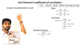
Calculation of Correlation Coefficient
Chapter 5 of 6
🔒 Unlock Audio Chapter
Sign up and enroll to access the full audio experience
Chapter Content
Methods to calculate the correlation coefficient include:
● Using raw data formulas.
● Using grouped data formulas.
Detailed Explanation
To find the correlation coefficient, we can use different methods based on how our data is organized. If we have a list of individual data points (raw data), specific formulas help directly compute the coefficient. Alternatively, if we have summarized data (grouped data), there are distinct formulas to determine the correlation, as these methods consider how data aggregates affect the overall relationship. Each method provides essential insights depending on the format of the data.
Examples & Analogies
Imagine you're baking. If you have a recipe for one cake (raw data), you know exactly how much sugar and flour to use. But if you're cooking for a large party and have a bulk recipe (grouped data), the proportions change. Similarly, finding correlation coefficients requires the right recipe depending on your data structure.
Interpretation of Correlation Coefficient
Chapter 6 of 6
🔒 Unlock Audio Chapter
Sign up and enroll to access the full audio experience
Chapter Content
Values close to +1 or -1 indicate strong positive or negative correlation respectively, while values near 0 indicate weak or no linear correlation.
Detailed Explanation
After calculating the correlation coefficient, it's important to interpret what the value signifies. If the value is near +1, it means there is a strong positive relationship, where both variables move in the same direction. If the value is near -1, it indicates a strong negative relationship, where one variable increases as the other decreases. A value around 0 suggests that there is minimal or no linear relationship between the variables. Understanding these values helps in gauging the connection strength effectively.
Examples & Analogies
Think of a sports coach analyzing player performance. A player whose scoring increases with practice hours would have a correlation closer to +1, while one who plays less but improves in defense may show a -1 value if analyzing points versus defense. A player who shows no trend between hours practiced and points scored would be at or around 0, indicating no correlation.
Key Concepts
-
Correlation: A statistical measure of relationships between variables.
-
Types of Correlation: Positive, negative, and no correlation define how variables move together.
-
Scatter Diagram: Visualizes the relationship of two variables through plotted points.
-
Correlation Coefficient: Quantifies the relationship between two variables on a scale from -1 to 1.
Examples & Applications
A positive correlation is seen in the height and weight of individuals, where both tend to increase together.
A negative correlation can be observed in the relationship between exercise frequency and body weight, where increased exercise might lead to decreased weight.
Memory Aids
Interactive tools to help you remember key concepts
Rhymes
When variables align and go uphill, that's positive; when they fall apart, it's negative still.
Stories
Imagine two friends, Jack and Jill. They both study harder and get higher marks, representing positive correlation. Then, Jack exercises more, while Jill, an active gamer, finds her marks dropping slightly, illustrating negative correlation.
Memory Tools
Remember: 'Positive goes together, negative goes opposite'.
Acronyms
PENG (Positive, Negative, No correlation) - helps to remember the three types.
Flash Cards
Glossary
- Correlation
A statistical measure that describes the extent to which two variables change together.
- Positive Correlation
A relationship where both variables increase or decrease together.
- Negative Correlation
A relationship where one variable increases while the other decreases.
- No Correlation
A situation where no discernible relationship exists between two variables.
- Scatter Diagram
A graphical representation that plots paired data points to visualize the relationship between two variables.
- Correlation Coefficient
A numerical value between -1 and 1 that quantifies the strength and direction of a linear relationship.
- Raw Data
Data that has not been processed or manipulated.
- Grouped Data
Data that has been summarized into groups for easier analysis.
Reference links
Supplementary resources to enhance your learning experience.