
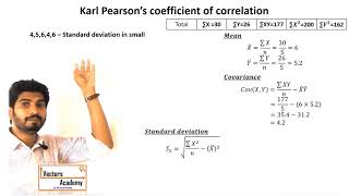
Scatter Diagram
Enroll to start learning
You’ve not yet enrolled in this course. Please enroll for free to listen to audio lessons, classroom podcasts and take practice test.
Interactive Audio Lesson
Listen to a student-teacher conversation explaining the topic in a relatable way.
Understanding Scatter Diagrams
🔒 Unlock Audio Lesson
Sign up and enroll to listen to this audio lesson

Today we're going to learn about scatter diagrams. Can anyone tell me what they think a scatter diagram is?

I think it’s a way to plot points on a graph?
Exactly! A scatter diagram shows pairs of data points that represent two quantitative variables. Why do you think we plot these points?

To see if there's a relationship between the two variables?
Correct! This helps us visualize if there's a correlation. For instance, if we plot the height and weight of several individuals, we can see if taller people tend to weigh more.
Patterns in Scatter Diagrams
🔒 Unlock Audio Lesson
Sign up and enroll to listen to this audio lesson

Now let’s talk about the patterns we can see in scatter diagrams. What kinds of relationships might we observe?

Positive correlation where both variables go up together?
Yes! That's one! Can anyone describe a negative correlation?

It would mean when one variable increases, the other decreases?
Absolutely right! And what if there is no correlation?
It means there's no clear pattern?
Exactly! When you see scattered points without a clear trend, it indicates no correlation.
Creating a Scatter Diagram
🔒 Unlock Audio Lesson
Sign up and enroll to listen to this audio lesson
Let's try creating a scatter diagram together! Suppose we have data on the hours studied and exam scores. How would we start?
We’d put the number of hours studied on the X-axis?
Great! And where would the exam scores go?
On the Y-axis!
Exactly! And we would plot each student's hours studied against their score. Can anyone predict what the scatter diagram might show?
Maybe a positive correlation, since studying more often leads to higher scores?
That’s a well-reasoned prediction! Let’s plot the data and see what we get.
Interpreting Scatter Diagrams
🔒 Unlock Audio Lesson
Sign up and enroll to listen to this audio lesson
After plotting our data, we've made a scatter diagram. What do we observe?
There’s an upward trend, so it looks like there's a positive correlation!
Yes! How might this information be useful in real life?
It could help teachers understand how study habits affect scores!
And they could adjust their teaching methods based on this!
Exactly! Scatter diagrams can be a powerful tool for interpreting data and making informed decisions.
Introduction & Overview
Read summaries of the section's main ideas at different levels of detail.
Quick Overview
Standard
This section explains scatter diagrams as graphical tools used to visualize the correlation between two variables. The patterns formed by the plotted points help in interpreting the nature and strength of their relationship.
Detailed
Scatter Diagram
The scatter diagram is a crucial tool in correlation analysis, providing a visual correlation indicator between two quantitative variables. By plotting individual data points on a two-dimensional graph, we can observe how one variable correlates with another. Each point represents a pair of values — one from each variable — allowing us to analyze whether the relationship appears to be positive, negative, or non-existent.
Key Features of Scatter Diagrams:
- Axes Designation: The horizontal axis (X-axis) typically represents the independent variable, while the vertical axis (Y-axis) represents the dependent variable, indicating what you wish to predict or explain based on the independent variable.
- Data Points: Each point on the scatter diagram corresponds to different pairs of variable values from your dataset.
- Pattern Recognition: Observing the scatter of points helps determine the type of correlation present:
- Positive Correlation: Points slope upwards indicating that as one variable increases, so does the other.
- Negative Correlation: Points slope downwards, suggesting that as one variable increases, the other decreases.
- No Correlation: No discernible pattern among the points, indicating random distribution.
In summary, scatter diagrams provide an intuitive way to visualize the relationship between variables before calculating formal measures of correlation, helping to identify trends that may warrant further analysis.
Youtube Videos


Audio Book
Dive deep into the subject with an immersive audiobook experience.
Definition of Scatter Diagram
Chapter 1 of 4
🔒 Unlock Audio Chapter
Sign up and enroll to access the full audio experience
Chapter Content
A graphical representation plotting paired data points to visualize the relationship between two variables.
Detailed Explanation
A scatter diagram is a visual tool used to understand the relationship between two quantitative variables. Each point on this diagram represents a pair of values from the two variables being studied. By plotting these points on a graph, we can see the pattern and direction of the relationship. This helps us identify whether the variables are positively related, negatively related, or have no correlation at all.
Examples & Analogies
Imagine you are looking at students' study hours versus their test scores. If you plot each student's hours studied against their scores, you might see a pattern. If most points cluster upward, it shows that as study hours increase, test scores also tend to increase—a positive correlation. If points trend downward, it suggests a negative correlation, while scattered points show no correlation.
Purpose of a Scatter Diagram
Chapter 2 of 4
🔒 Unlock Audio Chapter
Sign up and enroll to access the full audio experience
Chapter Content
The purpose of a scatter diagram is to allow for easy identification of the relationship between two variables.
Detailed Explanation
The main objective of using a scatter diagram is to visualize how one variable may affect another. By displaying data points on a graph, analysts can quickly discern patterns, trends, and potential correlations. This visual representation makes it easier to see whether increasing one variable likely leads to an increase or decrease in another variable.
Examples & Analogies
Think of a scatter diagram like looking at a map of the stars in the night sky. Each star represents a data point, and by observing their positions relative to each other, you can begin to see constellations or clusters that tell stories about how they relate to each other.
Interpreting Scatter Diagrams
Chapter 3 of 4
🔒 Unlock Audio Chapter
Sign up and enroll to access the full audio experience
Chapter Content
Interpreting a scatter diagram involves analyzing the pattern of the points to determine the type of correlation.
Detailed Explanation
When interpreting a scatter diagram, the position and arrangement of the points indicate the correlation type. If the points rise from left to right, it suggests a positive correlation. Conversely, if the points fall from left to right, it suggests a negative correlation. If the points are scattered randomly, there is likely no correlation. Understanding these patterns helps in making informed conclusions about the data.
Examples & Analogies
Consider a gardener examining the relationship between sunlight exposure and plant growth. By plotting the amount of sunlight each plant receives against its height on a scatter diagram, the gardener can observe patterns—perhaps taller plants are found in areas with more sunlight, indicating a positive correlation.
Limitations of Scatter Diagrams
Chapter 4 of 4
🔒 Unlock Audio Chapter
Sign up and enroll to access the full audio experience
Chapter Content
While useful, scatter diagrams have limitations, including the inability to show causation and the influence of outliers.
Detailed Explanation
Although scatter diagrams are helpful, they do not prove that one variable causes changes in another. They illustrate correlation but not causation. Additionally, the presence of outliers—a few points that lie far from the rest—can distort the perceived relationship and lead to misleading conclusions. Care must be taken to analyze data comprehensively.
Examples & Analogies
Imagine evaluating the effect of exercise on weight loss. A scatter diagram might show a trend where increased exercise correlates with weight loss, but a few outliers (e.g., athletes who gain muscle mass) can skew this picture. The gardener analogy could apply here again; just because plants look taller doesn't mean that they are necessarily thriving due to more sunlight—other factors might play a role too.
Key Concepts
-
Scatter Diagram: A graphical tool for visualizing the relationship between two quantitative variables.
-
Positive Correlation: Indicates that as one variable increases, the other also increases.
-
Negative Correlation: Indicates that as one variable increases, the other decreases.
-
No Correlation: Indicates that there is no discernible relationship between the variables.
Examples & Applications
Example 1: Plotting the hours studied versus test scores to examine if more study time correlates with better performance.
Example 2: Analyzing the relationship between temperature and ice cream sales to see if higher temperatures lead to increased sales.
Memory Aids
Interactive tools to help you remember key concepts
Rhymes
Scatter points can tell a tale, positive and negative paths prevail.
Stories
Imagine a farmer plotting the height of his corn against rainfall. Each dot tells of a growing season; more rain brings taller corn, while drought brings stunted growth.
Memory Tools
Remember the acronym C-P-N: C for Correlation, P for Positive, N for Negative.
Acronyms
PAND
Positive is rising
is absent
Negative is diving.
Flash Cards
Glossary
- Scatter Diagram
A graphical representation of two quantitative variables plotted against each other to visualize their relationship.
- Correlation
A statistical measure that describes the extent to which two variables change together.
- Positive Correlation
A relationship where both variables increase or decrease together.
- Negative Correlation
A relationship where one variable increases as the other decreases.
- No Correlation
A situation in which changes in one variable do not predict changes in another variable.
Reference links
Supplementary resources to enhance your learning experience.