
Graphical Representation: Break-even Chart
Enroll to start learning
You’ve not yet enrolled in this course. Please enroll for free to listen to audio lessons, classroom podcasts and take practice test.
Interactive Audio Lesson
Listen to a student-teacher conversation explaining the topic in a relatable way.
Introduction to Break-even Chart
🔒 Unlock Audio Lesson
Sign up and enroll to listen to this audio lesson

Today, we're going to explore the break-even chart. This chart is vital for understanding how costs, volume, and profits relate to one another. Can anyone tell me what the X and Y axes represent?

The X-axis represents the units sold or produced, right?
Correct! Now, what about the Y-axis?

It shows revenue and costs!
Exactly! The Y-axis helps us visualize how revenue and costs change with different production levels. Remember the acronym 'RCE' -Revenue, Costs, and Expenses. What do we plot on this chart?
Components of the Break-even Chart
🔒 Unlock Audio Lesson
Sign up and enroll to listen to this audio lesson

Now that we know the axes, let's look at the components of the break-even chart. Who can tell me about the fixed cost line?

It's a horizontal line that shows fixed costs, right? They stay the same no matter how much we produce.
Great! And what does the total cost line represent?

It starts at the fixed cost and goes up as we produce more because it adds variable costs.
Perfect! This line helps us see how total costs accumulate as production increases.
Understanding the Break-even Point
🔒 Unlock Audio Lesson
Sign up and enroll to listen to this audio lesson
Now let’s focus on the break-even point. What occurs at this intersection of the total cost and total revenue lines?
That’s where total costs equal total revenue, so the business isn’t making a profit or loss.
Exactly! That's vital for managers to know — it helps in strategic planning. Can anyone share why understanding this point is important in business decision-making?
It helps determine how much sales volume is needed to avoid losses.
Correct! The break-even point gives businesses a target sales figure - they need to sell at least that many units to start making a profit.
Applications of the Break-even Chart
🔒 Unlock Audio Lesson
Sign up and enroll to listen to this audio lesson
Let’s discuss where you'd apply the break-even chart in real business scenarios. Can someone mention an area?
It could be helpful for setting prices for products!
Absolutely! It can inform pricing strategies. Other examples include budgeting. How can the break-even chart assist in that area?
It would help identify the minimum sales volume required to cover costs.
Exactly! Understanding these concepts can lead to better financial management.
Introduction & Overview
Read summaries of the section's main ideas at different levels of detail.
Quick Overview
Standard
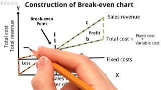
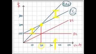
A break-even chart is a graphical representation that helps businesses understand how different levels of production affect costs and profits. It illustrates fixed costs, variable costs, and total revenue, culminating in the critical break-even point that informs financial decision-making.
Detailed
Detailed Summary
The break-even chart is an essential visual tool in understanding how costs and revenues interact as output or sales volume changes. It typically features:
- X-axis representing the units produced or sold.
- Y-axis showing revenue and costs.
- Fixed cost line, depicted as a horizontal line since fixed costs do not change with output levels.
- Total cost line, originating from the fixed cost and increasing with production volume, reflecting both fixed and variable costs.
- Total revenue line, which starts from zero and increases with sales.
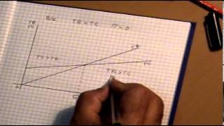
The intersection of the total revenue line and the total cost line indicates the Break-even Point (BEP), the point at which a company experiences neither profit nor loss. Understanding this chart is crucial for managers, especially when making strategic business decisions such as pricing, budgeting, and financial planning.
Youtube Videos
![Break Even Chart in CVP Analysis ~ Marginal Costing [Cost Accounting] ~ For B.Com/M.Com/CA/CS/CMA](https://img.youtube.com/vi/EMVs0IL0EfU/mqdefault.jpg)


Audio Book
Dive deep into the subject with an immersive audiobook experience.
Break-even Chart Overview
Chapter 1 of 4
🔒 Unlock Audio Chapter
Sign up and enroll to access the full audio experience
Chapter Content
The break-even chart is a graphical tool that shows the relationship between cost, volume, and profits.
Detailed Explanation
The break-even chart is used to visually represent how costs, sales volume, and profits interact. This diagram helps businesses identify the point at which their total sales cover their total costs, thus showing the break-even point — the stage at which neither profit nor loss occurs.
Examples & Analogies
Imagine a farmer who grows fruits and vegetables. They want to determine how many baskets of produce they need to sell to cover their planting, growing, and harvesting costs. The break-even chart will visually show them how many baskets (volume) they must sell to not lose money.
Axes of the Break-even Chart
Chapter 2 of 4
🔒 Unlock Audio Chapter
Sign up and enroll to access the full audio experience
Chapter Content
It has:
- X-axis: Units sold/produced
- Y-axis: Revenue and cost
Detailed Explanation
In the break-even chart, the X-axis represents the quantity of goods sold (units produced) while the Y-axis represents the monetary values of revenue and costs. This layout helps to assess whether a company is meeting, exceeding, or falling short of its financial goals based on sales volume.
Examples & Analogies
Think of it like a school fundraiser. The X-axis would indicate the number of cookies sold, while the Y-axis would reflect the total money made from those cookie sales. You can then see how your costs line up against your sales.
Lines on the Break-even Chart
Chapter 3 of 4
🔒 Unlock Audio Chapter
Sign up and enroll to access the full audio experience
Chapter Content
Lines plotted: Fixed cost line (horizontal), total cost line (starts from fixed cost), and total revenue line (starts from zero)
Detailed Explanation
The break-even chart includes three key lines: the fixed cost line, which is horizontal and represents the total fixed expenses that do not change with sales volume; the total cost line that starts from the fixed cost and increases as variable costs are added; and the total revenue line, which starts from zero and increases proportionally to units sold. The way these lines interact indicates the break-even point.
Examples & Analogies
Visualize a road trip. The fixed cost line could represent the initial fuel you need to start the trip (like your fixed costs), while the total cost line represents total fuel used as you travel further. The total revenue line indicates how much 'fun' or experiences you gain with each mile. The intersection represents the moment your experiences (revenue) equal your trip costs.
Identifying the Break-even Point
Chapter 4 of 4
🔒 Unlock Audio Chapter
Sign up and enroll to access the full audio experience
Chapter Content
The intersection of the total cost line and total revenue line is the Break-even Point.
Detailed Explanation
The break-even point is where the total cost line and the total revenue line intersect on the graph. This point represents the sales volume (or level of production) at which total revenues equal total costs. This helps the business understand how much they need to sell to avoid losses.
Examples & Analogies
Consider an ice cream shop. The break-even point may be the moment they sell exactly enough cones to pay for their ingredients and rent. If they sell above this point, they make a profit; if below, they suffer a loss.
Key Concepts
-
Break-even chart: A graphical tool showcasing the relationship between costs, volume, and profits.
-
Break-even Point (BEP): The intersection of total revenue and total cost.
-
Fixed Cost Line: A horizontal line representing costs that do not change with production.
-
Total Cost Line: A line depicting the accumulation of fixed and variable costs.
-
Total Revenue Line: A line representing the income generated from sales.
Examples & Applications
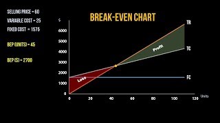
If a company sells 1,000 units at a price of ₹250 each, with total fixed costs of ₹50,000 and variable costs of ₹150 per unit, the break-even point can be visualized as the point where these revenue and cost lines intersect on the chart.
Memory Aids
Interactive tools to help you remember key concepts
Rhymes
Costs go high, revenue should rise, break-even point, let's be wise!
Stories
Imagine a bakery where each loaf of bread sold represents a step on the X-axis, while the growing smell of bakery goodness fills the Y-axis with revenue. Each sale moves slices closer to that perfect balance where cash in meets cash out - the break-even point.
Memory Tools
Remember 'CRIS' - Costs, Revenue, Intersection, Sales, to recall the core elements of the break-even chart.
Acronyms
FRE
Fixed
Revenue
Expenses - Remember these as key parts of the break-even analysis.
Flash Cards
Glossary
- Breakeven Point (BEP)
The level of output or sales at which total revenue equals total cost.
- Fixed Costs
Costs that remain constant regardless of the production level.
- Variable Costs
Costs that vary directly with production levels.
- Contribution Margin
The selling price per unit minus the variable cost per unit.
Reference links
Supplementary resources to enhance your learning experience.