
Scatter Diagram
Enroll to start learning
You’ve not yet enrolled in this course. Please enroll for free to listen to audio lessons, classroom podcasts and take practice test.
Interactive Audio Lesson
Listen to a student-teacher conversation explaining the topic in a relatable way.
Introduction to Scatter Diagrams
🔒 Unlock Audio Lesson
Sign up and enroll to listen to this audio lesson

Today, we will learn about scatter diagrams! These are useful tools for visualizing relationships between two variables. Can anyone tell me what a scatter diagram is?

Is it a way to plot points on a graph based on two sets of data?
Exactly! A scatter diagram plots points that represent pairs of values of two variables. This helps us to see if there's a relationship. What types of relationships do you think we can identify?

There could be a positive relationship, where both variables increase together!

Or a negative relationship, where one goes up and the other goes down.
Right! Positive and negative correlations are essential concepts in understanding scatter diagrams. Also, there's the idea of no correlation at all. Great points!

How do we know if a correlation is strong or weak?
That's a good question! The closer the data points are to a straight line, the stronger the correlation. Let's summarize: scatter diagrams can show positive, negative, or no correlation.
Correlation Measurement Techniques
🔒 Unlock Audio Lesson
Sign up and enroll to listen to this audio lesson

Now that we understand scatter diagrams, let’s talk about how we measure correlation. Who remembers Karl Pearson’s coefficient?
Isn't it used to quantify the linear relationship between two variables?
Correct! It gives us a numerical value indicating the strength and direction of the correlation. What about Spearman’s rank correlation?
Is that for ordinal data or when the relationship isn’t linear?
Exactly! Spearman's method is ideal when we can't accurately measure the variables. Let’s explore the differences between these two methods.
How do we choose which one to use?
Great question! If your data is continuous and normally distributed, you'd use Pearson. If it's ordinal or not normally distributed, Spearman is better. Let’s summarize: Pearson measures linear relationships while Spearman handles ranked data.
Interpreting Scatter Diagrams
🔒 Unlock Audio Lesson
Sign up and enroll to listen to this audio lesson
Let’s look at how we interpret scatter diagrams. When we say there's a strong correlation, what does that mean?
It means that as one variable changes, the other tends to change in a predictable way.
Exactly! If we look at temperature and ice cream sales – what kind of correlation might we expect?
That would be a positive correlation because higher temperatures mean more ice cream sold!
That's right! It’s important to remember that correlation does not imply causation. For example, just because ice creams are selling well in summer doesn’t mean they cause the temperature.
So what should we be careful about when interpreting correlations?
We should always consider other variables that might affect the relationship. Let’s recap: scatter diagrams help visualize relationships, we can measure correlation with Pearson and Spearman, and correlation does not imply causation.
Introduction & Overview
Read summaries of the section's main ideas at different levels of detail.
Quick Overview
Standard
This section focuses on the use of scatter diagrams in examining the correlation between two variables. It explains how these diagrams visually represent relationships, whether they are positive, negative, or absent, and discusses the importance of correlation measures, particularly Karl Pearson's correlation coefficient and Spearman’s rank correlation.
Detailed
Scatter Diagram
Overview
Scatter diagrams are a fundamental tool in statistics for visualizing the relationship between two quantitative variables. They plot the values of two variables as points on a Cartesian plane, allowing observers to infer potential correlations.
Key Concepts
- Nature of Relationship: A scatter diagram helps determine whether a relationship exists between two variables and whether it is positive, negative, or non-existent.
- Correlation Types:
- Positive Correlation: Both variables trend in the same direction.
- Negative Correlation: The variables trend in opposite directions.
- No Correlation: No discernable trend.
- Measurement Techniques:
- Karl Pearson’s Coefficient: Quantifies the strength and direction of a linear relationship.
- Spearman’s Rank Correlation: Used for ordinal data or relationships where data cannot be accurately measured.
- Practical Examples: Examples include the correlation between temperature and ice-cream sales. The section warns that correlation does not imply causation, highlighting the importance of context in interpreting scatter diagrams.
Conclusion
Understanding scatter diagrams and their correlation measurements is crucial for analyzing data effectively. They offer valuable insights into relationships between variables, guiding further statistical analysis and decision-making.
Youtube Videos


Audio Book
Dive deep into the subject with an immersive audiobook experience.
Definition and Purpose of Scatter Diagrams
Chapter 1 of 5
🔒 Unlock Audio Chapter
Sign up and enroll to access the full audio experience
Chapter Content
A scatter diagram is a useful technique for visually examining the form of relationship, without calculating any numerical value. In this technique, the values of the two variables are plotted as points on a graph paper.
Detailed Explanation
A scatter diagram is a graphical representation used to explore the relationship between two variables. Each point on the graph represents an observation from the data set, with one variable plotted on the x-axis and the other on the y-axis. This visual method helps identify patterns, trends, or correlations within the data. For instance, if you were to plot the height and weight of individuals, each point on the scatter plot would represent an individual’s height (x-axis) and weight (y-axis).
Examples & Analogies
Imagine you're a teacher trying to understand how students' study habits relate to their grades. If you plot each student on a graph, where the x-axis represents hours spent studying and the y-axis represents their scores in an exam, you can quickly see if students who study more tend to get higher scores, which would be shown by points clustering upwards in the graph.
Interpreting Scatter Diagrams
Chapter 2 of 5
🔒 Unlock Audio Chapter
Sign up and enroll to access the full audio experience
Chapter Content
From a scatter diagram, one can get a fairly good idea of the nature of relationship. The degree of closeness of the scatter points and their overall direction enable us to examine the relationship.
Detailed Explanation
The way points are arranged in a scatter diagram gives insights into the type of relationship between the two variables. If the points form a clear upward slope, it indicates a positive correlation (both variables increase together). A downward slope suggests a negative correlation (as one variable increases, the other decreases). If points are scattered without any discernible pattern, it indicates no correlation. Therefore, scatter diagrams are powerful in identifying relationships but do not quantify them.
Examples & Analogies
Think about a ball thrown in the air. If you plot its height against time, you will see a curve that rises and then falls, showing that first the height increases, and then it decreases. In contrast, if we plotted the number of books read by students against their scores, and found points flying everywhere with no pattern, it might imply that reading books does not guarantee higher scores.
Perfect Correlations
Chapter 3 of 5
🔒 Unlock Audio Chapter
Sign up and enroll to access the full audio experience
Chapter Content
If all the points lie on a line, the correlation is perfect and is said to be unity. If the scatter points are widely dispersed around the line, the correlation is low.
Detailed Explanation
When every point on a scatter diagram lies perfectly on a straight line, it indicates a perfect correlation, either positive or negative. A perfect positive correlation (+1) means that as one variable increases, the other variable increases proportionately. Conversely, a perfect negative correlation (-1) indicates that as one variable increases, the other decreases proportionately. If points gather closely around a line, it shows a strong correlation, while dispersion indicates a weaker relationship.
Examples & Analogies
Imagine two friends sharing common interests. If they both like the same types of movies, taste in music, and hobbies, plotting these interests on a graph would show a perfect correlation because every change in one friend's interest matches exactly with the other's. If, however, they occasionally have differing opinions on some movies but agree on others, their points might be scattered around a central line indicating a weaker correlation.
Types of Correlation in Scatter Diagrams
Chapter 4 of 5
🔒 Unlock Audio Chapter
Sign up and enroll to access the full audio experience
Chapter Content
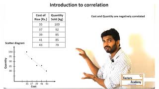
The correlation is said to be negative when they move in opposite directions. When the price of apples falls its demand increases. When the prices rise its demand decreases.
Detailed Explanation
A negative correlation occurs when two variables move in opposite directions. For example, in economics, if the price of a good rises, the demand for it typically decreases, and vice versa. In a scatter diagram, this would appear as a downward sloping line or pattern. Recognizing this type of correlation is crucial for understanding market dynamics and consumer behavior.
Examples & Analogies
Picture how the cost of your favorite candy affects how many you buy. If the store raises the price, you're likely to buy fewer or even choose a different snack altogether. In a scatter diagram, as the price of candy increases (along the x-axis), the number you buy decreases (along the y-axis), creating a downward slope.
Determining the Strength of Relationships
Chapter 5 of 5
🔒 Unlock Audio Chapter
Sign up and enroll to access the full audio experience
Chapter Content
The degree of closeness of the scatter points and their overall direction enable us to examine the relationship. If the scatter points are widely dispersed around the line, the correlation is low.
Detailed Explanation
To assess the strength of correlation from a scatter diagram, we look at how tightly the data points cluster around a line. If points are clustered closely to a line, it suggests a strong linear relationship; if they are widely scattered, the relationship is weak. This insight is essential in statistics as it quantifies how reliably one variable can predict another.
Examples & Analogies
Consider the popularity of a song. If many people hear the song and enjoy it, you may notice a tight cluster on the sales graph indicating a strong relationship between buzz from media (how often it is played) and the number of downloads. Conversely, if the graph shows points all over the place, it suggests that media attention does not accurately predict song popularity.
Key Concepts
-
Nature of Relationship: A scatter diagram helps determine whether a relationship exists between two variables and whether it is positive, negative, or non-existent.
-
Correlation Types:
-
Positive Correlation: Both variables trend in the same direction.
-
Negative Correlation: The variables trend in opposite directions.
-
No Correlation: No discernable trend.
-
Measurement Techniques:
-
Karl Pearson’s Coefficient: Quantifies the strength and direction of a linear relationship.
-
Spearman’s Rank Correlation: Used for ordinal data or relationships where data cannot be accurately measured.
-
Practical Examples: Examples include the correlation between temperature and ice-cream sales. The section warns that correlation does not imply causation, highlighting the importance of context in interpreting scatter diagrams.
-
Conclusion
-
Understanding scatter diagrams and their correlation measurements is crucial for analyzing data effectively. They offer valuable insights into relationships between variables, guiding further statistical analysis and decision-making.
Examples & Applications
An example of positive correlation is the relationship between hours of study and grades achieved; as study hours increase, grades typically improve.
A real-world example of negative correlation is between supply and price; often, when the supply of a commodity increases, its price tends to decrease.
Memory Aids
Interactive tools to help you remember key concepts
Rhymes
Scatter plots and lines so fine, help us see the trends in time.
Stories
Imagine two friends, one grows taller each year, while the other drops weights. Their scatter points make a story of their ups and downs!
Memory Tools
CORR: Correlation's Outcome Reads Relationships. It helps us remember that correlation focuses on the relationship between the variables.
Acronyms
SPREAD
Scatter Plots Reveal Entertaining Analyzing Data.
Flash Cards
Glossary
- Scatter Diagram
A graphical representation that displays the relationship between two numerical variables using points on a Cartesian plane.
- Correlation
A statistical measure that describes the size and direction of a relationship between two variables.
- Positive Correlation
A relationship where, as one variable increases, the other variable also increases.
- Negative Correlation
A relationship where, as one variable increases, the other variable decreases.
- Karl Pearson’s Coefficient
A measure that quantifies the linear relationship between two variables, ranging from -1 to +1.
- Spearman’s Rank Correlation
A non-parametric measure that assesses how well the relationship between two variables can be described using a monotonic function.
Reference links
Supplementary resources to enhance your learning experience.