
TYPES OF RELATIONSHIP
Enroll to start learning
You’ve not yet enrolled in this course. Please enroll for free to listen to audio lessons, classroom podcasts and take practice test.
Interactive Audio Lesson
Listen to a student-teacher conversation explaining the topic in a relatable way.
Understanding Correlation
🔒 Unlock Audio Lesson
Sign up and enroll to listen to this audio lesson

Today, we kick off our discussion on correlation. Can anyone tell me what correlation means in statistics?

Isn't it when two variables somehow relate to each other?
Exactly! Correlation examines how two variables are related. For instance, if we increase the temperature, what happens to ice cream sales?

They probably increase, right?
Correct! This is a positive correlation where variables move in the same direction. Remember the acronym 'TICO' for Types of Correlation: 'T' for Temperature, 'I' for Ice cream sales, 'C' for Correlation, and 'O' for Other variables related.

So positive is when they both go up together. What about negative correlation?
Great follow-up! Negative correlation occurs when one variable increases while the other decreases. For instance, when the price of apples rises, the demand goes down.

Got it! Positive is both going up and negative is one goes up and the other goes down.
Exactly! Let's summarize: correlation is about understanding relationships between variables, both positive and negative.
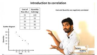
Scatter Diagrams
🔒 Unlock Audio Lesson
Sign up and enroll to listen to this audio lesson

Now, let's shift our focus to scatter diagrams. Can anyone explain what a scatter diagram is?
I've seen them in graphs! They plot points on a graph based on two variables.
Exactly! Scatter diagrams help visualize how two variables relate. The distribution of points reveals a lot. Can you tell me how we interpret these diagrams?
If the points cluster around a line going up, that's positive correlation!
And if they go down, that’s negative correlation. But if they spread randomly, there’s no correlation at all.
Great points! When you examine the scatter diagram, pay attention to the overall trend to determine whether the relationship is positive, negative, or non-existent.
So in a scatter plot of ice cream sales vs. temperature, more points would be upward because both increase, right?
Absolutely! Use what you learned about visual aids to clarify these concepts. Remember, visualizing data helps solidify our understanding.
Pearson's and Spearman's Coefficient
🔒 Unlock Audio Lesson
Sign up and enroll to listen to this audio lesson
Let's discuss two critical measures of correlation: Karl Pearson’s coefficient and Spearman’s rank correlation. Who can tell us the difference?
Pearson's measures linear relationships with numerical data, right?
Exactly! The formula uses means and products. What about Spearman’s rank correlation?
It uses ranks instead of actual data values. So it's good for non-numeric data also.
Spot on! Spearman is particularly useful when dealing with attributes we cannot measure numerically, such as beauty or intelligence.
And both should tell us the same story about the relationship in ideal linear conditions, right?
Yes! But be cautious; Pearson’s may be misleading in non-linear cases. Always assess your data first!
So, we should look at the type of data we have before choosing the method?
Exactly! Choosing the right tool is essential for analyzing relationships accurately.
Introduction & Overview
Read summaries of the section's main ideas at different levels of detail.
Quick Overview
Standard
The section details how correlation examines the relationship between two variables, distinguishing between positive and negative correlations. It explains various techniques for measuring correlation, such as scatter diagrams and correlation coefficients, while also emphasizing the importance of recognizing that correlation does not imply causation.
Detailed
Detailed Summary
In this section, we explore the concept of correlation and its implications in analyzing relationships between two variables. The nature of these relationships can either be positive, negative, or exhibit no correlation. Positive correlation indicates that as one variable increases, the other does as well (e.g., higher income leading to increased consumption). Conversely, negative correlation shows that as one variable increases, the other decreases (e.g., an increase in the price of apples resulting in decreased demand).
We discuss several critical measures of correlation, including Karl Pearson's coefficient and Spearman's rank correlation coefficient, which quantify the strength and direction of these relationships. A scatter diagram serves as a visual tool to aid understanding by plotting the values of the two variables and revealing their associations without requiring numerical computations. Furthermore, the section underscores crucial distinctions: correlation signifies covariation but does not imply causation. We must recognize that similar movements between variables might result from external third-party influences. Therefore, correlation analysis is essential in statistical examination, guiding us in identifying patterns and potential connections between data points.
Youtube Videos


Audio Book
Dive deep into the subject with an immersive audiobook experience.
Understanding Relationship Types
Chapter 1 of 5
🔒 Unlock Audio Chapter
Sign up and enroll to access the full audio experience
Chapter Content
Let us look at various types of relationship. The relation between movements in quantity demanded and the price of a commodity is an integral part of the theory of demand, which you will study in Class XII. Low agricultural productivity is related to low rainfall. Such examples of relationship may be in one direction (i.e. positive change) or in the opposite direction (i.e. negative change), but in a definite way.
Detailed Explanation
This chunk introduces the concept of relationships between variables, particularly in economics. It emphasizes understanding how changes in one variable can affect another. For example, increased rainfall usually leads to better agricultural productivity. Similarly, an increase in temperature can result in increased ice-cream sales. Understanding these relationships is crucial in economics as it informs predictions and decisions.
Examples & Analogies
Imagine you notice that every time there's a bright sunny day, more people buy ice cream. This reflects a positive correlation: as the temperature rises (one variable), the ice cream sales also increase (another variable). Just as we can predict ice cream sales based on the weather, economists predict market behaviors based on variable relationships.
Types of Correlation
Chapter 2 of 5
🔒 Unlock Audio Chapter
Sign up and enroll to access the full audio experience
Chapter Content
Correlation is commonly classified into negative and positive correlation. The correlation is said to be positive when the variables move together in the same direction. When income rises, consumption also rises. The correlation is negative when they move in opposite directions.
Detailed Explanation
This chunk explains positive and negative correlation. Positive correlation occurs when both variables increase or decrease together—like with income and consumer spending. Negative correlation, on the other hand, means that as one variable increases, the other decreases. For example, as the price of apples rises, the demand for apples may fall. This concept helps in understanding how different economic factors interact.
Examples & Analogies
Think about how your mood can influence your spending habits. If you feel happy (rising mood), you might treat yourself to something nice (increased spending). This reflects a positive correlation. Conversely, feel stressed (falling mood), you might cut back on unnecessary expenses (decreased spending), illustrating negative correlation.
Scatter Diagrams as a Visual Tool
Chapter 3 of 5
🔒 Unlock Audio Chapter
Sign up and enroll to access the full audio experience
Chapter Content
A scatter diagram visually presents the nature of association without giving any specific numerical value. In this technique, the values of the two variables are plotted as points on graph paper, allowing us to examine the relationship visually.
Detailed Explanation
In this chunk, the focus is on scatter diagrams, which are useful for visualizing relationships between two variables. Each point on the graph represents a pair of values. The pattern that emerges from these points helps us to see if there's a correlation: whether it's positive, negative, or none at all.
Examples & Analogies
Imagine plotting your homework time against your grades on a scatter diagram. Each dot represents a student’s homework time and their respective grade. By looking at the pattern, you can quickly see if students who study more tend to get higher grades (positive correlation), or if there's no clear trend at all.
Karl Pearson’s Coefficient of Correlation
Chapter 4 of 5
🔒 Unlock Audio Chapter
Sign up and enroll to access the full audio experience
Chapter Content
Karl Pearson’s coefficient of correlation measures the direction and intensity of relationship among variables. It is used when the correlation is linear, and its value ranges between -1 and +1.
Detailed Explanation
This chunk discusses Karl Pearson’s coefficient of correlation, a statistical measure that quantifies how strongly two variables are related. A value close to +1 indicates a strong positive correlation, meaning both variables increase together. A value near -1 indicates a strong negative correlation, while a value around 0 means no correlation. This coefficient helps economists and statisticians to gauge the strength and direction of relationships effectively.
Examples & Analogies
Think of a scale measuring how connected different activities are. If you were measuring hours spent studying versus test scores, a coefficient of 0.8 suggests that more study hours significantly improve test scores. This is a strong positive correlation—like saying that the better you prepare, the better you'll do!
Understanding Negative and Positive Changes
Chapter 5 of 5
🔒 Unlock Audio Chapter
Sign up and enroll to access the full audio experience
Chapter Content
When the value of one variable changes, does the value of the other change? This shows how closely linked two variables are. For example, with the price of apples falling, the demand may rise, indicating a negative relationship.
Detailed Explanation
This chunk emphasizes the dynamics of changing variables. It highlights how one variable's increase or decrease can affect another's movement. For instance, a price drop for a commodity typically leads to increased demand. Understanding these relationships is key for making informed decisions in business and economics.
Examples & Analogies
Consider the relationship between gas prices and how much you drive. If gas prices go up (a change in one variable), you might consider driving less (a change in the other variable). This reflects a negative correlation: when one goes up, the other goes down.
Key Concepts
-
Correlation: The relationship between two variables where the variation in one is associated with the variation in the other.
-
Positive Correlation: Both variables increase together.
-
Negative Correlation: One variable increases while the other decreases.
-
Scatter Diagram: A visual representation of the relationship between two variables.
-
Pearson’s Coefficient: A measure used for linear correlation between two numerical variables.
-
Spearman’s Rank Correlation: A method for assessing the strength of a relationship when the variables are ranked.
Examples & Applications
The relationship between temperature and ice-cream sales is an example of positive correlation; as temperature rises, ice-cream sales increase.
The relationship between the price of apples and their demand illustrates negative correlation; as the price increases, demand tends to decrease.
A scatter diagram illustrating the correlation between study hours and examination scores would show positive correlation as study hours increase.
Memory Aids
Interactive tools to help you remember key concepts
Rhymes
Correlation's the game, tracking who's to blame, one goes up, the other too, in positive, they're true.
Stories
Imagine two friends, one loves ice cream and the other loves the sunny weather. As the sun shines brighter, our first friend sells more ice cream. This shows their positive correlation!
Memory Tools
Remember 'POS' for Positive correlation: P for 'Prices Up', O for 'Opens Opportunities', and S for 'Sales Soar'.
Acronyms
Use the acronym SLOPE
for Scatter diagrams
for Linear relationships
for Observations
for Positive correlation
and E for Evaluation!
Flash Cards
Glossary
- Correlation
A statistical measure that indicates the extent to which two variables fluctuate together.
- Positive Correlation
A relationship where an increase in one variable results in an increase in the other.
- Negative Correlation
A relationship where an increase in one variable results in a decrease in the other.
- Scatter Diagram
A graph that displays values for two variables for a set of data, showing their relationship.
- Karl Pearson’s Coefficient
A measure of the strength and direction of a linear relationship between two variables.
- Spearman’s Rank Correlation
A measure of the strength and direction of the association between two ranked variables.
Reference links
Supplementary resources to enhance your learning experience.