
What Does Correlation Measure?
Enroll to start learning
You’ve not yet enrolled in this course. Please enroll for free to listen to audio lessons, classroom podcasts and take practice test.
Interactive Audio Lesson
Listen to a student-teacher conversation explaining the topic in a relatable way.
Introduction to Correlation
🔒 Unlock Audio Lesson
Sign up and enroll to listen to this audio lesson

Today, we're going to talk about correlation. Can anyone tell me what they think correlation means?

I think it’s about how two things are related, right?
Exactly! Correlation measures the relationship between two variables. It helps us understand how changes in one variable might relate to changes in another. Remember, correlation doesn't imply causation!

So, if two things are correlated, it doesn't mean one causes the other?
Correct! It simply shows us that they vary together. For instance, ice cream sales and temperature are correlated, but that doesn't mean eating ice cream causes warmer weather!

That makes sense! Are there types of correlation?
Yes, there are mainly two: positive correlation, where both variables increase or decrease together, and negative correlation, where one increases while the other decreases. Let’s remember this with the acronym PAND - Positive And Negative Direction.

PAND - I like that! What about no correlation?
Good question! No correlation means there's no relationship between the variables, they don’t influence each other. Let’s wrap up this session - remember that correlation can inform us about relationships but doesn’t prove any causal links.
Measuring Correlation
🔒 Unlock Audio Lesson
Sign up and enroll to listen to this audio lesson

We just discussed the definition of correlation. Now, let’s move on to how we can actually measure it. Who knows what tools we can use?
Isn't there something called a scatter diagram?
That's right! A scatter diagram is a visual representation that allows us to observe the nature of the relationship between two variables. When we plot data points on a graph, we can see if the relationship is positive, negative, or nonexistent. Just remember, the closer the points cluster around a line, the stronger the correlation!
And what about those coefficients?
Great question! We have Karl Pearson’s coefficient and Spearman’s rank correlation coefficient. Karl Pearson's is used for linear relationships and provides a value between -1 and 1. If r is around 1, that means a strong positive correlation; if it’s around -1, a strong negative correlation!
What does it mean if r is 0?
If r is 0, it indicates no correlation, meaning the variables do not affect each other at all. A quick way to remember this is: ZERo means no relationship!
So, is there always a need for perfect linearity?
Not necessarily! While Pearson's coefficient requires linearity, sometimes relationships can be non-linear. In those cases, understanding the nature through scatter diagrams is crucial. To recap, we measure correlation through visuals like scatter diagrams and numerical values using different coefficients.
Introduction & Overview
Read summaries of the section's main ideas at different levels of detail.
Quick Overview
Standard
This section delves into the concept of correlation, defining its nature, types, and the statistical tools used to measure it, including scatter diagrams and correlation coefficients. It emphasizes that correlation reflects a relationship without confirming causation and outlines the properties of correlation metrics.
Detailed
What Does Correlation Measure?
Correlation is a critical statistical concept that studies the relationship between two variables, providing insights into how they vary together. This section explains various types of correlation, distinguishing between positive, negative, and no correlation. It discusses the methods for measuring correlations including scatter diagrams, Karl Pearson’s coefficient, and Spearman’s rank correlation.
The section highlights that correlation analysis does not establish a cause-effect relationship but simply indicates covariation. For instance, while higher temperatures may correlate with increased ice cream sales, that does not imply one causes the other. The analysis also addresses linearity in relationships, emphasizing how visual representations like scatter diagrams can reveal associations. Lastly, the summary underscores the interpretation of correlation coefficients, which range from -1 to 1, to gauge the intensity and direction of the relationship.
Youtube Videos

Audio Book
Dive deep into the subject with an immersive audiobook experience.
Understanding Correlation
Chapter 1 of 5
🔒 Unlock Audio Chapter
Sign up and enroll to access the full audio experience
Chapter Content
Correlation studies and measures the direction and intensity of relationship among variables.
Detailed Explanation
This statement introduces the concept of correlation in statistics. Correlation refers to a statistical measure that describes the degree to which two variables move in relation to each other. In simpler terms, it helps us understand how changes in one variable are associated with changes in another variable.
Examples & Analogies
Imagine two friends, Alice and Bob. When it gets hot outside, Alice tends to buy more ice cream while Bob tends to drink more lemonade. If we note that on hotter days, both of them increase their purchases of these items, we could say there is a positive correlation between temperature and ice cream and lemonade sales.
Types of Relationships in Correlation
Chapter 2 of 5
🔒 Unlock Audio Chapter
Sign up and enroll to access the full audio experience
Chapter Content
Let us look at various types of relationship. Correlation measures covariation, not causation.
Detailed Explanation
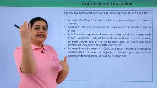
This chunk explains that correlation can show how two variables change together but does not imply that one causes the other to change. For example, just because ice cream sales and drowning deaths both increase during the summer, it doesn’t mean eating ice cream causes more drownings. Understanding this distinction helps prevent incorrect conclusions about relationships.
Examples & Analogies
Think of correlation like a dance between two partners: they may move together beautifully, but one does not lead the other – they just happen to move together in sync. For instance, both the length of your thumb and your height may increase with age, but it doesn’t mean that your thumb’s length is causing your height to increase.
Understanding Positive and Negative Correlation
Chapter 3 of 5
🔒 Unlock Audio Chapter
Sign up and enroll to access the full audio experience
Chapter Content
The correlation is said to be positive when the variables move together in the same direction. When the income rises, consumption also rises.
Detailed Explanation
This describes positive correlation, where an increase in one variable leads to an increase in another variable, and vice versa. Conversely, negative correlation is when one variable increases while the other decreases, showing an inverse relationship. This idea explains types of correlations, labeling them as positive or negative based on the nature of their movement.
Examples & Analogies
Consider your grades and the time you spend studying. More hours studying (an increase in one variable) generally leads to better grades (an increase in another variable), which exemplifies positive correlation. In contrast, if you think of the price of fruits going up when supply goes down, this demonstrates negative correlation – as the supply decreases, the price increases.
Visualizing Relationships with Scatter Diagrams
Chapter 4 of 5
🔒 Unlock Audio Chapter
Sign up and enroll to access the full audio experience
Chapter Content
A scatter diagram visually presents the nature of association without giving any specific numerical value.
Detailed Explanation
Scatter diagrams are a graphical representation that helps visualize the relationship between two variables. Each point on the graph corresponds to a pair of values for the two variables. These diagrams can help clarify the type of correlation: whether it seems positive, negative, or shows no clear pattern.
Examples & Analogies
Imagine a gallery of photos that shows how two things change over time. Looking at these pictures, you could tell if they grow together or if one is constantly lower than the other. For example, plotting hours studied against test scores could reveal a pattern where points cluster upward, suggesting a positive correlation.
Interpreting Correlation Coefficients
Chapter 5 of 5
🔒 Unlock Audio Chapter
Sign up and enroll to access the full audio experience
Chapter Content
This property is used to calculate the correlation coefficient in a highly simplified manner.
Detailed Explanation
The correlation coefficient, usually represented as 'r', quantifies the strength and direction of a relationship between two variables. The value of r typically ranges from -1 to +1; where +1 indicates a perfect positive correlation, -1 indicates a perfect negative correlation, and 0 indicates no correlation. Thus, understanding r helps us interpret how linked two variables are.
Examples & Analogies
Think of r like a performance score. If a movie gets a score of 1, it was a blockbuster. If it scores 0, people left the theater confused or bored. Similarly, knowing how 'close' our score is to either 1 or -1 tells us whether the relationship we’re studying is strong or weak, just like knowing whether you have a hit or a flop in the box office!
Key Concepts
-
Correlation: A measure of relationship between two variables.
-
Types of Correlation: Positive, negative, and no correlation.
-
Scatter Diagrams: A tool for visually assessing relationships.
-
Pearson’s Coefficient: Measures linear correlation ranging from -1 to 1.
-
Spearman’s Rank: Used for non-linear data and rank relationships.
Examples & Applications
Example: The increase in temperature is positively correlated with ice cream sales.
Example: The increase in supply of tomatoes often leads to a decrease in their price, indicating negative correlation.
Memory Aids
Interactive tools to help you remember key concepts
Rhymes
Correlation shows how things flow, together they rise or fall, now you know!
Stories
Imagine a farmer who plants tomatoes. When he waters them, they grow bigger and smoother fruit. But if it rains too much, the prices drop. This illustrates both a positive and negative correlation.
Memory Tools
Use PAND to remember: Positive And Negative Direction.
Acronyms
COV for Correlation Over Variability
shows how two variables covary.
Flash Cards
Glossary
- Correlation
A statistical measure that expresses the degree to which two variables fluctuate together.
- Positive Correlation
A relationship where both variables increase or decrease together.
- Negative Correlation
A relationship where one variable increases as the other decreases.
- Scatter Diagram
A graphical representation that shows the relationship between two quantitative variables.
- Karl Pearson’s Coefficient
A measure of the linear correlation between two variables, ranging from -1 to 1.
- Spearman’s Rank Correlation
A statistical technique used to measure the correlation between the ranks of two variables.
Reference links
Supplementary resources to enhance your learning experience.