
GIS Output and Visualization
Enroll to start learning
You’ve not yet enrolled in this course. Please enroll for free to listen to audio lessons, classroom podcasts and take practice test.
Interactive Audio Lesson
Listen to a student-teacher conversation explaining the topic in a relatable way.
Map Generation
🔒 Unlock Audio Lesson
Sign up and enroll to listen to this audio lesson

Today, we'll learn about how GIS generates maps. Can anyone tell me what a thematic map is?

Isn't it a map that shows a specific theme, like land use or population density?
Exactly! Thematic maps highlight particular datasets, which can include various features like zoning or soil types. They contain important cartographic elements, like a title and legend. Who can give me an example of a cartographic element?

A legend is one! It helps you understand what the symbols on the map represent.
Great! Remember, when creating a map, it’s important to include a scale to show distances accurately. How might that impact map usage?

Without scale, we wouldn't know how far things are in real life!
Exactly! To sum up, thematic maps display specific data and must contain elements like titles, legends, and scales.
3D Visualization
🔒 Unlock Audio Lesson
Sign up and enroll to listen to this audio lesson

Now let's shift gears and discuss 3D visualization in GIS. Why do you think 3D models are useful in urban planning?

They can show how buildings fit together in a real environment!
Absolutely! Tools like ArcScene and QGIS allow us to create 3D models of terrain and infrastructure. This helps in grasping complex landscapes and planning effectively. Can you think of any fields that benefit from this?
Hydrology! Understanding water flow in a 3D space is critical.
Exactly! 3D visualizations help in multiple domains, including landscape analysis and city planning. What’s one takeaway from today’s session?
3D models make it easier to visualize complex data!
Very well! Remember, 3D visualization enhances understanding of real-world applications in GIS.
Report and Dashboard Creation
🔒 Unlock Audio Lesson
Sign up and enroll to listen to this audio lesson
In our last session, we talked about generating maps and 3D models. Today, let's discuss how GIS integrates with Business Intelligence tools to create reports. What do you think is the benefit of combining GIS with tools like Power BI?
I guess it allows for much more interactive and informative reports!
Exactly! Interactive dashboards can provide insights from spatial data, making the information accessible to a broader audience. What features do you think should be included in these dashboards?
I think they should have interactive maps that users can zoom into.
Great suggestion! Interactivity is key. Dashboards can enable users to manipulate data visually to facilitate better decision-making. Can anyone summarize how we can use GIS in reports?
We use GIS to visualize data clearly, making reports more engaging and insightful!
Perfect! Remember, integration with BI tools enhances how we communicate and analyze GIS information.
Introduction & Overview
Read summaries of the section's main ideas at different levels of detail.
Quick Overview
Standard
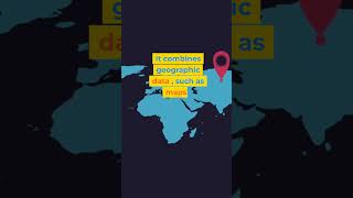
In this section, we explore how GIS outputs are generated and visualized. Key points include the creation of thematic maps, the use of 3D visualization tools like ArcScene and QGIS, and the integration of GIS with business intelligence tools for interactive reports and dashboards.
Detailed
GIS Output and Visualization
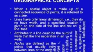
This section discusses how Geographic Information Systems (GIS) facilitate the output and visualization of spatial data to aid in decision-making and communication. A key aspect of GIS is its ability to generate various types of maps, including thematic maps that represent specific datasets, such as land use or soil type. Important cartographic elements, such as titles, legends, scales, north arrows, and grids, are fundamental in making these maps comprehensible.
Furthermore, tools such as ArcScene and QGIS provide capabilities for 3D visualizations, which enhance understanding in fields like urban planning, hydrology, and landscape analysis. The integration of GIS outputs with Business Intelligence (BI) tools like Power BI and Tableau allows for the creation of reports and dashboards that can present GIS data interactively. This integration supports stakeholders in making informed decisions based on visualized data, thus highlighting the significance of GIS in various domains.
Youtube Videos


Audio Book
Dive deep into the subject with an immersive audiobook experience.
Map Generation
Chapter 1 of 3
🔒 Unlock Audio Chapter
Sign up and enroll to access the full audio experience
Chapter Content
• Thematic maps (e.g., land use, soil type, zoning maps).
• Cartographic elements: title, legend, scale, north arrow, grid.
Detailed Explanation
Map generation in GIS involves creating various types of maps that represent different themes or topics. Thematic maps focus on specific themes or variables like land use or soil types. To effectively communicate the information, maps need specific cartographic elements such as a title (to understand what the map represents), a legend (which explains the symbols used), a scale (showing the ratio between a distance on the map and the actual distance), a north arrow (indicating direction), and sometimes a grid for easier reference.
Examples & Analogies
Consider a thematic map like one showing the distribution of parks in a city. The map's title would tell you it's about parks, while the legend would help you identify which types of parks are represented. The scale would allow you to measure how far apart parks are from one another, while the north arrow would show you that north is upwards. This would be similar to using a treasure map where each symbol needs clarification so you can find the treasure with ease.
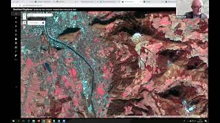
3D Visualization
Chapter 2 of 3
🔒 Unlock Audio Chapter
Sign up and enroll to access the full audio experience
Chapter Content
• Tools like ArcScene and QGIS support 3D terrain and infrastructure modeling.
• Useful in urban planning, hydrology, and landscape analysis.
Detailed Explanation
3D visualization in GIS takes spatial data to a new level, allowing users to view terrain and infrastructure in three dimensions. Tools like ArcScene and QGIS facilitate this process, enabling planners and analysts to better understand geographic features' relationships and attributes in a more realistic format. This visualization aids in applications such as urban planning, where evaluating how buildings interact with the environment is essential, and hydrology, where the flow of water over terrain must be assessed.
Examples & Analogies
Imagine a city planner looking at a neighborhood. A 3D model lets them see how new buildings will fit among existing ones, considering factors like sunlight and water drainage, much like how an architect uses a model to visualize a building’s design before construction. Without this 3D view, the planner might miss important interaction aspects between buildings and their environment.
Report and Dashboard Creation
Chapter 3 of 3
🔒 Unlock Audio Chapter
Sign up and enroll to access the full audio experience
Chapter Content
• Integrating GIS with BI tools (e.g., Power BI, Tableau) for interactive reports.
Detailed Explanation
Creating comprehensive reports and dashboards is another critical function of GIS. By integrating GIS data with business intelligence (BI) tools like Power BI or Tableau, users can generate informative and interactive reports. These tools allow visualization of spatial data alongside other datasets, enabling stakeholders to make decisions based on dynamic, informative visuals rather than static reports. This integration is crucial for real-time data analysis and decision-making.
Examples & Analogies
Think of it like using a control panel for a spaceship where a pilot can see various data points that reflect the spacecraft’s status. Similarly, a GIS dashboard combines geographical data and statistics such as population density or transport routes into an easy-to-understand view, allowing decision-makers to quickly assess a situation and determine necessary actions, similar to a pilot evaluating their flight status before takeoff.
Key Concepts
-
Thematic Maps: Visual representations focusing on specific themes like land use.
-
Cartographic Elements: Essential components such as legends and scales vital for map interpretation.
-
3D Visualization: Enhances spatial understanding through three-dimensional models.
-
Business Intelligence Integration: Combines GIS with data tools for interactive reports.
Examples & Applications
Creating a thematic map to visualize urban zoning divisions.
Using 3D visualization to model terrain for environmental impact studies.
Memory Aids
Interactive tools to help you remember key concepts
Rhymes
For maps that share a theme, Use a legend and let it beam!
Stories
Imagine a city planner, frustrated with 2D maps, until they discover 3D models that show building heights and shadow impacts, transforming their planning strategies.
Memory Tools
L-S-N-G to remember Map Elements: Legend, Scale, Name, Grid.
Acronyms
MAP
for Meaning (what’s shown)
for Accurate (with scale)
for Presentation (with layers and elements).
Flash Cards
Glossary
- Thematic Maps
Maps that display specific themes or datasets, such as land use or soil type.
- Cartographic Elements
Components present on maps, including title, legend, scale, north arrow, and grid.
- 3D Visualization
The representation of geographic data in a three-dimensional format to enhance understanding.
- Business Intelligence (BI) Tools
Software applications used for data analysis and reporting, often allowing for interactive visualizations.
Reference links
Supplementary resources to enhance your learning experience.