
AWT Layout Managers
Enroll to start learning
You’ve not yet enrolled in this course. Please enroll for free to listen to audio lessons, classroom podcasts and take practice test.
Introduction & Overview
Read summaries of the section's main ideas at different levels of detail.
Quick Overview
Standard
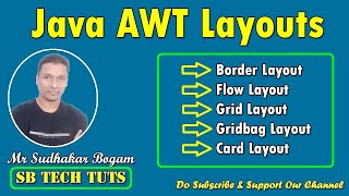
This section discusses the four main layout managers in AWT: FlowLayout, BorderLayout, GridLayout, and CardLayout, providing insights into how they manage component organization in GUI applications.
Detailed
AWT Layout Managers
AWT (Abstract Window Toolkit) provides different layout managers that handle the arrangement of GUI components in Java applications. These layout managers allow developers to control the positioning and sizing of components dynamically, ensuring that the user interface is both functional and aesthetically pleasing. The four primary layout managers discussed are:
- FlowLayout: Components are arranged in a left-to-right flow, similar to the way text is arranged in a paragraph. Components wrap to the next line as needed, maintaining a specified alignment.
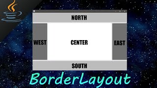
- BorderLayout: Divides the container into five areas: North, South, East, West, and Center. Each area can contain one component, making it easy to design simple, structured layouts.
- GridLayout: Arranges components in a rectangular grid. Each cell in the grid has the same size, and components are added in a top-to-bottom, left-to-right manner.
- CardLayout: Manages multiple components (cards), allowing only one component to be visible at a time. This layout is useful for building tabbed interfaces or wizards, where users navigate through different
Youtube Videos


Audio Book
Dive deep into the subject with an immersive audiobook experience.
Introduction to Layout Managers
Chapter 1 of 5
🔒 Unlock Audio Chapter
Sign up and enroll to access the full audio experience
Chapter Content
• FlowLayout
• BorderLayout
• GridLayout
• CardLayout
Detailed Explanation
This chunk introduces the four main types of layout managers available in AWT: FlowLayout, BorderLayout, GridLayout, and CardLayout. These layout managers help organize components in a Java GUI application systematically. Each layout manager has its own rules for placement and sizing of components, which dictates how they appear on the screen.
Examples & Analogies
Think of a layout manager as a blueprint for a room. Just like a blueprint specifies where furniture goes in a room—like a sofa, table, or chairs—layout managers define where GUI components like buttons and labels sit within a window.
FlowLayout
Chapter 2 of 5
🔒 Unlock Audio Chapter
Sign up and enroll to access the full audio experience
Chapter Content
FlowLayout
• Arranges components in a line, from left to right.
• Wraps to the next line when the edge of the container is reached.
Detailed Explanation
FlowLayout arranges components in a sequence, starting at the top left of the containing area and moving horizontally. If there isn't enough room on one line, it automatically wraps components to the next line, maintaining the order. This behavior makes it useful for displaying buttons and labels in a neat line, ensuring they always fit within the window size.
Examples & Analogies
Consider how people line up in a queue. They stand in a row until there's no more space, at which point they start a new row. Similarly, FlowLayout keeps placing elements in a line until it runs out of space and then moves to the next line.
BorderLayout
Chapter 3 of 5
🔒 Unlock Audio Chapter
Sign up and enroll to access the full audio experience
Chapter Content
BorderLayout
• Divides the container into five regions: North, South, East, West, and Center.
• One component can occupy each region.
Detailed Explanation
BorderLayout is particularly useful for applications with a defined structure, as it breaks the container into five distinct areas. You can add components to any of these regions, and it ensures that the central region expands to fill any extra space. This layout is ideal for applications with a menu at the top (North), status at the bottom (South), and primary content in the center.
Examples & Analogies
Think of a restaurant layout. The 'North' might be the entrance where customers come in, the 'South' could be the area where they pay, 'East' might contain the kitchen, and 'West' could be where the restrooms are—all while the central area is filled with tables and chairs.
GridLayout
Chapter 4 of 5
🔒 Unlock Audio Chapter
Sign up and enroll to access the full audio experience
Chapter Content
GridLayout
• Arranges components in a grid of specified rows and columns.
• Every component is the same size and fits within the grid.
Detailed Explanation
GridLayout divides the container into a grid with a specific number of rows and columns. Each component fills one cell in the grid, ensuring they are all the same size and aligned properly. This is useful for items that benefit from being organized in rows and columns, such as a calculator interface or a form.
Examples & Analogies
Imagine a chessboard where each square represents a component. Each square must be equal in size, maintaining uniformity, just as components in a GridLayout do. This ensures that buttons, fields, or labels align neatly.
CardLayout
Chapter 5 of 5
🔒 Unlock Audio Chapter
Sign up and enroll to access the full audio experience
Chapter Content
CardLayout
• Allows multiple components to occupy the same space.
• Only one component is visible at a time, like 'cards' in a deck.
Detailed Explanation
CardLayout is ideal for interfaces that need to switch between different views or components. It allows you to stack components on top of each other, but only one is visible at a time. This is similar to flipping through a stack of cards, where only the top card is in view. It's useful for creating wizards or forms that progress through multiple steps.
Examples & Analogies
Think of a photo album. You can only see one photo (component) at a time, but if you want to look at a different photo, you simply flip to that card. CardLayout works in the same way, showing one component while hiding others behind it.