
Common AWT Components
Enroll to start learning
You’ve not yet enrolled in this course. Please enroll for free to listen to audio lessons, classroom podcasts and take practice test.
Interactive Audio Lesson
Listen to a student-teacher conversation explaining the topic in a relatable way.
Introduction to AWT Components
🔒 Unlock Audio Lesson
Sign up and enroll to listen to this audio lesson

Today we're going to look at some of the common components used in AWT. Can anyone tell me what AWT stands for?

Is it Abstract Window Toolkit?
Correct! AWT is indeed the Abstract Window Toolkit, and it provides essential building blocks for creating graphical user interfaces in Java. Let's start with the first component, which is the Button. Can anyone tell me what a Button does?

A button is something you can click to perform an action.
Exactly! And in Java, we use `java.awt.Button` for that. Remember this: BB - Button for 'Button Action'. Let's move on to the Label component. What do you think a Label does?

Labels display text information, right?
That's right! Labels are mainly for displaying non-editable text to the user. So, Label is for 'Labeling Information'. Let’s keep building on this knowledge.
Exploring Text Fields and Areas
🔒 Unlock Audio Lesson
Sign up and enroll to listen to this audio lesson

Next, let’s discuss input components: TextField and TextArea. Who can tell me the difference between the two?

A TextField is for single-line input, and a TextArea is for multiple lines.
Great job! Remember: TF for TextField - 'One Line' and TA for TextArea - 'All Lines'. Why might you choose one over the other?
If you only need a short answer, a TextField is better, but for writing a full paragraph or more, a TextArea is necessary.
Exactly! It’s important to choose the right component based on user needs. Let's continue!
Checkboxes and Choices
🔒 Unlock Audio Lesson
Sign up and enroll to listen to this audio lesson
Now, let’s discuss Checkboxes and Choices. What do you think a Checkbox allows users to do?
Checkboxes let users select multiple options.
Correct! Using `java.awt.Checkbox`, users can check or uncheck options. Now, what about the Choice component?
Choice lets users select only one option from a dropdown list.
Exactly! Remember: C for Checkbox - 'Choice Multiple', and C for Choice - 'Choice One'. It’s essential to know when to use each one.
The List Component
🔒 Unlock Audio Lesson
Sign up and enroll to listen to this audio lesson
Lastly, let’s explore the List component. Who can explain what it does?
The List presents several options that users can scroll through and select.
Well done! The List can allow either single or multiple selections depending on how it’s set up. It’s versatile! Remember this: LL for List - 'List of Options'.
Introduction & Overview
Read summaries of the section's main ideas at different levels of detail.
Quick Overview
Standard
The section outlines common AWT components, including buttons, labels, text fields, and other essential classes, which are fundamental in building Java graphical user interfaces. Understanding these components is critical for effective GUI application development.
Detailed
Common AWT Components
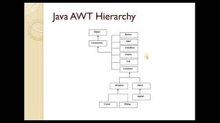
In this section, we delve into the principal components of the Abstract Window Toolkit (AWT), which is Java's original GUI toolkit. AWT provides a number of key classes that allow developers to create interactive user interfaces. Here, we will look at some of the most commonly used components:
Key AWT Components:
- Button (java.awt.Button): A button that users can click to trigger actions.
- Label (java.awt.Label): Displays text on the GUI that cannot be edited by the user.
- TextField (java.awt.TextField): Allows for single-line text input from users.
- TextArea (java.awt.TextArea): A component that enables multi-line text input, providing more space for user input.
- Checkbox (java.awt.Checkbox): A box that users can check or uncheck, allowing for boolean choices.
- Choice (java.awt.Choice): A drop-down list from which users can select one option from many.
- List (java.awt.List): Displays a list of items, allowing users to select one or multiple options.
Understanding these components is crucial for anyone looking to develop applications using AWT, as they form the building blocks of user interaction within Java GUI applications.
Youtube Videos


Audio Book
Dive deep into the subject with an immersive audiobook experience.
AWT Component Classes Overview
Chapter 1 of 1
🔒 Unlock Audio Chapter
Sign up and enroll to access the full audio experience
Chapter Content
- Button java.awt.Button
- Label java.awt.Label
- TextField java.awt.TextField
- TextArea java.awt.TextArea
- Checkbox java.awt.Checkbox
- Choice (dropdown) java.awt.Choice
- List java.awt.List
Detailed Explanation
In this chunk, we discuss common components of the AWT (Abstract Window Toolkit) in Java. Each component is represented by a class in the java.awt package. These include:
- Button (java.awt.Button): A clickable button that users interact with to perform actions.
- Label (java.awt.Label): A non-editable text element used to display information to users.
- TextField (java.awt.TextField): A single-line input field where users can enter text.
- TextArea (java.awt.TextArea): A multi-line input field for larger amounts of text.
- Checkbox (java.awt.Checkbox): A box that can be checked or unchecked, often used for options.
- Choice (dropdown) (java.awt.Choice): A drop-down menu allowing users to select one option from many.
- List (java.awt.List): A component for displaying a list of items from which users can select one or more.
Examples & Analogies
Think of a supermarket checkout counter. Each component is like an item you encounter:
- A button is like the 'Pay' button on the register, which you press to complete your purchase.
- A label is like the price tags on items that inform you about their costs.
- A text field is like the area where you type in a coupon code.
- A text area could represent a comments box where you write feedback.
- A checkbox is like a box for opting in for a loyalty program.
- A choice/droplist is like a menu to select the type of payment (cash, credit card).
- A list might resemble the weekly specials list available for customers to see.
Key Concepts
-
AWT Components: Key UI elements in Java, including buttons, labels, text fields, and more.
-
Button: A component for triggering actions in a GUI application.
-
Label: Displays text that cannot be edited.
-
TextField: A component for single-line text input.
-
TextArea: A component for multi-line text input.
-
Checkbox: Allows multiple boolean selections.
-
Choice: A dropdown component for selecting a single option.
-
List: Displays multiple items for user selection.
Examples & Applications
An example of a Button could be a 'Submit' button that triggers a form action when clicked.
A Label might display 'Enter your name:' above a text field in a registration form.
Memory Aids
Interactive tools to help you remember key concepts
Rhymes
Buttons click, Labels stick, TextFields are neat, TextAreas complete!
Stories
Once in a Java city, every component had an important role. The Button loved to click for actions, the Label provided guidance, and the TextField and TextArea were great friends, helping people input their stories.
Memory Tools
BLT C: Button, Label, TextField, TextArea, Checkbox, Choice, List.
Acronyms
BUTTON
Basic User Tool for Triggering Options and Navigation.
Flash Cards
Glossary
- AWT
Abstract Window Toolkit, Java's original GUI toolkit, using platform components.
- Button
A clickable component that triggers actions in the GUI.
- Label
A text component that displays non-editable information for users.
- TextField
A single-line text input field in AWT.
- TextArea
A multi-line text input field for more extensive user input.
- Checkbox
A component allowing the user to select one or multiple options.
- Choice
A drop-down list that lets users select a single option from multiple choices.
- List
An AWT component that displays a list of items for selection.
Reference links
Supplementary resources to enhance your learning experience.